Hiya, scrappy peeps! It’s Suzanna with you today! What are your thoughts on stamping on your memory keeping projects: yea or nay? Do you buy the stamps every month and then struggle with how to use them? That was me until a year ago. I LOVED the look of them—in the packaging. On my layout, not so much. Never mind the fear of ruining my page! Last month, I showed you how to make the Elle’s Studio printables your own, customize them and make them work for you. Today, I would like to show you how to use this month’s stamp set, Wild At Heart, to make the whole kit your own! Diversify the kit like never before!
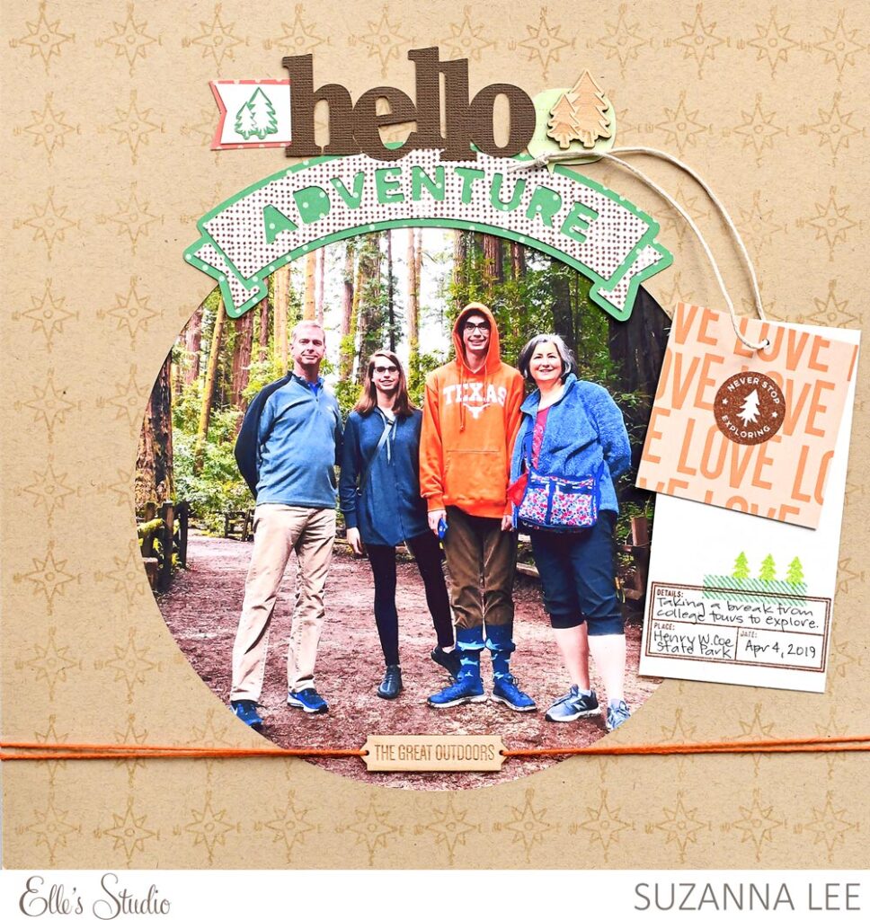
Supplies | July 2020 Kit, July 2020 Cut Files, Adventure Wood Veneers, Bright Polka Dot 6.5 x 8 Inch Paper Stack, Wild at Heart Stamp
I have used 6 of the stamps on this layout in 4 different spots! If you look at the supply list, it’s minimal because the stamps have done so much of work for me! Let’s take a look at the four different parts of the layout where I have used the Wild at Heart stamp set on this layout:
1. Compass to create the background
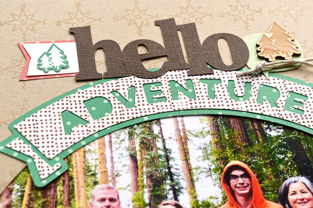
2. Repeated dots to provide pattern to the “adventure” digital cut file banner
3. “Never Stop Exploring” to add contrast color and repeated circle to the tag topper
4. Journaling/date spot with embellishment for the bottom tag
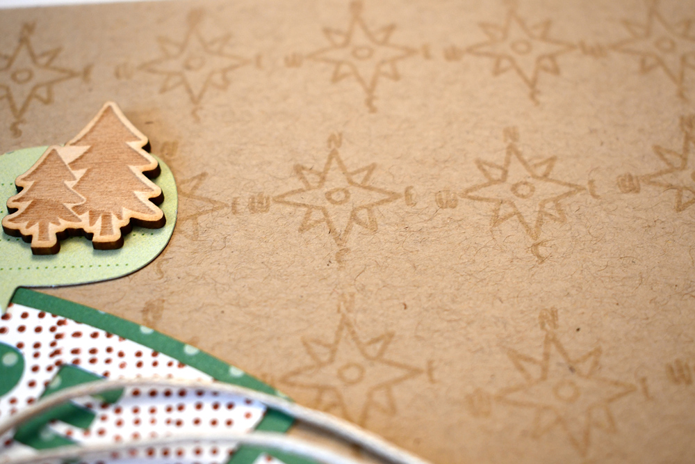
You can use stamps on repeat to create your own background paper! For this layout, I wanted a subtle pattern. Using a VersaMark ink with the compass stamp afforded me the ability to get that tone on tone pattern.
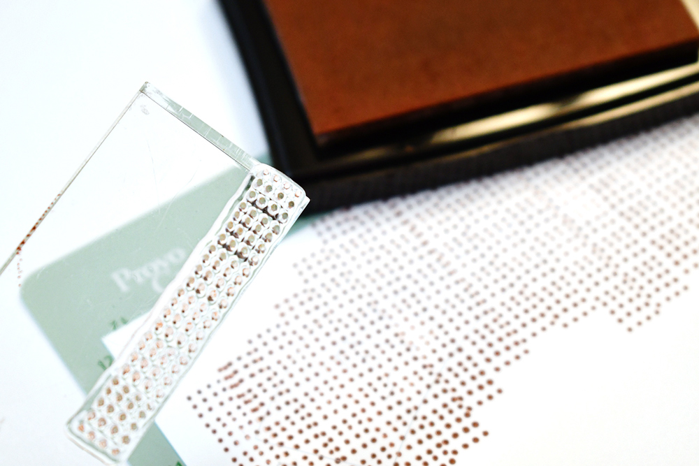
While the Bright Polka Dot Paper Stack this month is AMAZING and I will need about 5 of these, it didn’t have exactly what I wanted for a patterned paper. No worries—I made it myself. I used the repeated dots stamp and just layered it up, as you can see above, to provide the repeated pattern across the white cardstock. I do this A LOT, using these edge stamps on a bigger scale.
Here is a closer look of the finished banner:
To the right of the large photo is a double layer tag (inspired by a product tag from clothing!)
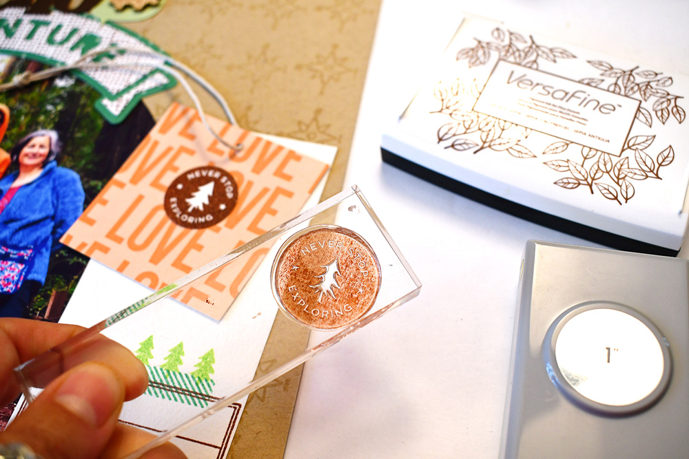
The top layer of the double tag is a 3″ x 4″ tag that I cut down to size with a stamped circle on top. It looks like an Elle’s Studio sticker, doesn’t it? But it’s not! It’s stamped—made by me to coordinate perfectly with this very layout! Just stamp, use a 1 inch circle punch and voila! Your very own embellishment in the very color you need to coordinate with your page! Simple!
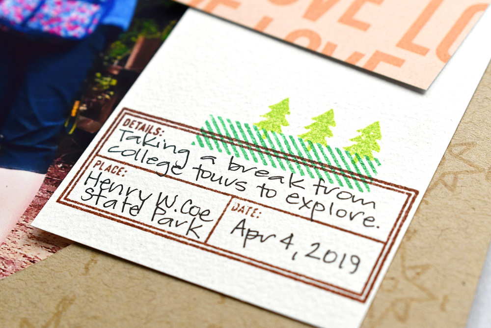
Last but not least, for the fourth and final spot where I used the Wild at Heart Stamp on this page was the bottom layer of the tag. Three stamps were used here. The “Details” stamp is pretty self-explanatory. The diagonal strip edge stamp overlaps the top border for some color. I polished it off with a row of trees to compliment the wood veneer and fussy cuts trees in the title cluster.
I hope I have inspired you to get out your Elle’s Studio stamps and USE THEM! They really do look better used then sitting all pretty in the packaging where nobody else can admire them.
Thanks for stopping in today!

Show us how you have used this month’s Wild at Heart Stamp on your projects! Post on Instagram using the hashtag #EllesStudio or share in our Elle’s Studio Facebook Group!
