Hi friends! It’s Jackie here using the May 2021 kit and add-ons to create a fun grid format layout.
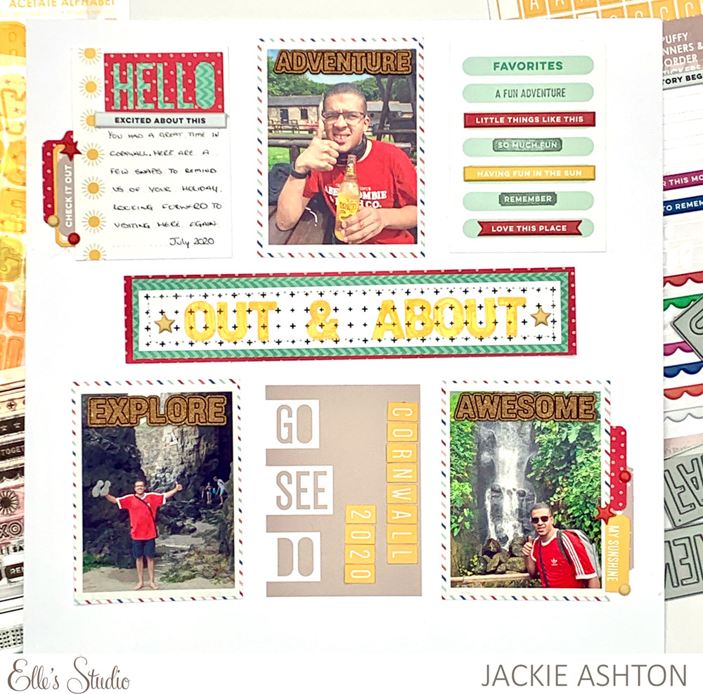
Supplies | May 2021 Kit, Jane Tile Alphabet Cardstock Stickers – Yellow, Yellow Cardstock Label Stickers, Yellow Parker Acetate Alphabet Stickers, Puffy Banners and Border Stickers, Tiny Shapes and Dots Puffy Stickers – Warm Tones, Cork Words, Good Times Paper Stack, Fun with Borders Stamp, Knockout Words Metal Die
To start this layout, I decided to focus on color, so I used the red colour from my son’s tee-shirt, combined it with the yellow Jane Tile and Parker Acetate alphabets, and choose the striped patterned paper, which included mint, to help tie the colors together.
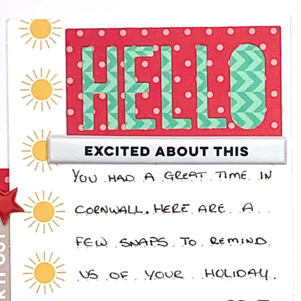
After choosing three of the tags from May 2021 Kit that would work with my photographs and the color scheme I was using, I layered patterned papers from the new Good Times Paper Stack behind each one, leaving a slight border around the edge.
I wanted to add some detail to each of my tags. Starting at the top left of my page, and using patterned papers from the Good Times Paper Stack, I added a die-cut word from the Knockout Words Metal Die which I backed with patterned paper and adhered to the tag before adding my journalling.
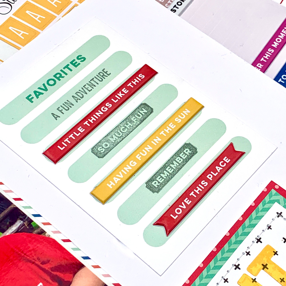
On the ‘favorites’ pocket tag I added three of the gorgeous Puffy Banners and Border Stickers, and stamped some phrases from the Fun with Borders Stamp.
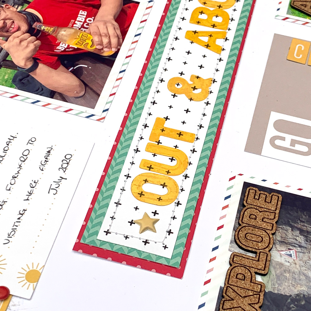
I layered three pieces of patterned paper from Good Times Paper Stack in the centre of the page, and used the lovely Yellow Parker Acetate Alphabet Stickers, to add my title.
Once I had adhered it all down it was time to add some embellishments, using some of the lovely add-ons this month.
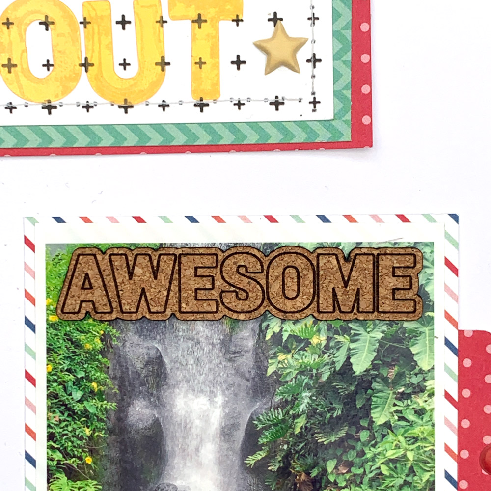
Don’t you just love these fun Cork Words which fit perfectly at the top of each of photographs?!
I have loved using the May 2021 kit and add-ons and I’ve found by just choosing three colors from the kit to work with, my layout came together quickly!
Do you have a particular way to tie your photographs and products together? Do you start with one product and work from there, or do you choose a color in your photograph as your starting point? I would love to find out what your approach is when creating a layout!

