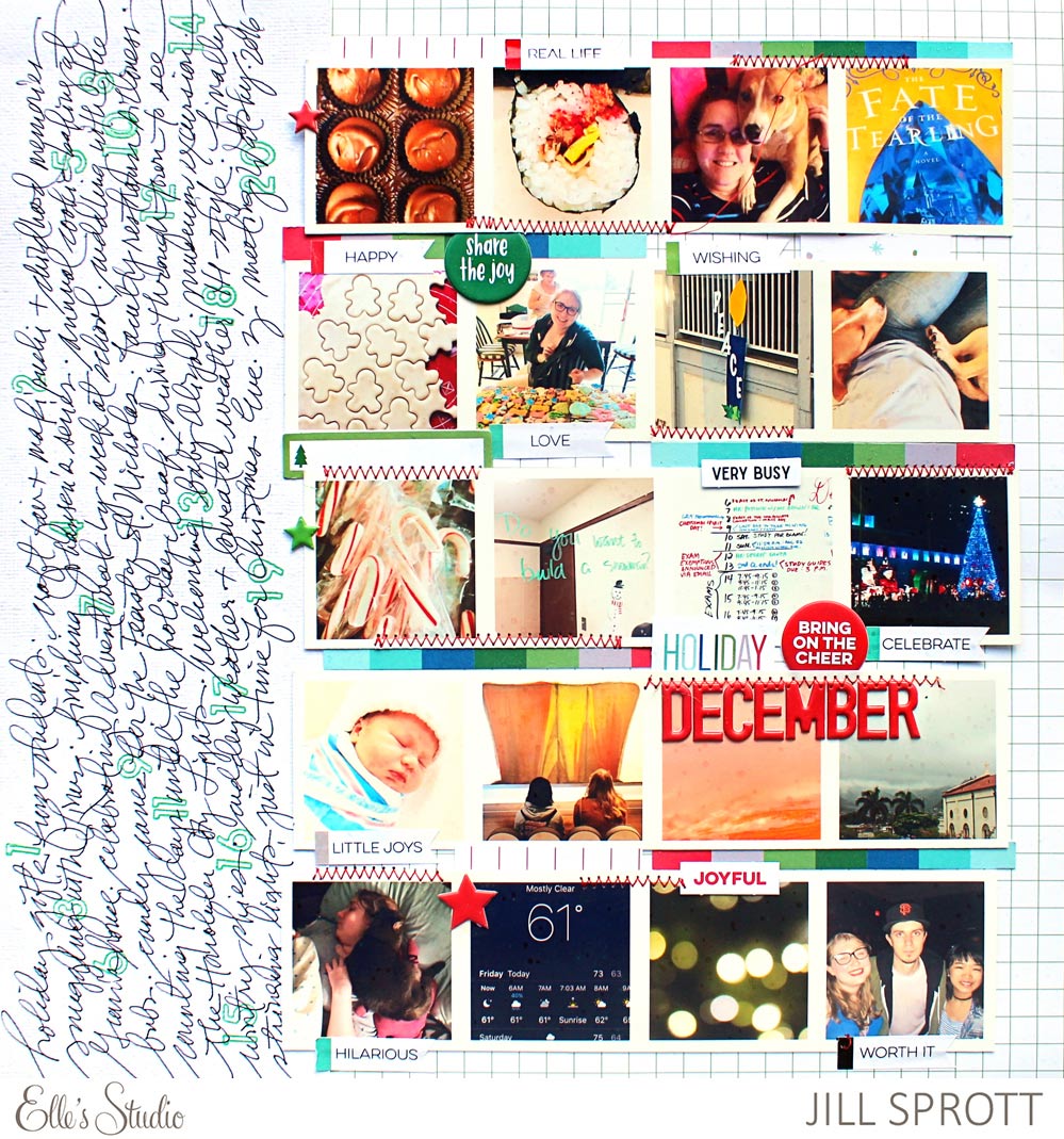
As we approach the end of 2017, we start looking back on a year of favorite moments, difficult times or things we’ve learned. Today, Jill Sprott is giving us a few tips on how to make the most of that 12″ x 12″ space to fully document our year or in her case, month of December, and we couldn’t love it more. Let’s take a look.
Fitting twenty photos on a page while still leaving room for lots of journaling can be a daunting task, but it is possible. It just takes a little bit of planning — and it also doesn’t hurt to have some help from the Elle’s Studio November Kit and extras.

Supplies | November 2017 Kit, Giving Thanks Puffy Stickers, Red Puffy Alphabet Stickers, Everyday Banner Stickers, Stanley Jr. Alphabet Stamp — Outline, Family Fun 12 x 12 Paper Collection
When including multiple photos and plentiful journaling on a page, a white or simply patterned background (like the Family Fun grid pattern from the 12″ x 12″ Paper Collection here) keeps the page feeling open and allows for the addition of color without too much visual competition.
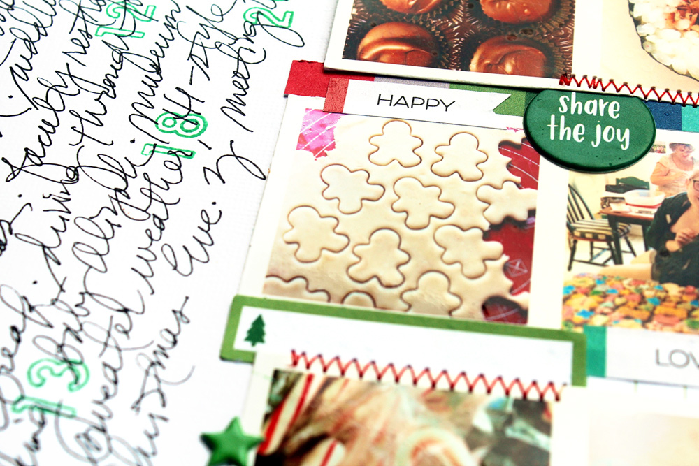
Because using accents on such a page can be tricky, it helps to take advantage of existing “openings” in the design. I worked stickers, like the “happy” Everyday Banner Sticker, Giving Thanks Puffy Stickers, and strips from journaling tags into the spaces between the rows of photos.

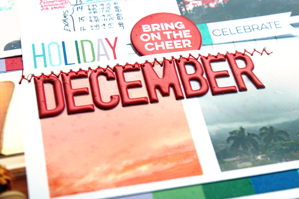
Since this is a month-in-review page, the title is simple and direct, but it also stands out, due to the Red Puffy Alphabet Stickers and the placement of the title according to the rule of thirds.

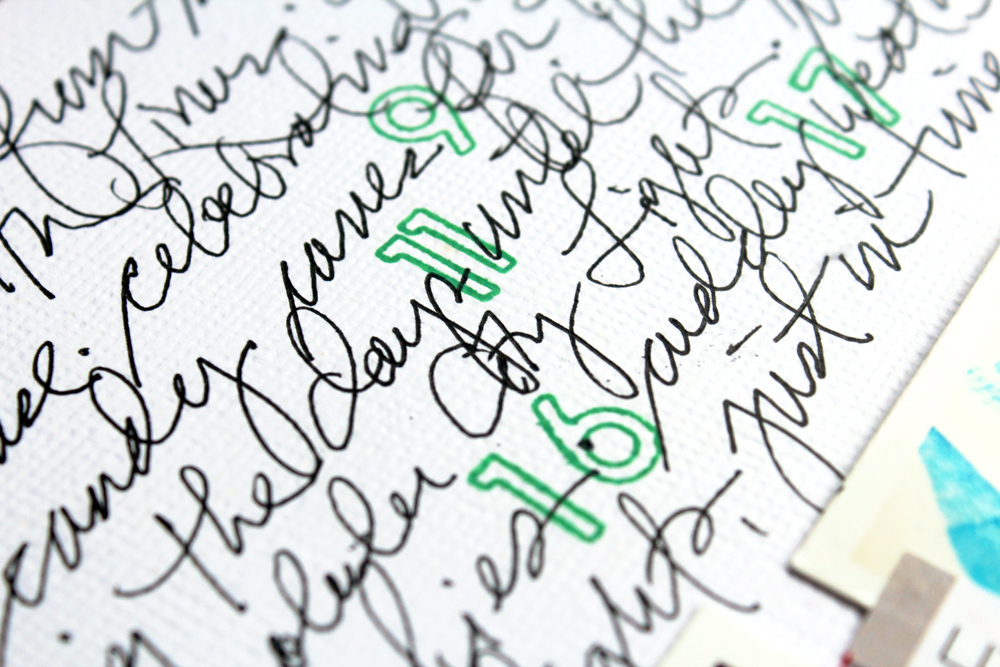
The final step was to include a list of the month’s highlights, in the order that they appear in the photos. Behind each item in the list, I lightly stamped an accompanying photo number using the Stanley Jr. Outline Alphabet Stamp.

This go-to grid approach serves me well when making review-based layouts. The design approach is fairly basic, but the inclusion of Elle’s Studio goodies helps to kick it up a notch or two.
Tips on Review-Based Documenting with Jill Sprott
