Hi there Elle’s Studio friends! It’s Aimee here today sharing with you a 9 x 12 inch pocket page using the July 2021 Kit and add-ons. It is not often that I see many scrapbook collections offering the color orange. Possibly, it doesn’t get much attention because it is so bright and maybe you don’t know what colors to pair with such a striking shade. I want to walk you through how I tackled the color orange and LOVE IT. Let’s take a look!
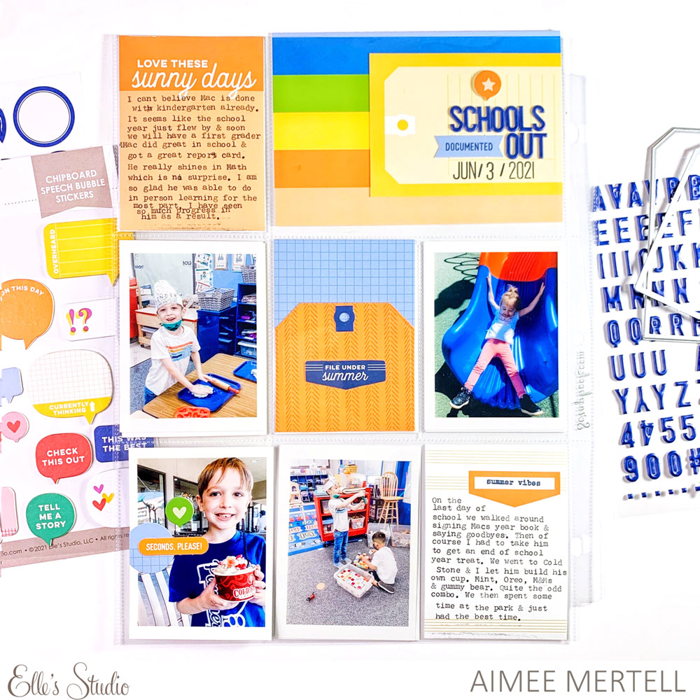
Supplies | July 2021 Kit, Chipboard Speech Bubble Stickers, Navy Puffy Alphabet Stickers, Adventure Paper Stack, Summertime Tabs Stamp, Mini Dated Stamp, Nesting Tags Metal Die
There’s no doubt about it— this pocket page is striking to say the least. It is out of my comfort zone, but I think that’s part of the fun. So in order for this to work, I went back to the basics of color theory and took a look at the old color wheel. I also took my photos into consideration and saw that my photos have predominantly primary colors in them: red, blue and yellow. The color wheel shows us that orange and blue, red and green are complementary colors, meaning they lie across from each other on the color wheel. This is perfect because the July Kit is already full of all those complimentary colors. Easy peasy right?!
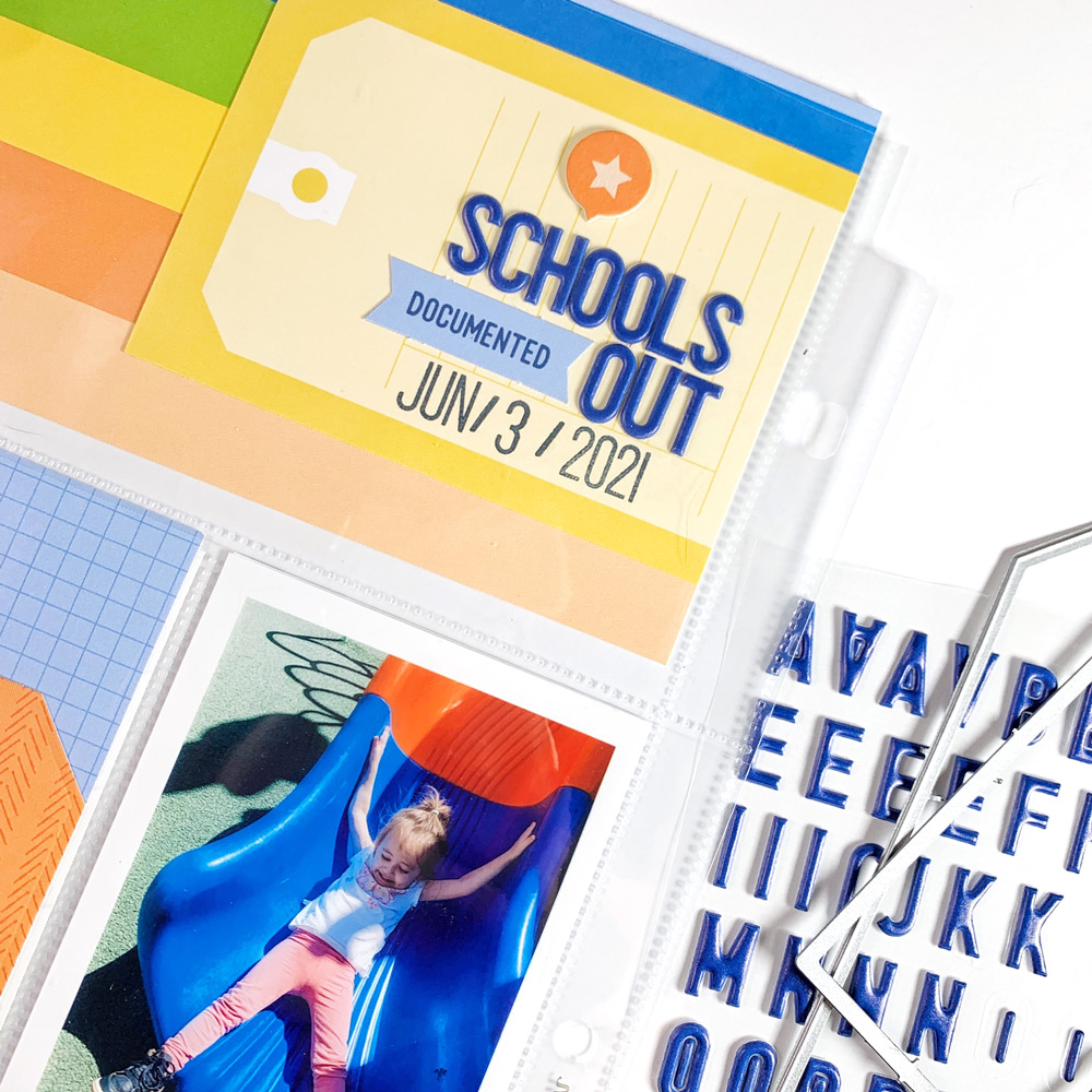
For my title tag, I layered the tag-shaped 3 x 4 inch tag on top of a rather colorful 4 x 6 inch tag to hold a place for my title. I went with, “Schools Out” spelled out using the Navy Puffy Alphabet Stickers to really make those orange colors pop. I strategically stuck to blue and red and their complementary colors when picking out my journaling tags and even decided to make my own using the new Nesting Tags Metal Die. I absolutely love these dies and especially love how it enables you to choose the color of the reinforcer so you can mix it up for a fun look. I used an orange patterned paper from the Adventure Paper Stack to cut a large tag and adorned it with a navy blue reinforcer and a blue die cut from the July Kit.
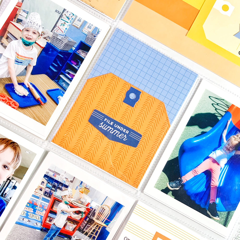
I used one of the orange journaling tags to write up a bit about our end of school ice cream date and I love how it helps to create a diagonal of orange from the top left, down to the bottom right.
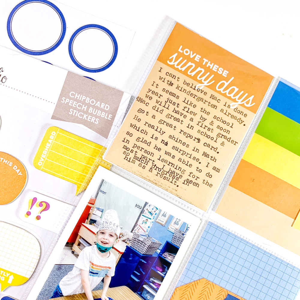
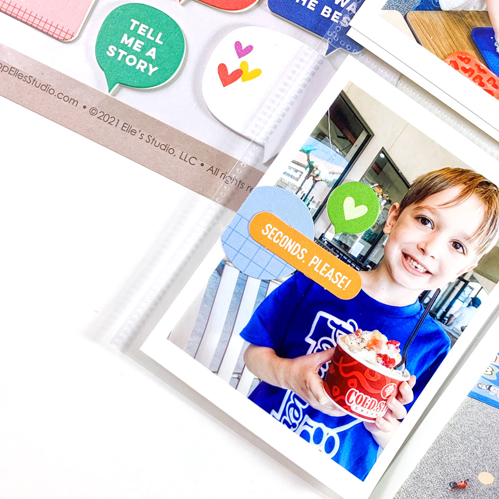
Moving down to the bottom of the page, I noticed that my son’s ice cream cup is bright red, so I felt confident adding a green speech bubble from the Chipboard Speech Bubble Stickers and the blue in his shirt allowed me to embellish with a fitting orange phrase die cut from the July Kit. Playing off of brightly-colored objects in your photos themselves can be a really useful tool in creating a bold and colorful spread.
If you’re creating something colorful, or working with a color out of your comfort zone, remember that you can always double-check the color wheel, or if your photos are less than complimentary, you can also change them into black and white. I find that Elle’s Studio kits are always easy to create with and have a perfectly curated color scheme as it is, but we all gravitate towards our comfort colors! I challenge you to step outside of your color safe haven this month like I did and make something fun. Happy crafting!

Show us how you use all of the beautiful colors in our July 2021 Kit and add-ons when your kit arrives! Post on Instagram using the hashtag #EllesStudio, or share in our Elle’s Studio Facebook Group, where Elle’s Studio fans gather!
