Hey there, Elle’s Studio friends! It’s Shannon here to talk with you about color. When I’m creating layouts, I’m always very mindful of my color choices. Color has the power to make a layout look cohesive or discombobulated and today I want to share a few tips for incorporating color into your next layout.
Now, I don’t know about you, but I can’t resist any rainbow stickers that Elle’s Studio puts out. Maybe it’s because I’m a sucker for rainbows! When I saw the new Happy Little Moments Chipboard Stickers, I knew they had to find a home on my layout. Since they’re rainbows and full of color, I had to put some planning into my layout. Let’s look at what I did.

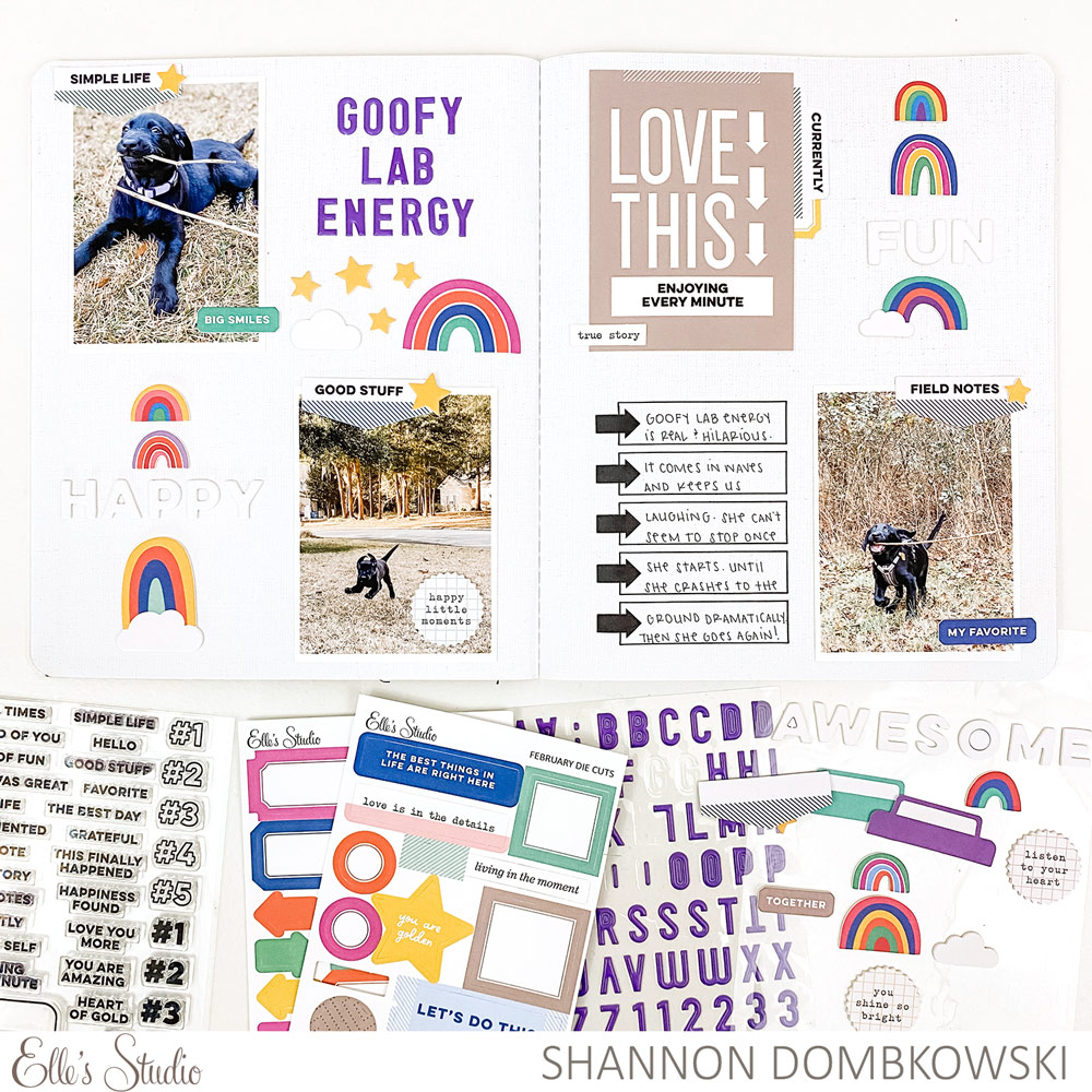
Supplies | February 2021 Kit, Bright Die Cut Tabs, Happy Little Moments Chipboard Stickers, Purple Puffy Alphabet Stickers, Good Times Tab Stamp, Noted Vol. 3 Stamp
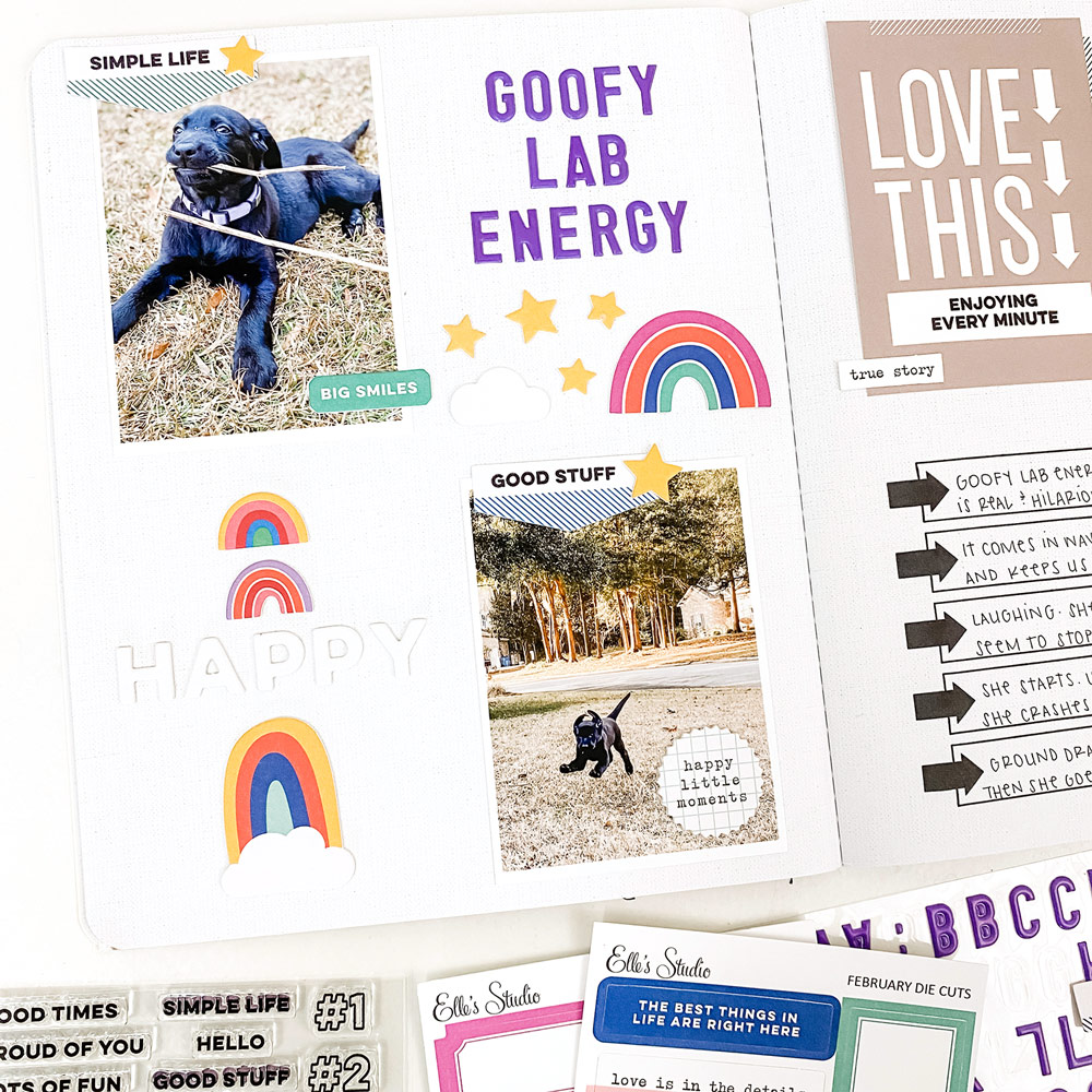
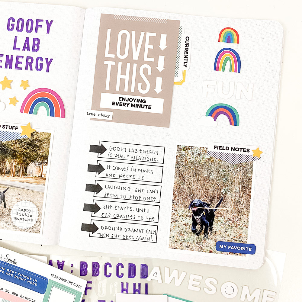
First, let’s look at the photos. I chose to use photos with natural colors. Since it’s winter here in Georgia, our grass is dormant. Not so pretty to look at, but perfect for neutral photos! And, of course, my black lab puppy is neutral by default! If your photos have lots of colors, you can make them neutral by turning them black and white. You could also choose a series of photos with one dominant non-neutral hue and make that the primary color of your layout. In addition to neutral colors in your photos, you’ll want to make sure you have plenty of white space. Especially if you’re working with a lot of colors as I did on this layout.

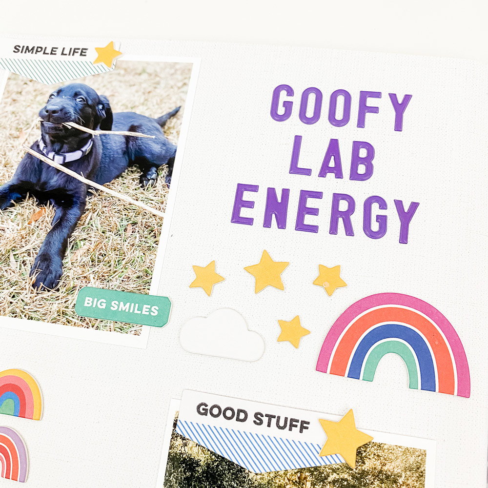
Second, choose a primary color to highlight throughout the layout. I knew that I’d be using the Purple Puffy Alphabet Stickers for my title, so I found ways to work that color into the rest of my layout. I made sure each of my rainbows had a purple stripe, though they are different shades. I also made sure that the rainbows with the purple stripes were arranged in a triangle on my page. This leads me to my next tip…

Third, arrange your colors in a visual triangle. On this two page spread, I arranged my color clusters in a visual triangle (it’s an odd-shaped triangle but there is a definite separation between the clusters). I made sure each cluster had a rainbow with a purple stripe. This allowed me to weave the color throughout my layout.

My fourth and final tip is to use the color wheel. I chose yellow as my secondary color on this layout. If you look at a color wheel, you’ll see that yellow and purple are complementary colors. This means that they enhance each other’s intensity. When you use complementary colors, you bring bold energy to your layout. That sounds like the perfect feeling for the theme of my page!
I hope I’ve given you some ideas that will help you use color with confidence on your next layout. Take a leap and see how you can use color in a new way!

Show us how you’re using our colorful February kit and add-ons to create your projects! Share with us on Instagram using the hashtag #EllesStudio, or in our Elle’s Studio Facebook Group!
