Each month during 2020, we are sharing two different sketches with you, geared toward boosting your creativity and helping you to create in a time crunch! We’d love for you to take these sketches and create with them, sharing your projects on Instagram using the hashtag #EllesStudio and in our Elle’s Studio Facebook Group!
Today, we’re excited to see how design team member Kristina Proffitt is simplifying today’s sketch to fit her style, proving that there is no right or wrong way to use a sketch! Let’s take a look!
Hi friends! Can you believe it’s already the end of January? Wow. Happy 2020 to you! I’m here today to share a super great sketch with you and share my take on it!
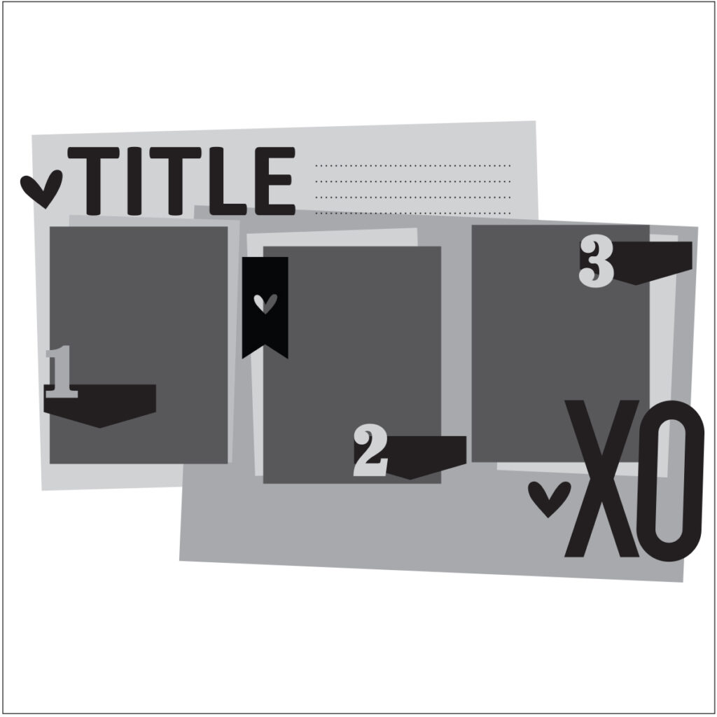
First of all, here is the sketch I was working with:
Here is the layout that I created based on the sketch:
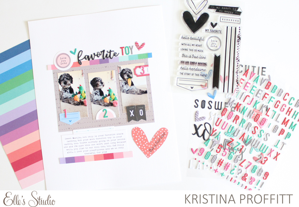
Supplies | January 2020 Kit, You Are Loved Die Cuts, La La Love You Puffy Stickers, Valentine Multi Color Puffy Alphabet Stickers, Love Is 6 x 8.5 Paper Stack, Love You Lots Stamp
I decided to create an 8.5″ x 11″ layout using the sketch. Just because a sketch is sized at 12″ x 12″, that doesn’t mean you have to recreate it at that size. This sketch worked perfectly for this size of layout!
The first thing that I did was cut a sheet of the gray heart patterned paper from the Love Is Paper Stack and placed it in the center of my layout. Next, I printed three photos of my dog Marlie with her favorite dog toys (her carrot in particular) and placed them a on top, at varying heights. I loved the layered look in the sketch, so I cut a strip of the striped paper from the Love Is Paper Stack and adhered that along the top of the gray patterned paper. I’m not big on layering, but you can take an idea from a sketch and put your own spin on it to simplify!
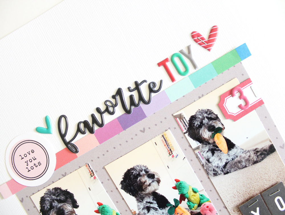
I loved the large title on the sketch, but decided to instead add a circle that I cut out from the “love you lots” dotted patterned paper from the Love Is Paper Stack to use it in its place. I added the “favorite” word of my title, along with hearts from the La La Love You Puffy Stickers to the right of my circle, and although it’s not as predominant as the sketch layout, I still love it. I paired the script word with the sans-serif font in the Valentine Multi Color Puffy Alphabet Stickers to complete the title. It is so fun to mix and match fonts, sizes and colors in a title!
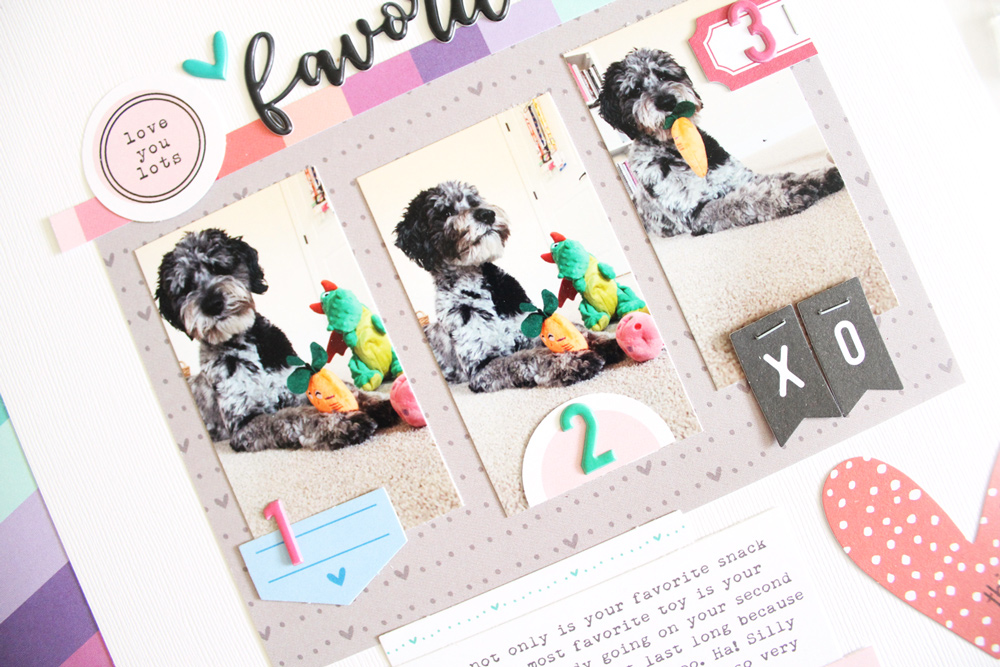
I loved the numbers on the photos in the sketch and this element worked perfectly for my page. I used tags from the January Kit, a label die cut from the You Are Loved Die Cuts and another circle punched from the dotted patterned paper in the Love Is Paper Stack to create little resting spots for each of the numbers.
The big “XO” on the sketch inspired me to use the “X” and “O” banners from the You Are Loved Die Cuts. I stapled them onto the photo—super simple!
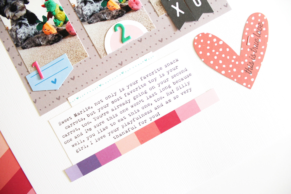
Lastly, I decided to print out my journaling and include it at the bottom of the layout, instead of the top of the layout like the sketch. I loved the colorful strip that I added on the top, so I repeated that along the bottom, too. For the large element on the bottom right, I decided to use a heart from the You Are Loved Die Cuts, stamping “this is true love” from the Love You Lots Stamp to the top. I also added border cut from a tag in the January Kit right above the journaling for a bit of whimsy.
I really love how a single sketch can be so inspiring. You can create a project exactly like the sketch or let the inspiration you get from the sketch direct your creativity. I did a little bit of both with this layout, and I love the way it turned out. I highly recommend using sketches from time to time to not only stretch your creativity, but to also give your creativity a reboot! It’s a great way to be inspired, use your products and get your stories told!

