Hi there, Elle’s Studio friends! It’s Shannon here, and by now, you’re probably in that post-holiday haze and can’t remember exactly what day it is. As we charge toward 2022, I want to share some pocket page inspiration with you. One of the comments that I receive most often is about the cohesive and consistent feel of my pocket pages. I am very intentional when I make my pages, but achieving a harmonious look is easier than you think! Let’s take a look at how I did it with this page about our first frost of the year:
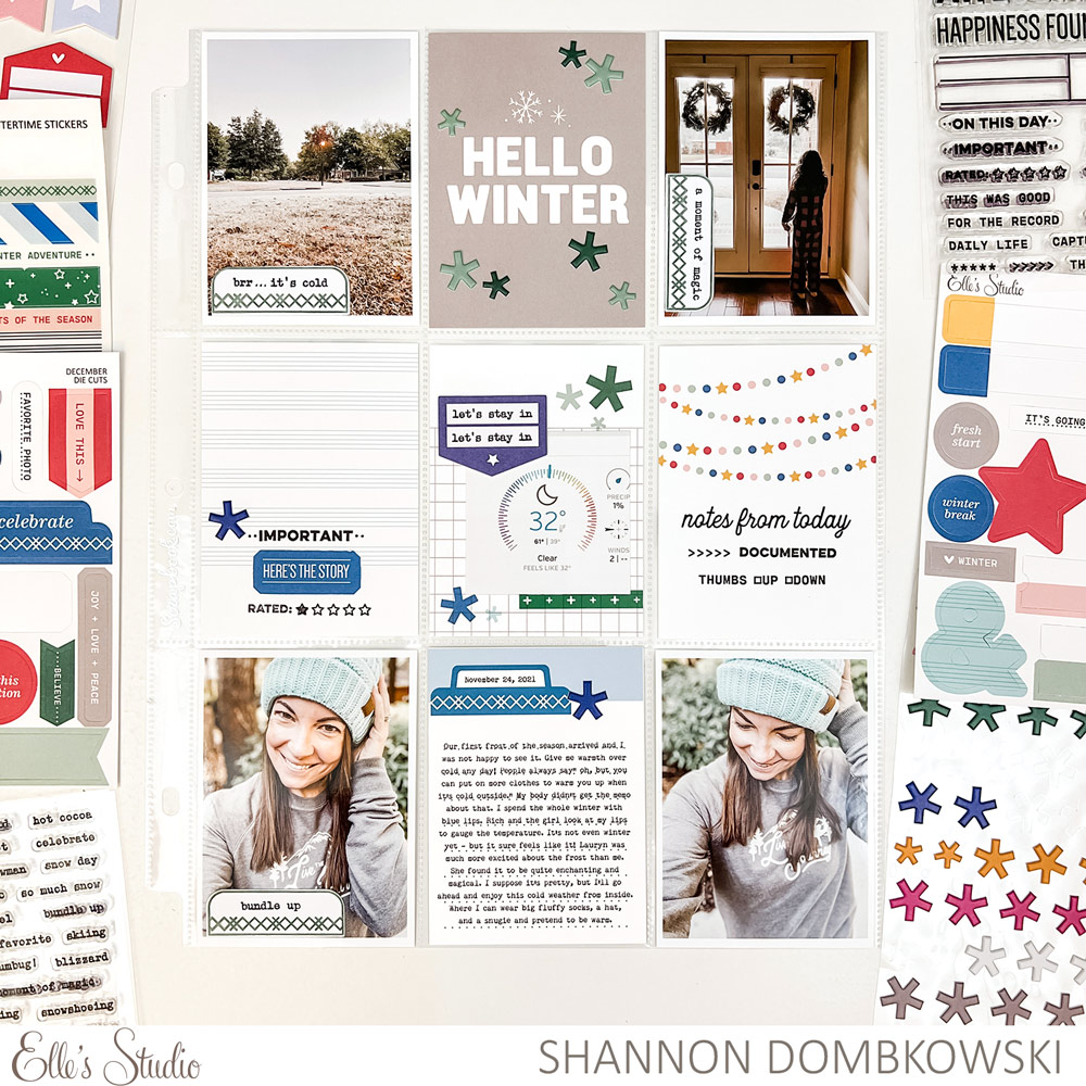
Supplies | December 2021 Kit, Wintertime Printables, Wintertime Vellum Stickers, Grateful Chipboard Stickers, Puffy Asterisk Stickers, Winter Tabs Stamp, For the Record Stamp, Everyday Tabs Vol. 2 Metal Die
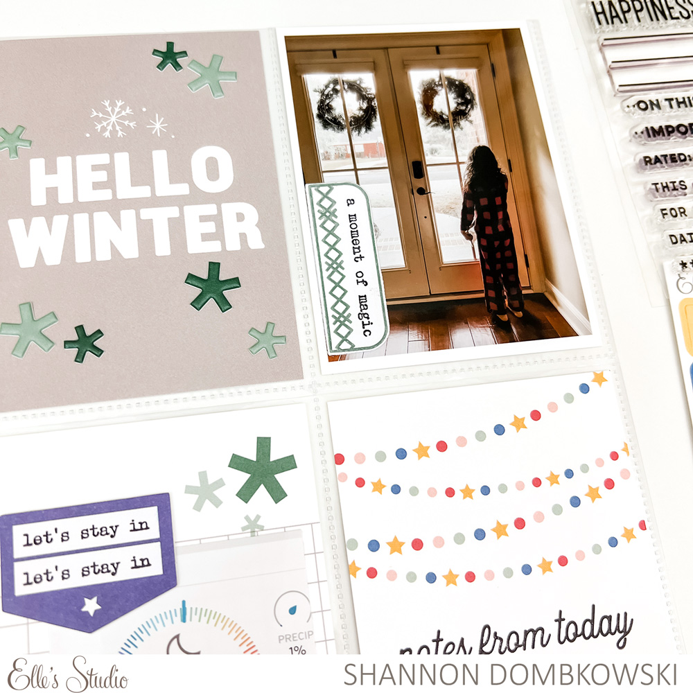
I create monthly pocket pages, so when I’m first starting my page, I look for photos with the same look, feel, or color scheme. Once my photos have been chosen, I move on to choosing my tags. I try to make the tags match the colors of my photos as much as possible. On this page, I chose the center tag from the December 2021 Kit first. It has green and blue asterisks so I chose those to be the two focus colors of this page. I try to make sure that I have a good balance of white tags and colored tags.
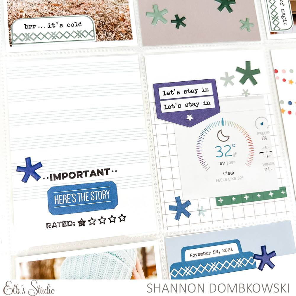
Once my tags are picked out, it’s time to embellish my page. Once again, I drew my inspiration from the center tag. The Puffy Asterisk Stickers allowed me to add asterisks to other tags on my page. I like how they kind of look like green snowflakes on this 3 x 4 inch tag! If you look in the bottom left corner of the photo, you can see that I also used a Puffy Asterisk Sticker as a way to draw attention to my stamping and sentiments at the bottom of the striped 3 x 4 inch tag.
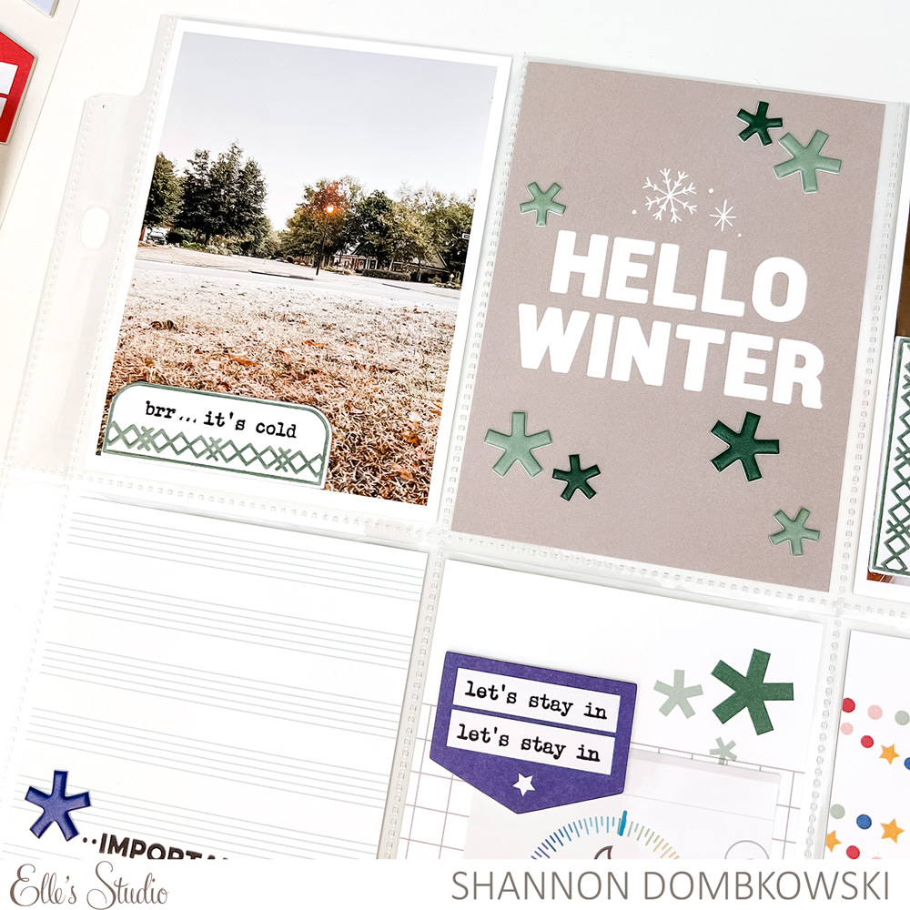
Another common embellishment that I added were tabs and stamped sentiments. I stamped the tab and sentiments using the Winter Tabs Stamp and then I used the Everyday Tabs Vol. 2 Metal Die to cut the shape with no fuss. I scattered these around my page in a visual triangle to draw the eye around the page and lend to that cohesive look.
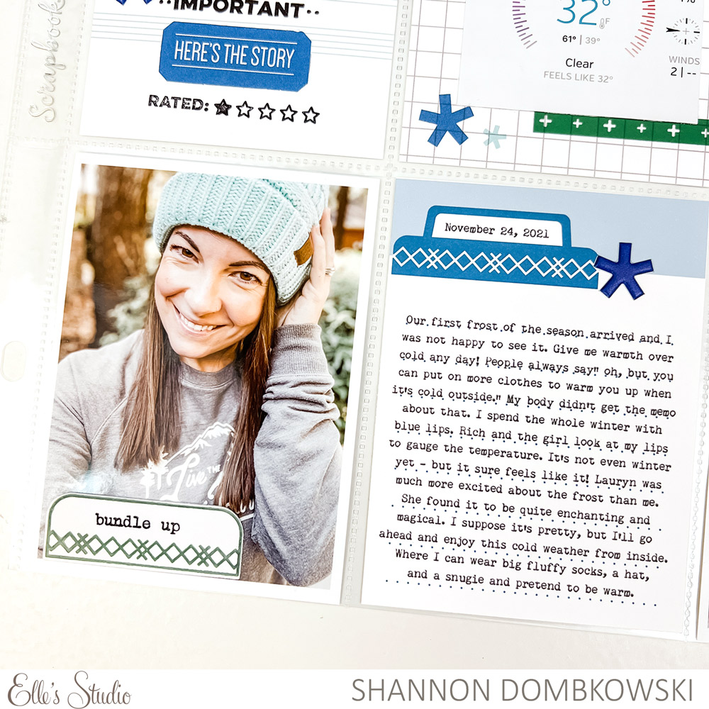
Finally, I added even more stamping. I chose to use stamps in fonts that matched the “Hello Winter” 3 x 4 tag from the For the Record Stamp. This helps make everything look like it belongs together. It also adds a little extra something to the mostly white 3 x 4 inch tags without making them too overwhelming for the page. Part of a harmonious page is making sure that there are places for the eye to rest.
Bringing a cohesive look to your pages is easier than you think. Once you’ve done it a few times, it’ll become second nature. I hope you’ll give these tips a try on your next project!

