Hi friends! It’s Daniela here, sharing a new sketch-based layout. Today I want to show you how to interpret a sketch and make it your own. Sketches leave a lot of room for interpretation, but also give you an idea of what to do to fill your page. Let’s take a look at the today’s sketch:
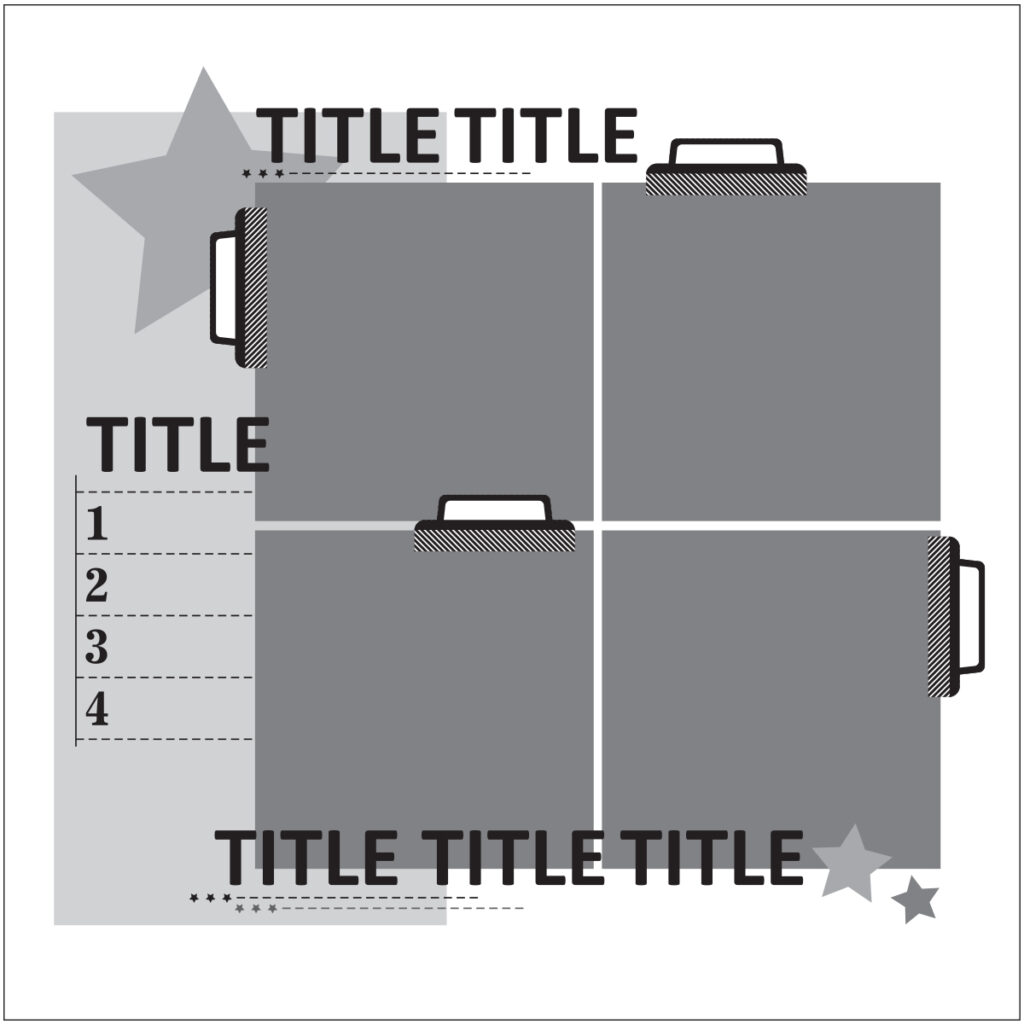
What hit the eye first is the big square consisting of four pictures. I had one photo that I really wanted to use, so I trimmed it into a square and decided to work with one picture only instead of using four. This is how my page turned out:
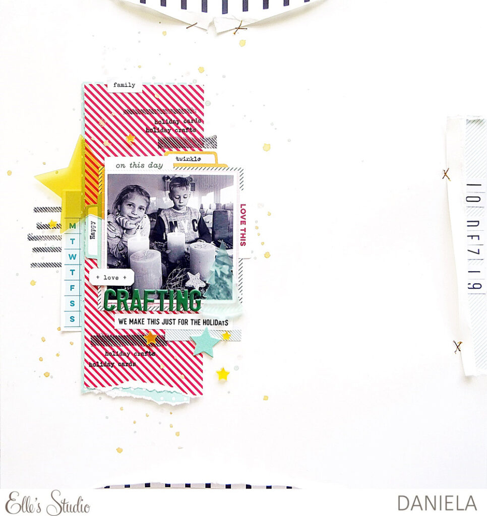
Supplies | November 2020 Kit, Autumn Die Cut Tabs, Holiday Foodie Stickers, Jane Tile Alphabet Cardstock Stickers – White, Very Merry Chipboard Stickers, Dark Green Puffy Alphabet Stickers, Acrylic Christmas Trees, Acetate Stars, Fa La La 6 x 8.5 inch Paper Stack, Christmas Basics 6 x 8.5 inch Paper Stack, Christmas Tabs Stamp
There are various titles in the sketch and I wanted to add all the elements the sketch offers, so I used stickers and die-cuts from the November Kit to have tiny titles spread around my picture. The yellow Acetate Stars added a shiny element that add a special touch to the page and also builds a nice contrast to the other colors.
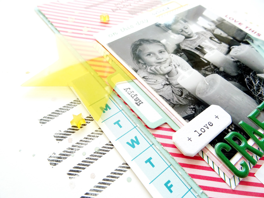
I also wanted to follow the sketch by adding some stamped details, so I played with the Christmas Tabs Stamp and added black lines and words to the beautiful paper from the Christmas Basics 6 x 8.5 Inch Paper Stack. Stars are the perfect embellishments for my picture, so I added another chipboard sticker and some acrylic stars from the Acrylic Christmas Trees pack, too.
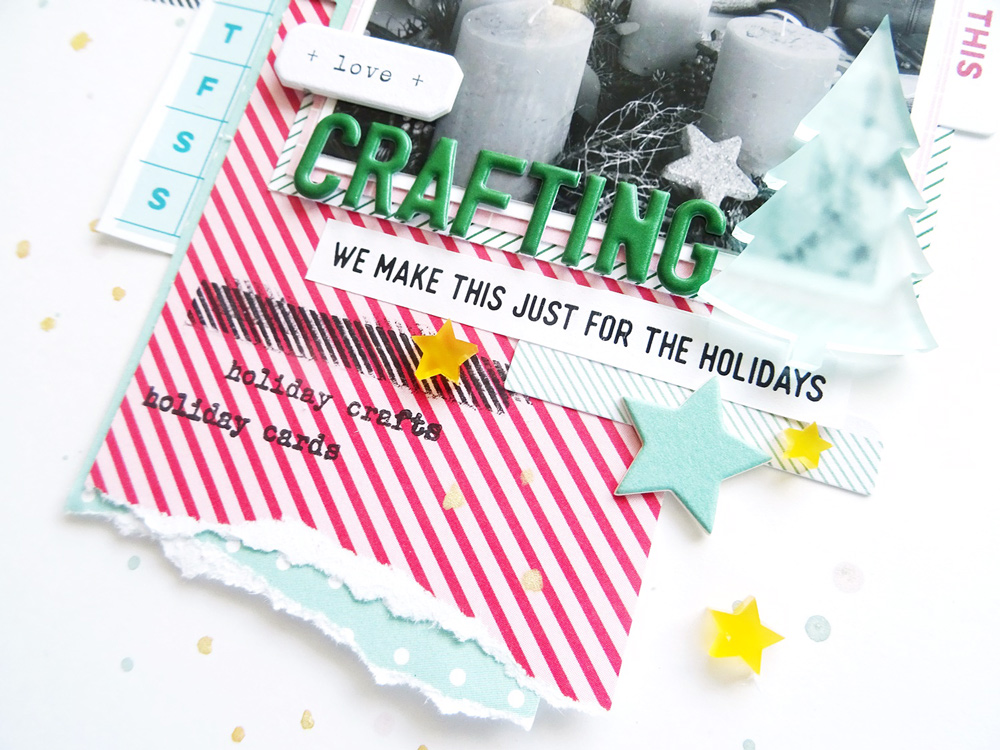
Working with black and white pictures and fresh colors, plus black ink is a great way to create a modern kind of style. I feel that Christmas-themed layouts can be fresh and modern, too. Black accents and shiny details like acetates and acrylics help to create something different. Ripped edges and different paper layers also add up to a modern and playful kind of style.
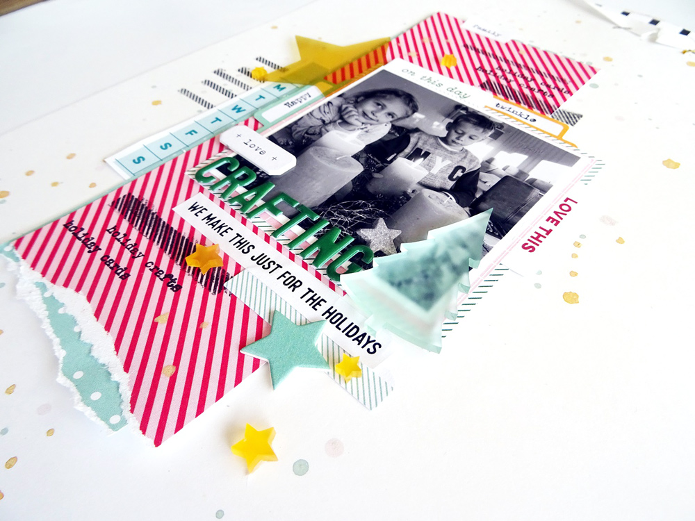
I hope you like my way of interpreting the sketch. The only big change I made was reducing the number of pictures from four to one. The rest of layout follows the sketch quite closely and I really like the way it turned out.
Thanks so much for stopping by today and have a great day!

How will you create with this sketch? Share your sketch-based project with us by posting in our Elle’s Studio Facebook Group, or on Instagram using the hashtag #EllesStudio!

Comments