Have you ever decided to mix up your scrapbooking format, only to find yourself at a loss on how to design on a smaller or larger scale? Today design team member Steph Grimes is here to help anyone who wants to try out a traveler’s notebook format, and she’s sharing wonderful design tips for how to make the transition as smooth as possible!
Hello friends! For those of you who follow me, you may know that I am most comfortable in pockets. However, this year I am really stretching outside my comfort zone to try more projects outside of pocket pages. One of the projects I am currently working on is a traveler’s notebook for this winter full of selfies and mini stories about me and my life right now. I have not worked in this format very much and while I like the size, it’s proven a little challenging for me. So as I was working on this spread, I decided I would set myself up for success by focusing on a few easy design elements that could help me pull this page together. Today I’d like to share those with you in case you also would like to try them out on a traveler’s notebook project!
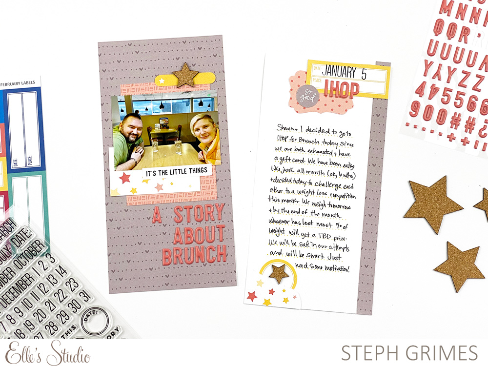
Supplies | February 2020 Kit, February Labels, Be Happy Stickers, Coral Puffy Alphabet Stickers, Cork Stars, Love Is 6 x 8.5 Paper Stack, Noted Vol. 2 Stamp
Design Element #1 – Repetition
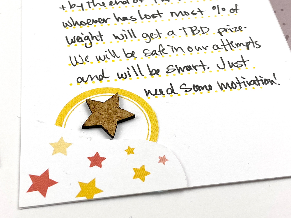
Repetition is a great design element on all projects, but can work especially well in a traveler’s notebook because you’re working in such a small space. It can make a larger, collective impact when elements are repeated. In this spread, I repeated a few colors and shapes. I used the gray heart paper from the Love Is Paper Stack and cut a smaller strip of it to add to the edge of the second page. I also repeated coral and yellow hues in my embellishments. I repeated the Cork Stars, one on each page. I especially like to carry elements across both pages as I find that also helps to bring them together to look more cohesive.
Design Element #2 – Alignment
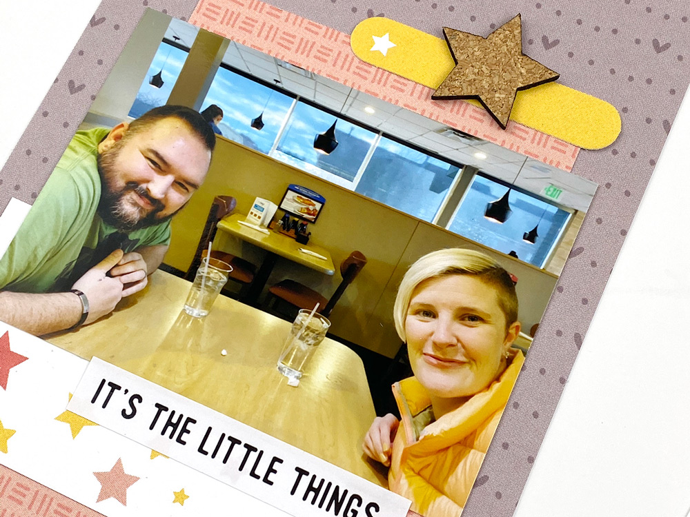
Don’t be afraid of playing with alignment. Sometimes, you will want everything to have the same alignment on a page, and other times, like in this case, it will be more eye-pleasing to mix it up. My photo and journaling are both aligned in the center on each page because those are the highlights of this spread, so for my other clusters I experimented with left and right alignment to create some visual balance. I decided to align my title on the right to bring some weight to the bottom right of the first page and help lead your eye to the second page.
Design Element #3 – Creating a Visual Triangle
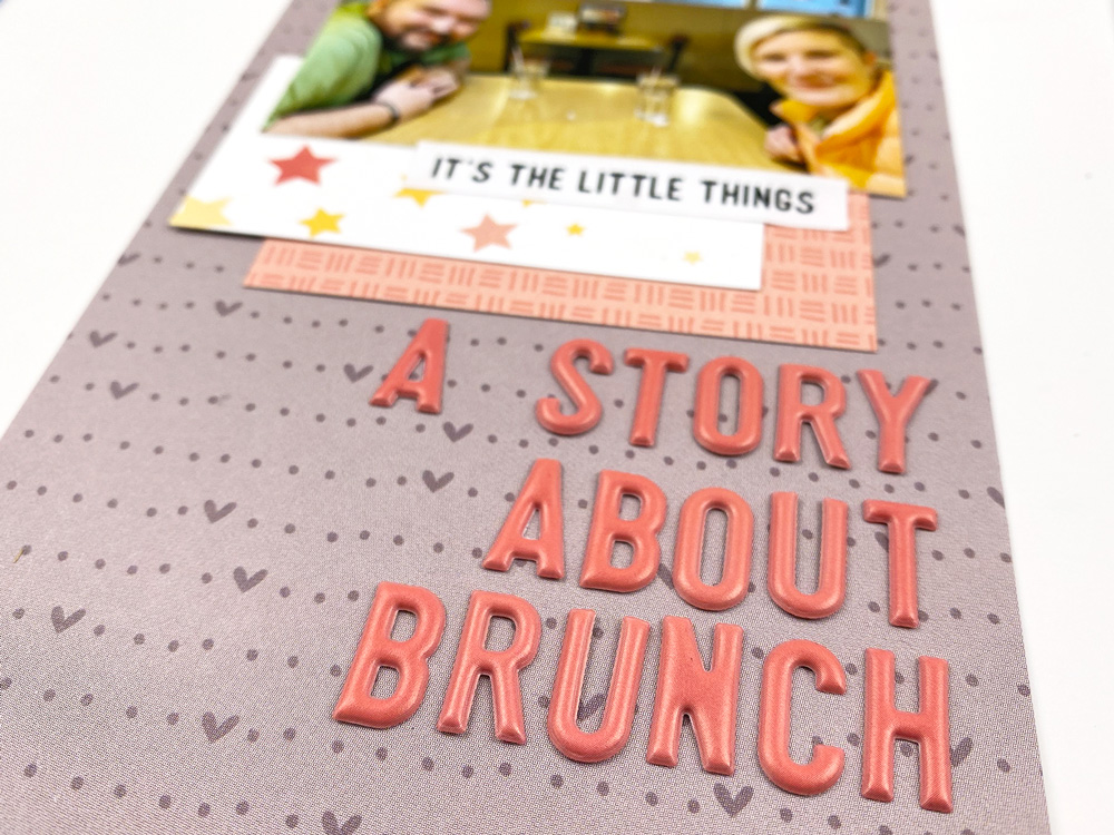
I like to work to create a visual triangle in most of my spreads and layouts, but I found it to be really helpful in this layout as I was trying to make decisions about what to add. I have two main triangles happening here: The first I made from the yellow labels—the one with the tiny star printed on it on the left, then down to the yellow circle label, both from the February 2020 Kit die cuts, and up to the yellow “Date / Place” label from the February Labels. The second triangle is made up of the coral 3” x 4” journaling tag on the left page, the title made from the Coral Puffy Alphabet Stickers, and then up to the top right corner of the right page where I have more Coral Puffy Alphas and a punched piece of coral patterned paper from the Love Is Paper Stack. These two triangles help make this a balanced layout.
Other Tips for Traveler’s Notebooks:
A few extra tips I have for working in traveler’s notebooks:
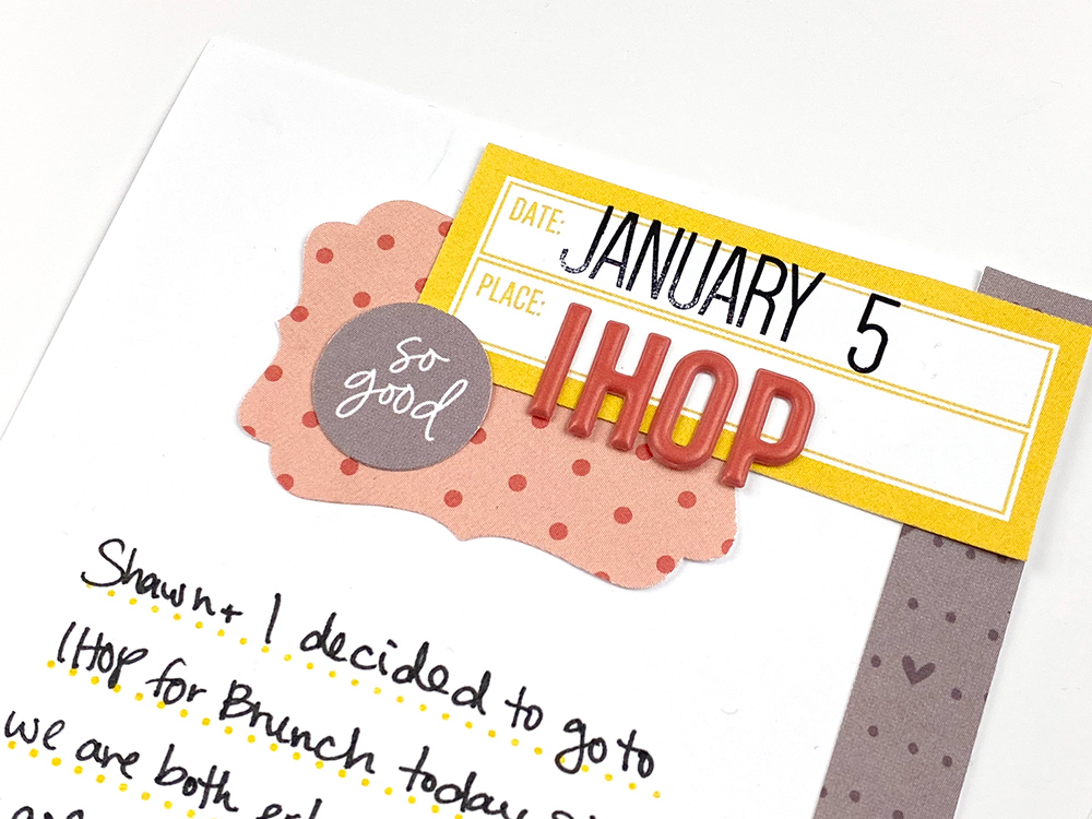
Layer It Up | It can be hard to work in a traveler’s notebook because you may not want to add a lot of bulky items. I didn’t stick to that so much in this layout, using the Cork Stars and the Coral Puffy Alphabet Stickers that have a bit of dimension to them. A good way to add interest and texture without a lot of bulk is layering! If you decide to work with flat elements only, like paper, labels, and flat stickers, you can still achieve depth in your project by layering all those pieces up on top of each other. I think this is a great way to keep traveler’s notebook spreads from seeming flat or boring, without adding a bunch of bulk to your notebook.
Make Your Supplies Work for You | Don’t be afraid to use your supplies the way you want to, and the way you feel they are going to best suit your project. I think one of the biggest “a-ha” moments that come to me when working in a smaller format like a traveler’s notebook, is that I can alter the supplies to fit my needs. In this spread, it was cutting apart the 3″ x 4” journaling tag with the coral and yellow stars printed on it from the February 2020 Kit. I loved that tag, and it worked perfectly with the colors of this spread, but I couldn’t figure out how to use it and get the most out of it as a whole piece. As soon as I thought to cut it into two different pieces, it came right together for me.
So there you have it, three design techniques (and two bonus tips!) for traveler’s notebook projects. Do you like working in traveler’s notebooks? Do you have any tips you’d like to share for working in this size? Please share them on Instagram and use the hashtag #ellesstudio, or in our Elle’s Studio Facebook Group. We would love to hear what your thoughts!

