Inspiration is all around us, and sometimes, a project totally unlike the one that we’re working on will speak to us. Today, design team member Steph Grimes found inspiration in a layout to help her start a new vacation documentation project! Let’s take a look!
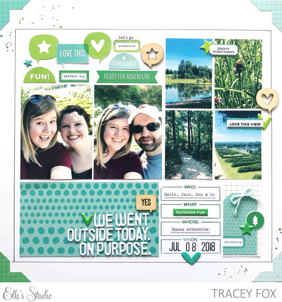
Can you even believe it’s nearly the end of April already? I hope that spring has reached your corner of the world by now and, if not, that you’ve at least got your springy April kit and extras already in hand! It’s Steph here and this month I was inspired by my uber-talented friend and fellow ES design team member Tracey Fox. As soon as I saw her “On Purpose” layout that she created for the March design team gallery, I wanted to scraplift it for a travel project I just started work on.
Here’s Tracey’s original layout:
And here’s what I created based on her layout:
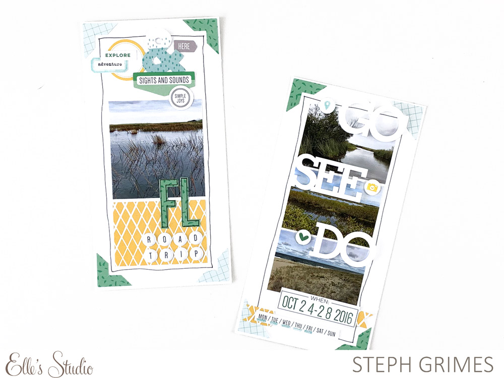
Supplies | April 2019 Kit, 5 W’s Journaling Tags, Typewriter Keys Puffy Alphabet Stickers, Go See Do Acrylic, Large Jane Alphabet Stamp – Outline, Large Jane Alphabet Metal Die, Springtime 6 x 6 Paper Stack, The Details Stamp, Mini Dated Stamp
I just started work on a travel album for our 2016 road trip to and around Florida and when I came across Tracey’s layout in the gallery last month, I immediately felt inspired! Tracey’s original layout was 12″ x 12″, however, I am only working in a 6″ x 8″ size for this album and already knew that I wanted my opening page to be traveler’s notebook sized (4.25” x 8.25”). So I decided to make it work anyway! I treated Tracey’s page as two smaller pages when working on my design, so I loosely turned the left half of her layout into my first page and the right half of her layout into my second page.
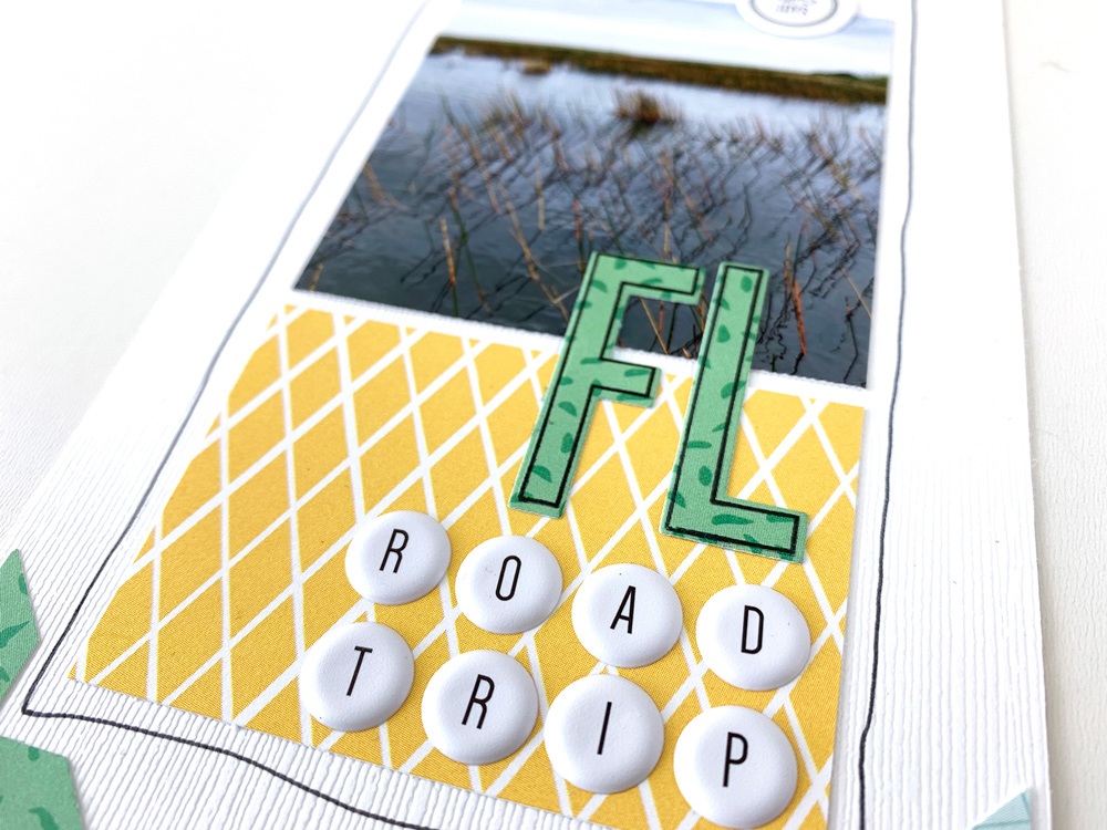
My favorite elements of Tracey’s layout were the grid, the hand-drawn thin line border around the page, the photo corners, and the green and aqua color scheme. I used those elements as my starting point and carried those directly into my own design. I added in a little yellow because I loved the yellow 4″ x 6” tag included in the April Kit and knew that I could trim it down to work on this layout and house my album title.
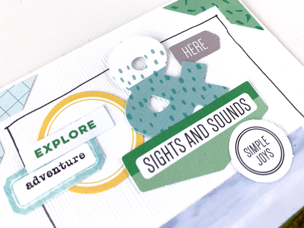
On Tracey’s original layout, she also had a grouping of die cuts and dimensional elements in the top left side of her grid. I also wanted to add this to my page since I thought so many of the die cuts in the April Kit went well with the theme of travel and matched the color scheme I had chosen. I love how these little bits and bobs work within the grid design of Tracey’s page, but also help to break it up a little and add some additional visual interest.
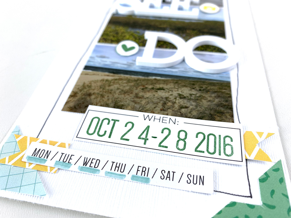
Like Tracey, I used the 5 W’s Journaling Tag and cut out only the part I wanted to use, which was the ‘When’ strip of the card. Then, I added in the dates of our trip using the Mini Dated Stamp. I highlighted the actual days of the week we were traveling by using a marker to underline the days of the week die cut from the April Kit.
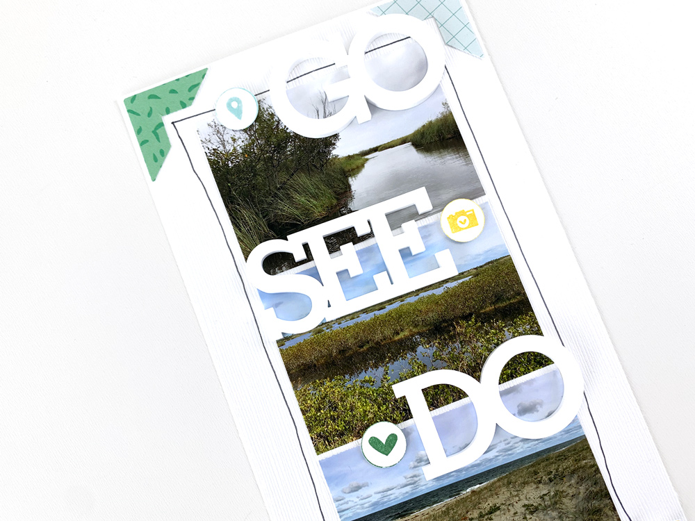
The final element I added was the Go See Do Acrylic over top of my grid of photos on the second page, which is perfect for any travel-themed projects! I also stamped out a few of the images from The Details Stamp—the geotag, camera, and heart—to add alongside the acrylic words and bring a little more color to the page.
It was so much fun to use another design team member’s project as inspiration this month! Thank you Tracey for an awesome jumping off point! Have you been inspired by the design team this month? Have you already scraplifted one of the projects from the gallery? Please share it with us using the hashtag #EllesStudio on Instagram so we can see what you’ve created!


Comments