Each month, one of our talented design team members will choose another design team member’s project from one of our reveal day inspiration posts to inspire their own project. Today, we’re excited to have Tracey Fox share her latest layout, inspired by a layout in our January Reveal Design Team Inspiration blog post. Let’s take a look at both of the projects!
I’m so excited to get to bring you the second installment of the “Inspired By” series! Each month, a design team member creates a project inspired by another team member’s inspiration gallery project. This month, I’m sharing a layout I made that was inspired by this lovely layout my scrappy bestie Jamie Leija created last month with the January Kit:
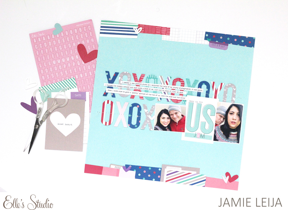
I loved the design of Jamie’s layout so much, with the patterned papers and tags layered at angles along the top and bottom of the page, and with the photos and repeating XOXOs in the middle. For my own take on Jamie’s cool design, I decided to run multiple little photos across the top and bottom of the layout.
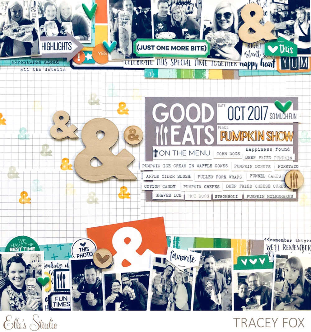
Supplies | February 2018 Kit, February Blank Label Stickers, Ampersand Wood Veneers, Wood Veneer Icons, Shapes & Dots Puffy Stickers, Icon Stamp, Stanley Jr. Alphabet Stamp—Outline, Stanley Jr. Alphabet Stamp—Solid, Dated Stamp, All the Details Stamp, Foodie Stamp, Live Laugh Love 6″ x 6″ Paper Stack, Family Fun 12″ x 12″ Paper Collection
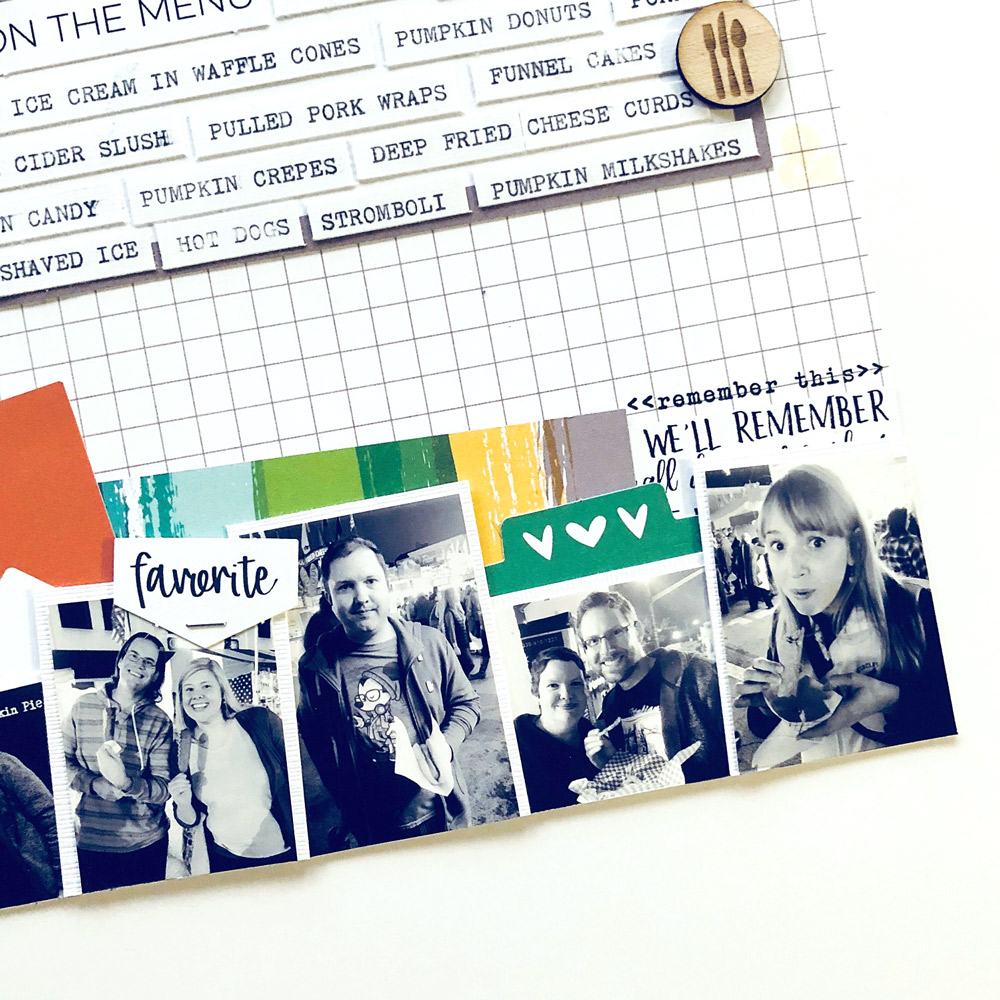
The photos I used on this page are a mix of daytime and nighttime photos taken at the same pumpkin festival. To make them match each other and to ensure they would match whatever colors I wanted to use from the February kit, I printed them all in black and white. I then pulled in pops of color and patterns from the February Kit, February Blank Label Stickers, and the Live Laugh Love 6″ x 6″ Paper Stack.
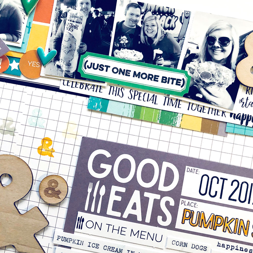
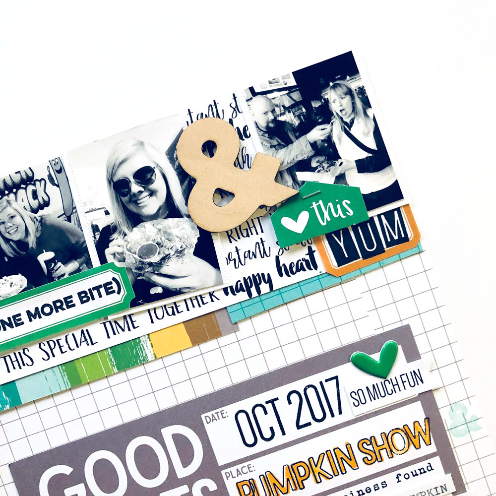
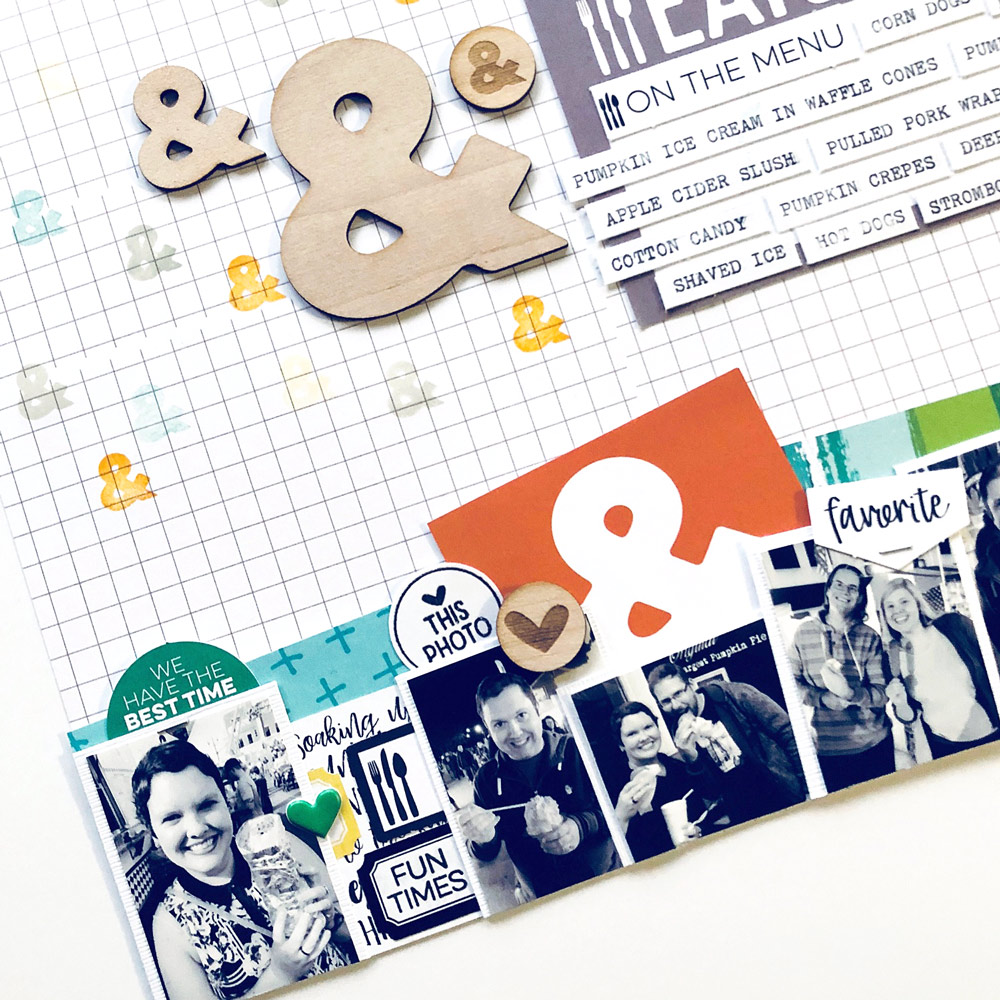
I added some extra dimension and embellishment to the bands of photos with the Wood Veneer Icons, Shapes & Dots Puffy Stickers, and the Ampersand Wood Veneers.
For the open space in the middle of the page, I used the awesome “Good Eats” 4” x 6” tag from the February Kit in the place where had Jamie placed photos on her layout. This tag was so perfect to fill up with the Dated Stamp, Stanley Jr. Alphabet Stamps, and a list of all the food my friends and I ate at this event.
To fill the space where Jamie used XOXOs, I used the Ampersand Wood Veneers, the Wood Veneer Icons, and the Icon Stamp to create a fun smattering of ampersands.
I just love that February’s kit and extras are chock full of ampersands, because they can so easily symbolize abundance on a scrapbook page. On this particular page, they were the perfect way for me to illustrate that the list of things we ate went on & on (& on & on & on)! How do you like to use ampersands in your own memory-keeping?
Thanks so much for stopping by today and checking out this edition of “Inspired By!”

If you create something inspired by the projects you see here on the Elle’s Studio blog, or anything with Elle’s Studio products, be sure to use the hashtag #ellesstudio when you post on social media, so we can take a look! You could win a gift certificate to the shop, and be featured here on the blog!
“Inspired By” with Tracey Fox
