Hi there, Elle’s Studio friends! It’s Shannon Dombkowski here to talk with you about symmetry. Maybe it’s just me and my perfectionist tendencies, but I kind of have a thing for symmetry. I find it just as satisfying as color coordination and putting items in rainbow order. Let’s get into how I used symmetry to make this 12 x 12 inch page.
Supplies | October 2021 Kit, October Labels, Moss Green Cardstock Label Stickers, Jane Tile Alphabet Cardstock Stickers – Moss Green, Moss Green Puffy Alphabet Stickers, Autumn Heart and Star Acetate Stickers, Thankful Paper Stack, Autumn Tab Stamp
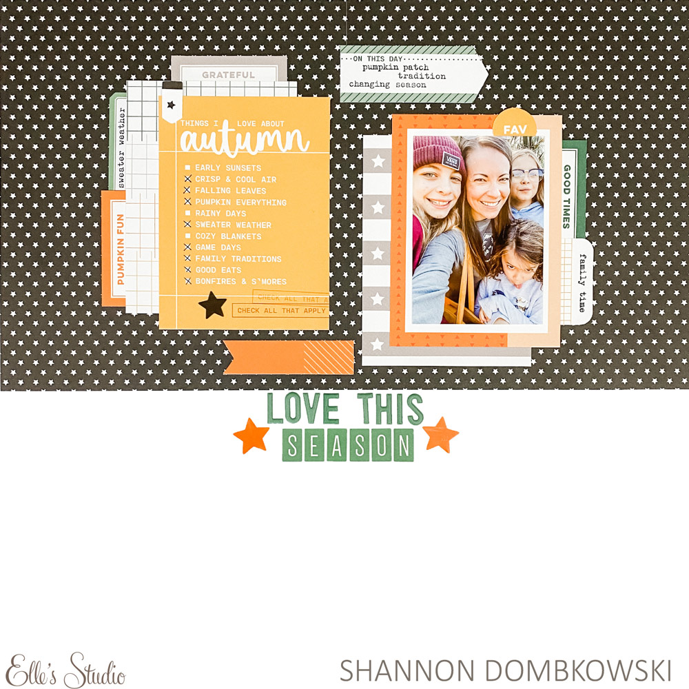
A quick glance will tell you that this page isn’t quite symmetrical, so let’s call it imperfectly symmetrical. The idea of splitting my layout down the middle and making both sides match came when I was adding the black star paper to my background. Elle’s Studio papers, and the Thankful Paper Stack that I used here are 6 x 8.5 inches, which means they aren’t long or wide enough to span a 12 x 12 inch page, but you can line them up in the middle and the seam is barely noticeable!
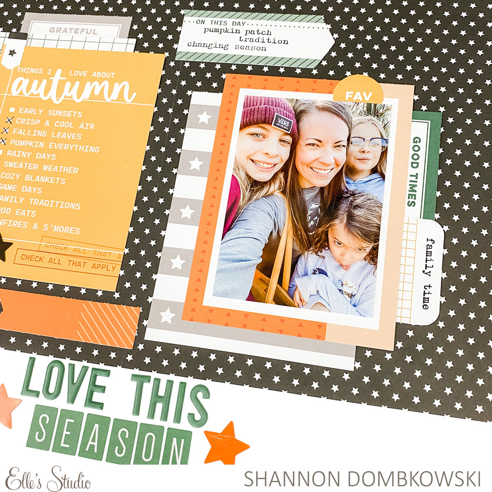
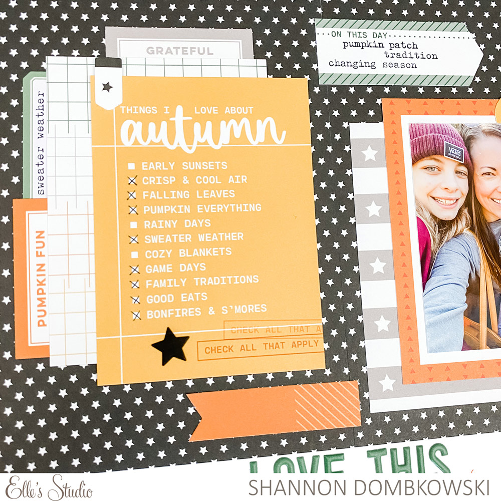
I am all for stretching my products, so I challenged myself to use 3 x 4 inch tags from the October Kit on my 12 x 12 inch layout. In the spirit of symmetry, I chose two tags for each side and layered them the same way. The top tag on the right side is a great frame for my photo while the top tag on the left side serves as my journaling. I lined the outer side of each of the bottom tags with a variety of labels, which adds to the symmetrical look and pulls my color palette through the layout.
Now, where this symmetry becomes imperfect is what brings interest to this page. To start, I added the die cuts on either side just slightly overlapping the center. I also added a couple of die cuts and labels to the top of my 3 x 4 inch tag clusters that don’t exactly match on both sides. Finally, I staggered where I put the different items on each side of my page. I feel like it still gets the point of symmetry across with a fun little twist.
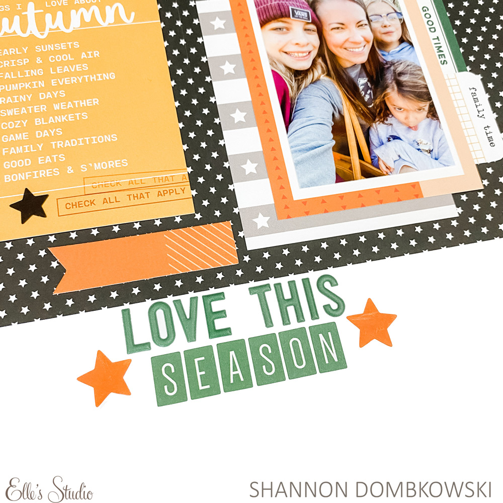
Finally, I had to decide where to put my title. My initial inclination was to align it on the right-hand side of the layout just below the black patterned paper. That would have thrown everything off! Thanks to a t-square, I was able to make sure that my title is centered on my page to keep my symmetry theme consistent.
Allowing myself a little bit of creative freedom with my idea of symmetry (how many times can I write that word in one post?!) made this page really fun to put together. I hope I have given you some ideas about how to try this for yourself!