Hi Elle’s Studio, friends! It’s Amanda here, and today I am sharing some of my top tips to stretch your August 2021 kit and add-ons! I only had one of the 3 x 4 inch journaling tags left from my August 2021 Kit, but that didn’t stop me from creating a full 12 x 12 inch page! Here’s what I crafted!
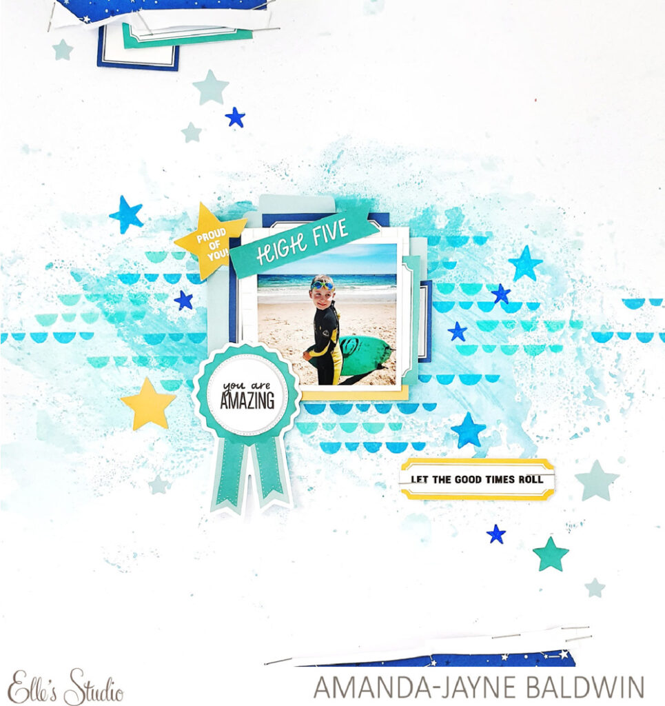
Supplies | August 2021 Kit, August Labels, Proud Of You Die Cuts, Light Teal Cardstock Basic Shape Stickers, Lizzy Alphabet Stamp
Wow! Such an amazing layout & you’d never guess that I was short on supplies! Here are my top tips on using your scraps!
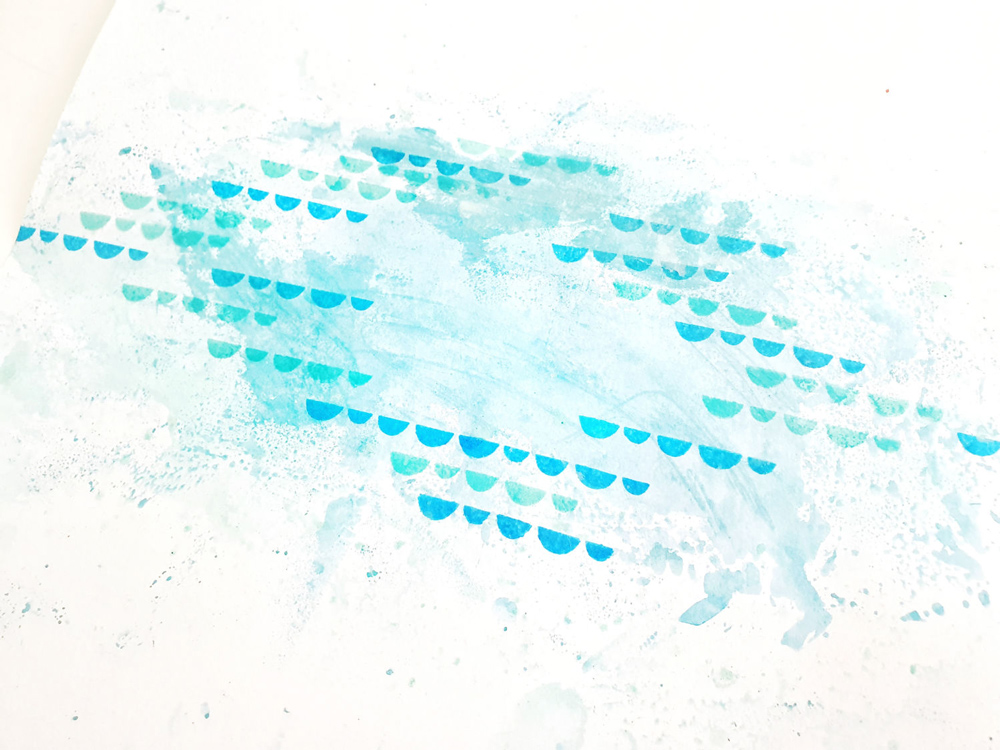
- Add a mixed media base! A splash of paint, and some cleverly repeated stamping will create the illusion of ‘more’. I used the packaging technique to apply my blue watercolor paints, and then repeat stamped the scallop icon from the amazing Lizzy Alphabet Stamp.
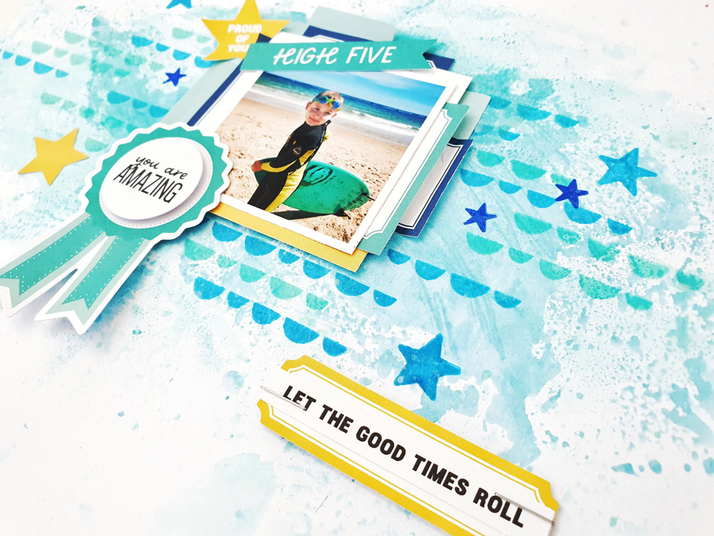
- Labels are everything! The humble label is such a useful and versatile embellishment. I cut a few of the August Labels and August Kit labels in half and tucked them under my photograph. Even though I only had the one journaling tag to mount my photo onto, I now had the appearance of a layered cluster. I also used labels to embellish my journaling (let the good times roll!) and enhance the torn edges at the top of my page. Simple, but so effective!
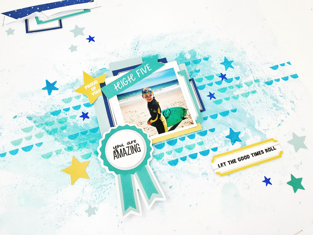
- Die cuts add interest and dimension! Adding die cuts can really bring attention to certain page elements. I used the Proud of You Die Cuts to adorn my photo and make it the focal point. The die cuts also act as page builder, and create the illusion of a much fuller design, despite the lack of supplies.
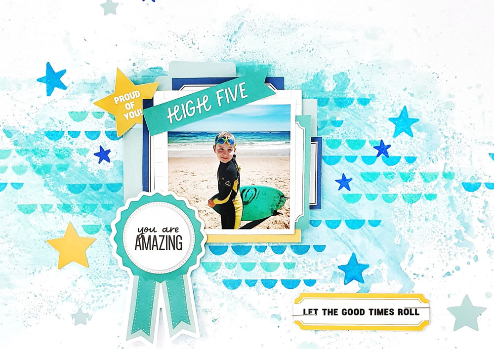
- Use your stamps! Not only did I use the Lizzy Alphabet Stamp for my mixed media base, I also repeat-stamped the stars from this stamp set to fill in the gaps. Using different colored inks or similar stamps in different sizes will also create the illusion of more embellishments on the page.
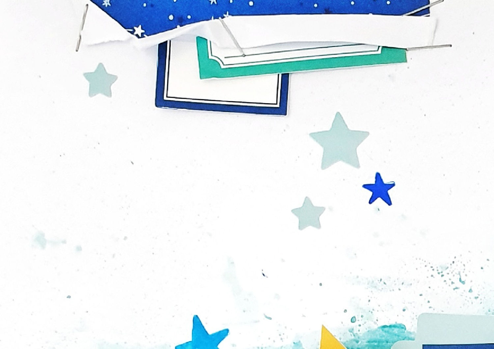
- Reveal ‘snippets’ of pattern paper to give the impression that there’s more hiding! I tore the edges of my white cardstock base and stapled my left over paper scraps to the back of these tears.
- Make stickers do the hard work! The Light Teal Cardstock Basic Shape Stickers were perfect for tucking into my photo cluster. I also sprinkled some of the light teal stars around my page.
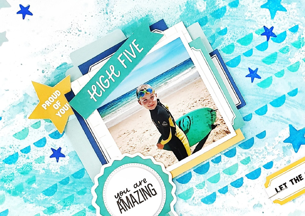
- Repetition is key! I opted for a simple color palette which I repeated to use in my embellishment selection. The over use of the same colors enhanced the design and gave it a more plentiful appearance. I also repeated the star shape throughout my layout. Again, the repetition of similar items really enforced the abundant look of the page.
And there you have it—my top tips for stretching your supplies while we wait for our newest kit to arrive! I hope I have given you a few ideas to try! Thanks so much for visiting today!

Show us how you’re stretching your August 2021 kit and add-ons! Post a project in our Elle’s Studio Facebook Group, or on Instagram using the hashtag #EllesStudio! We can’t wait to see how you use Amanda’s awesome tips!
