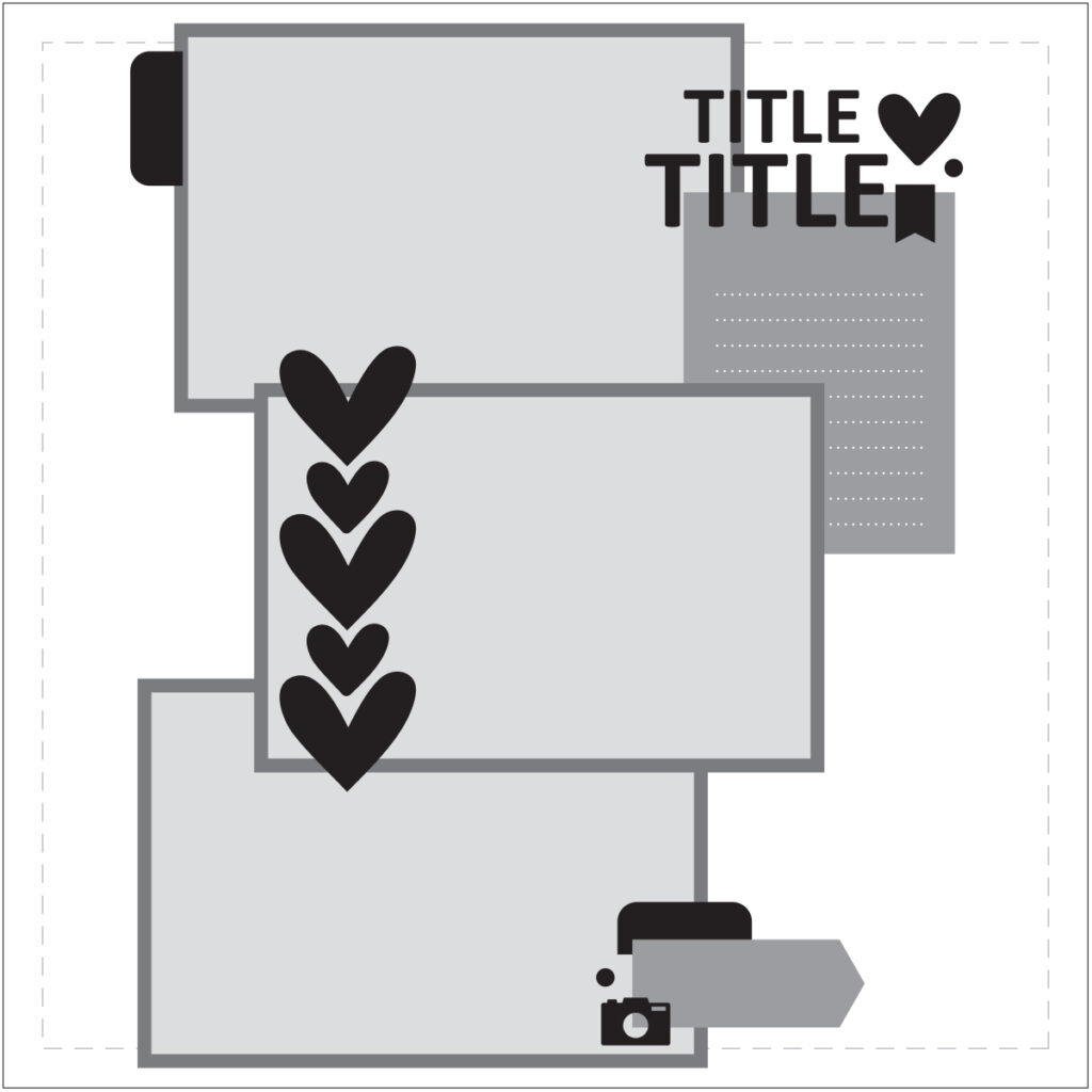
It’s Suzanna here with you on sketch day! Sketches are a great way to provide a jumping off spot and get your creative juices flowing, especially if you’ve just been away for 10 days doing all kinds of outdoorsy things and have no idea where to begin! This sketch was the perfect re-entry into memory keeping for me after not using design principles or creative thinking for quite some time!
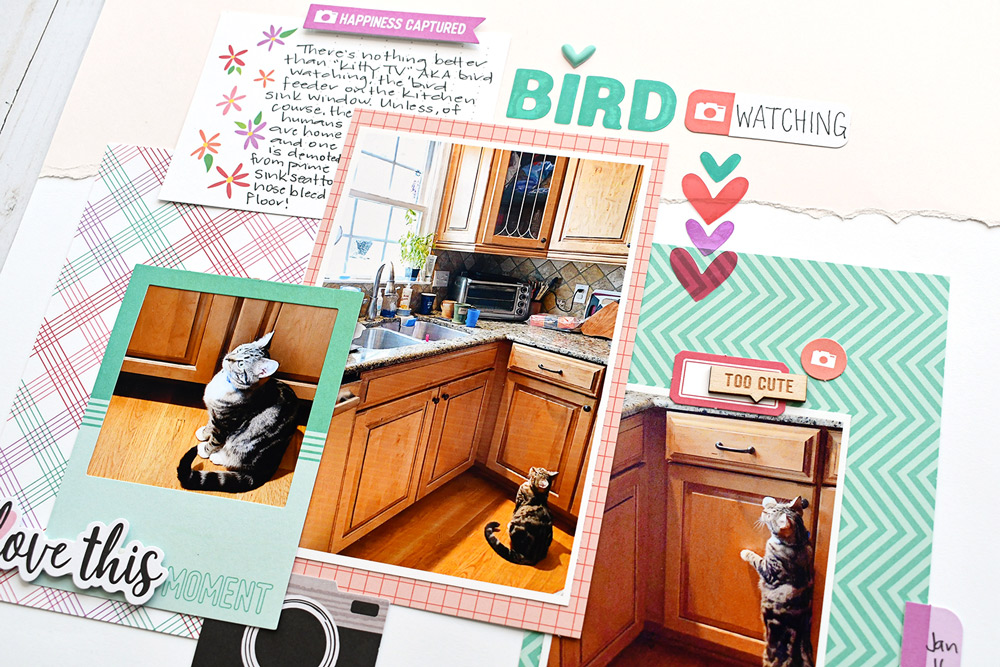
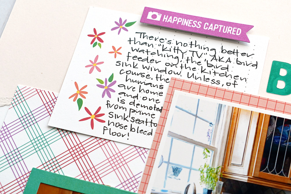
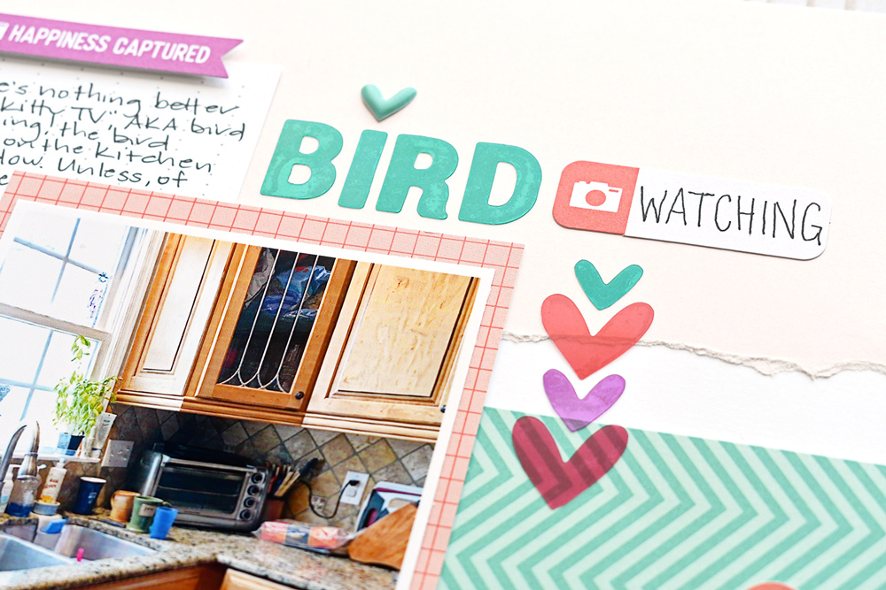
I made quite a few changes to accommodate the pictures that I wanted to use. The pictures themselves aren’t the greatest but together, they tell the story. The story of a naughty cat who loves to sit in the kitchen sink and watch what we call “kitty TV”, AKA the window bird feeder.
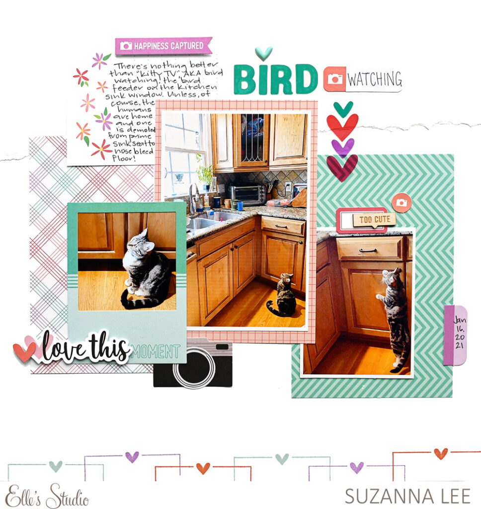
Supplies | April 2021 Kit, Smile Cardstock Die Cuts, Teal Parker Acetate Alphabet Stickers, Acetate Heart Stickers, Smile Wood Veneers, Celebrate 6 x 8.5 inch Paper Stack, Love This Smile Stamp
Rotating the sketch: I really wanted to use these three photos, all of which are vertically orientated and needed to remain as such for the full picture to be told by the photo itself. Rotating the sketch is an easy way to change up the look of a layout.
Adding a “header” and “footer; I don’t like chaotic layouts but I do like substance to them. I felt that while I have the busy-ness of the patterned papers, they needed grounding. Having a solid cardstock header and a stamped border footer, using a stamp from the Love This Smile Stamp, I was able to unite the layout and tie it together.
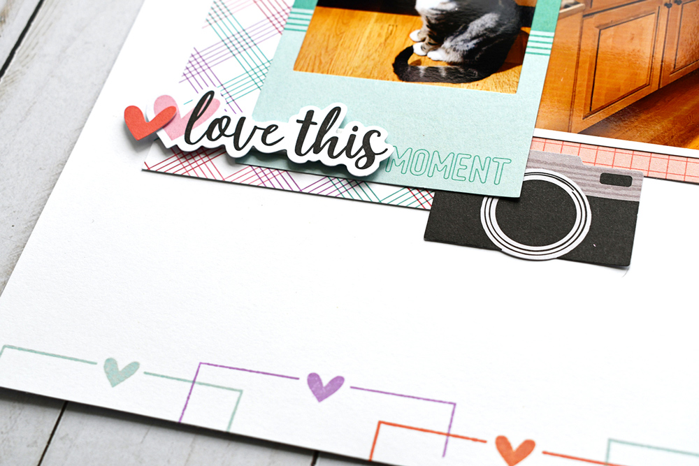
Re-arranging elements: Embellishment clusters, the repeated hearts and the title all needed to be relocated. The elements are all still present on the layout, just in different locations than the sketch calls for. Often times, embellishments are for visual interest or to guide your eye around the page. Or determined by parts of the photo/layout that you can cover or overlap or not. The row of Acetate Heart Stickers (aren’t those the best?) would have covered up Jasmine in the center photo, a critical part of the story. There wasn’t room for the title the way I had rotated the sketch, but there was empty space to the right.
Re-sizing photo: I kept the center photo 4″ x 6″, as it is in the sketch. Each of the neighboring blocks is also 4″ x 6″, but to keep the proportion of the cat relative to the rest of the layout, smaller photos served the storytelling and perspective better. This allowed me to frame one of the smaller photos with a Polaroid frame from the Smile Cardstock Die Cuts.
Do you have plans for this sketch? Does it speak to you? Some sketches will and others won’t, and that’s okay. If you play along, be sure to use the hashtag #EllesStudio on Instagram or share in our Elle’s Studio Facebook Group so we can leave you some love! Thanks for stopping in today!