Happy July, friends! It’s summer here in Toronto, which means sunshine and warmer weather are here to stay for a few months. Using the hot temperatures as inspiration, I made a pocket page using journaling tags with warmer tones from the July 2020 Kit. The results are lots of pops of colour around my page! Have a look:
Supplies | July 2020 Kit, Summer Stickers, Yellow Puffy Alphabet Stickers, Puffy Star Stickers
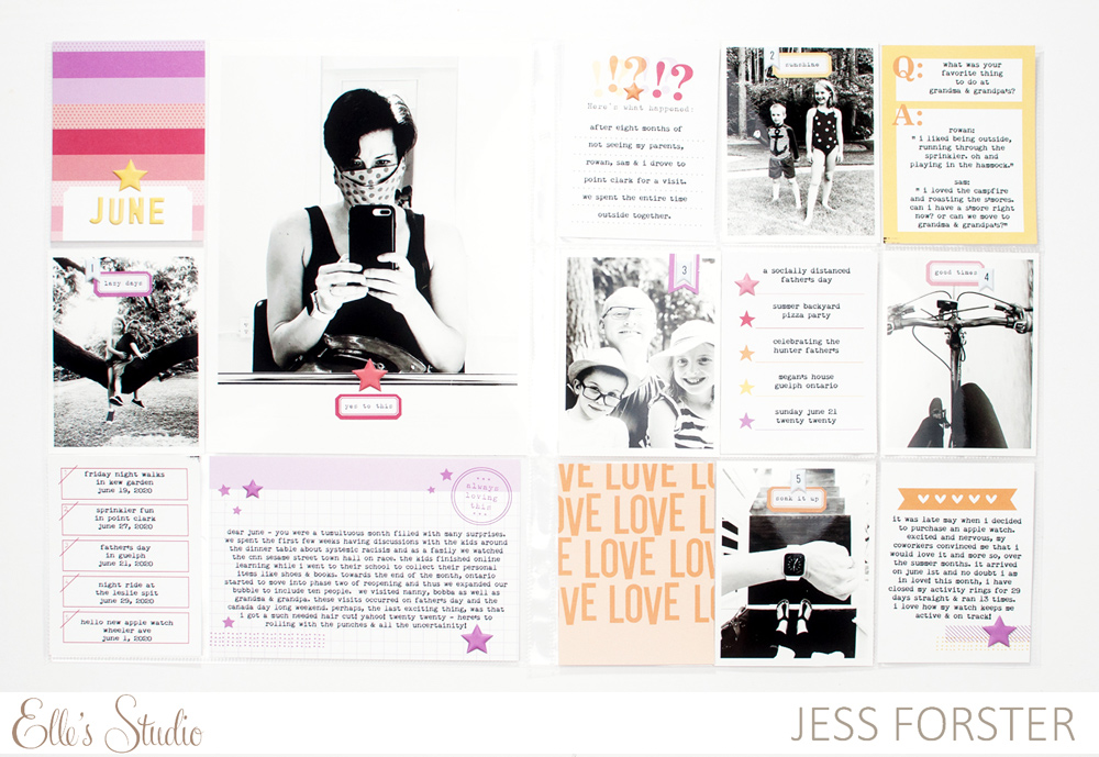
In this 9″ x 12″ double pocket page layout, I recorded my family stories from June 2020. This year, I am documenting my everyday life in a monthly format and using the monthly kit is a nice reminder to get the details of my life documented.
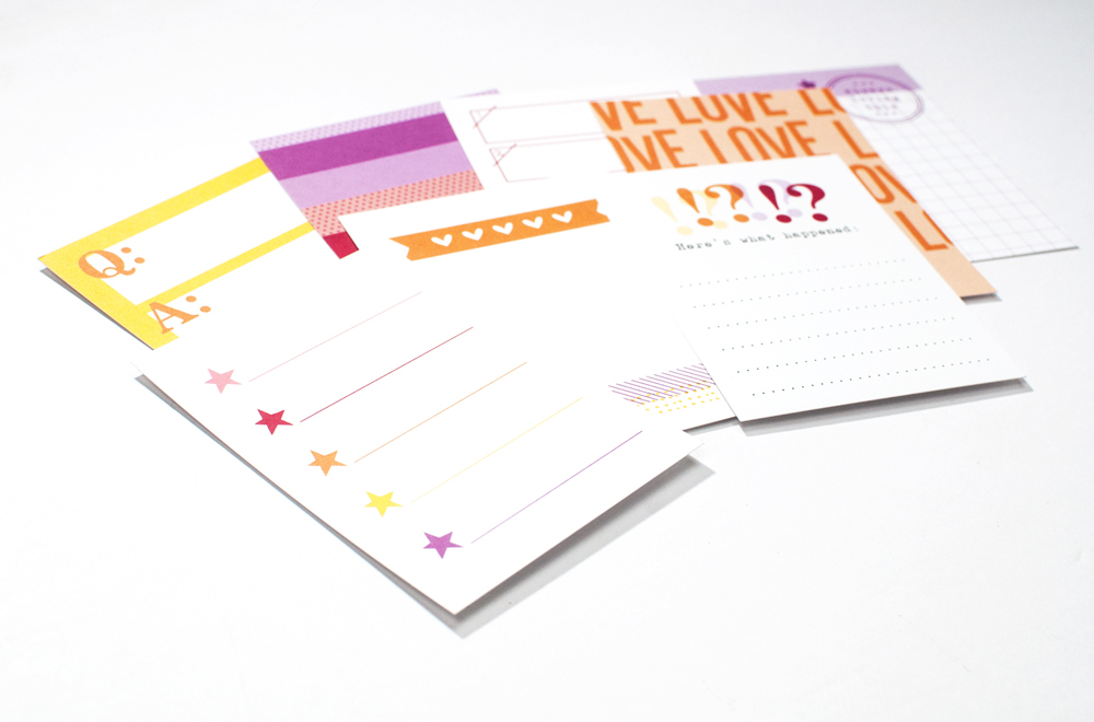
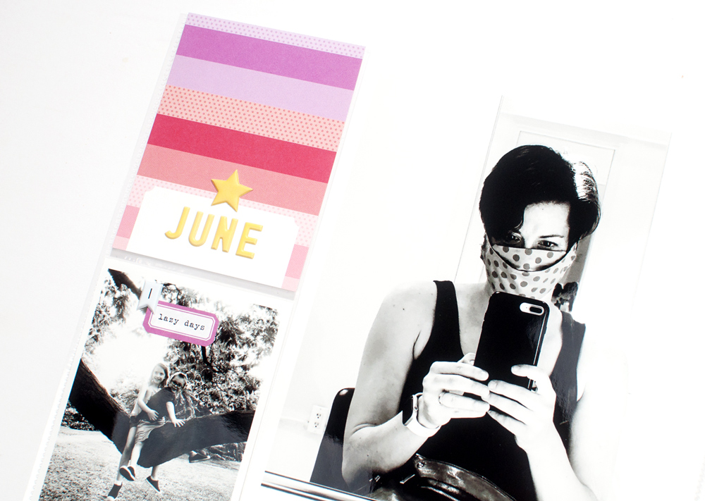
I really loved the warmer hues found on the the 3″ x 4″ inch star tag and used that as inspiration for selecting the other tags. As you can see, all of the tags that I included in my pockets had red, orange, yellow or purple on them. One of my favourite go-to design decisions is to incorporate cards using similar colours.
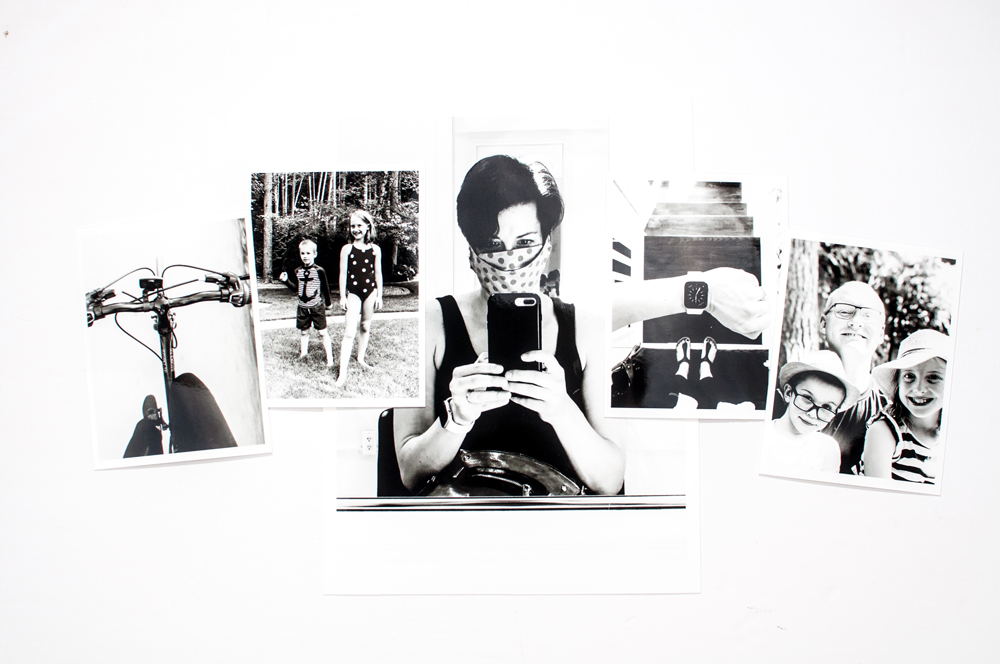
In order to make the products pop off the page, I converted all my photos to black and white. This is a simple technique that creates a timeless look. By having all your photos in a uniform neutral colour, the eye is then drawn to the colour on the page. After printing my photos, I embellished them with the Yellow Puffy Alphabet Stickers, Puffy Star Stickers and Summer Stickers. Super simple but effective, this pocket page is complete!

Next time you receive your monthly kit, challenge yourself to use warmer hues on the colour wheel in your pockets. Get inspired to document your summer stories and try to make your pocket pages pop! Happy summer, and thanks for looking!

Show us what color combinations you are using in your projects! Share on Instagram using the hashtag #EllesStudio, or share with fellow ES fans in our Elle’s Studio Facebook Group!
Pingback: Setting Up 2021 For Success with Jess Forster | Elle's Studio Blog