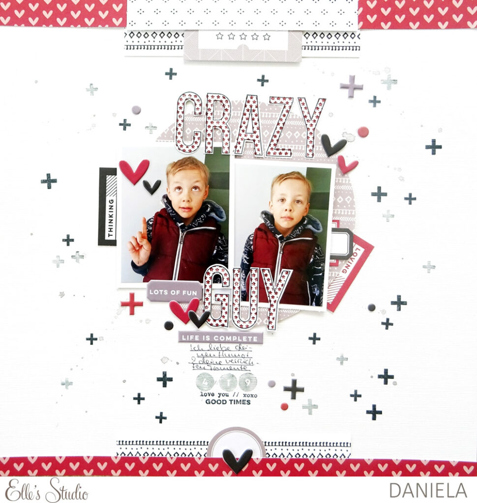
Hi everyone! It’s Daniela here with a brand-new layout. I guess you all know situations with your kids, family or friends that always make you laugh. Maybe it’s a certain habit, a saying that’s typical for somebody or a simple gesture. With people we know so well, it often doesn’t take much to create these funny situations. I could name so many habits of my kids right away that make me smile each and every time. And I have to admit I love their tomfoolery and that’s exactly what my layout is about.
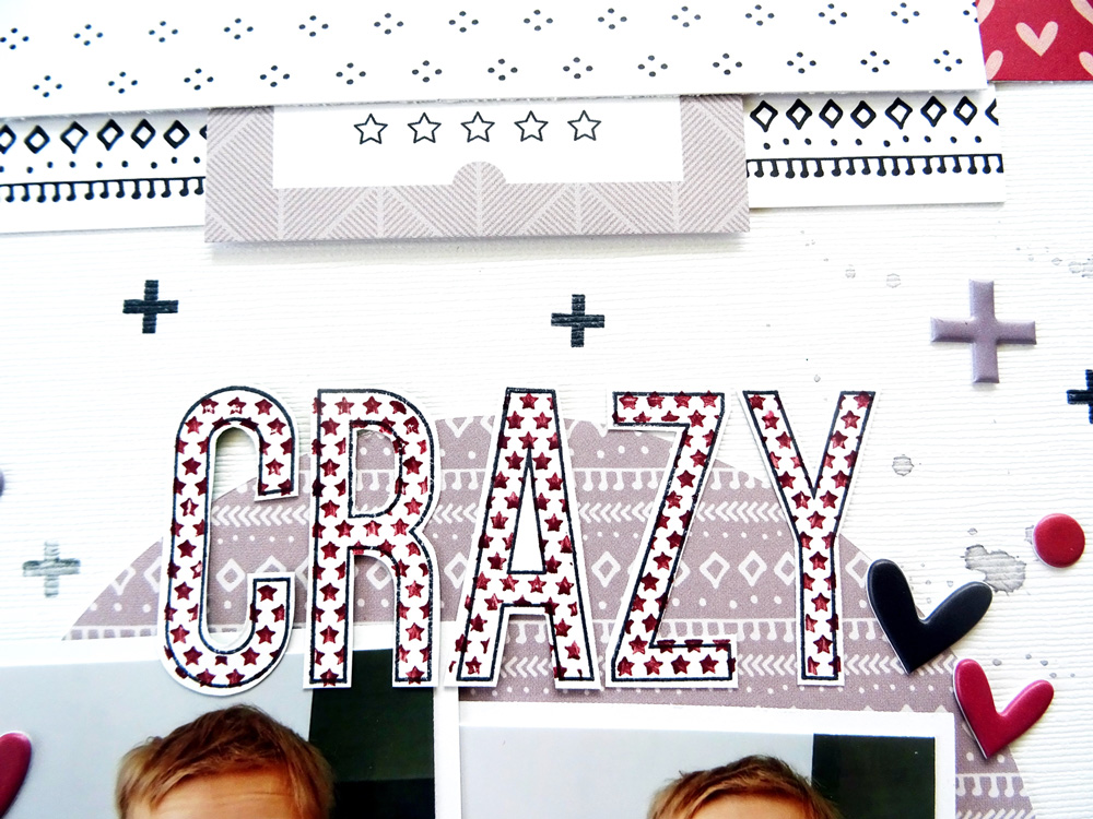
To highlight my son’s craziness, I wanted to use a big title, so I went through my Large Jane Alphabet stamps and spend some time on deciding which set to use because they are all so awesome in so many ways. I decided to work with the Stars to fill the Outline. So here it goes, this is my layout about my crazy little boy:
Supplies | September 2019 Kit, September Labels, Die Cut Labels – Jewel Tones, Puffy Autumn Heart Stickers, Happy Moments Puffy Stickers, Home Sweet Home 6 x 6Paper Stack, Large Jane Alphabet Stamp – Stars, Large Alphabet Stamp – Outline, Good Times Stamp
The cool thing about using stamps to create a title is that you are so flexible—you can create a title in any color you want. I really wanted to use wine red to have a title matching his vest—the only strong color in the pictures. I never had any alphabet stickers in this color, so I used wine red ink to fill the black outline of the stamped alphas. I was so happy to find perfect pieces in the same hue in my September kit and add-ons. The heart patterned paper from the Home Sweet Home Paper Stack and the Puffy Autumn Heart Stickers come in such a pretty wine-red.
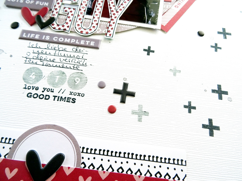
Since I only used one main color on my layout, I wanted to have some interesting tiny little eye-catchers here and there. I’m still crazy about the Good Times Stamp so I stamped the plus sign all over the page in black ink. The stamps build a nice contrast on the white background and add a special messy touch.
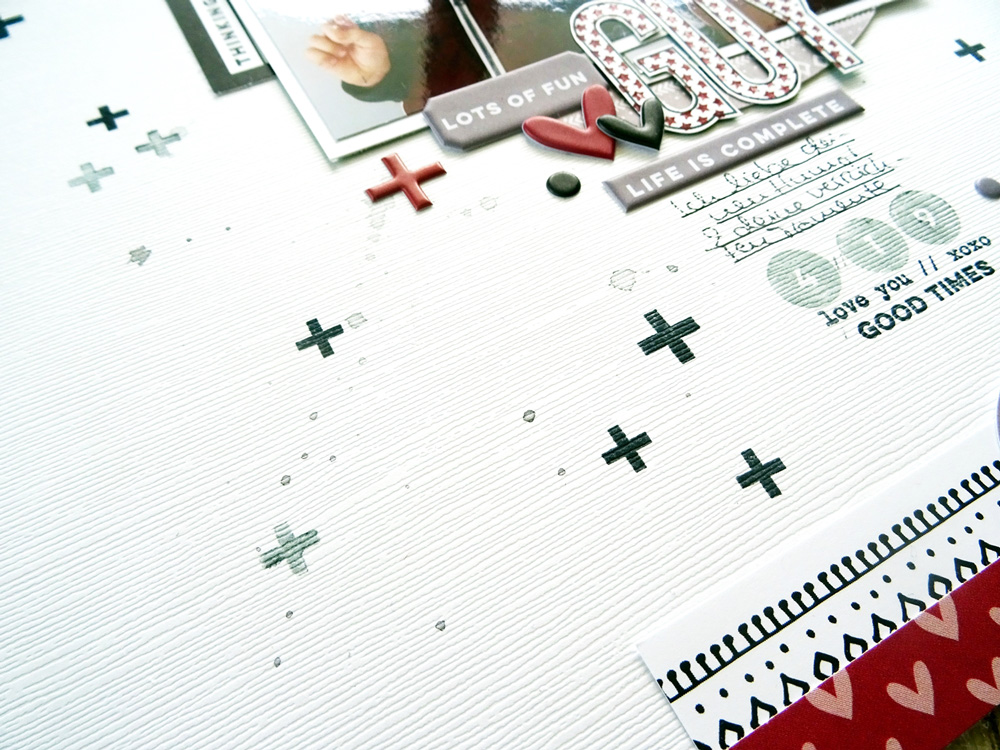
Sometimes it doesn’t take much color to create a fun page. Clusters in wine red, black and white and grey are the main elements on my page. This color range is quite unusual for me, but I really like the way the layout turned out. I often tend to use black and white picture if I feel that the colors in the picture might be challenging. But I also want to document common outfits, toys and so on in their vibrant colors, so why not use a very simple color scheme on a layout instead of washing color out of the pictures.
Thanks so much for stopping by again. If you feel inspired, don’t forget to share your work using the hashtag #ellesstudio on Instagram!
Have a great day!