Digital cut files are always great to have on hand—they’re the perfect way to add a word or die-cut shape in just the color or pattern you need for a project. Today, design team member Daniela is showing us a show-stopping new layout that she created using our November 2018 Digital Cut File that we know you will love! Let’s take a look:
Hi crafty friends, it’s Daniela again and I’m thrilled to be sharing another layout today focusing on the November 2018 Digital Cut File. I’m a huge fan of Elle’s cut files and I use them every month. Using cut files offers so many possibilities and the files Elle’s Studio offers are always a great addition to the kit and other products.
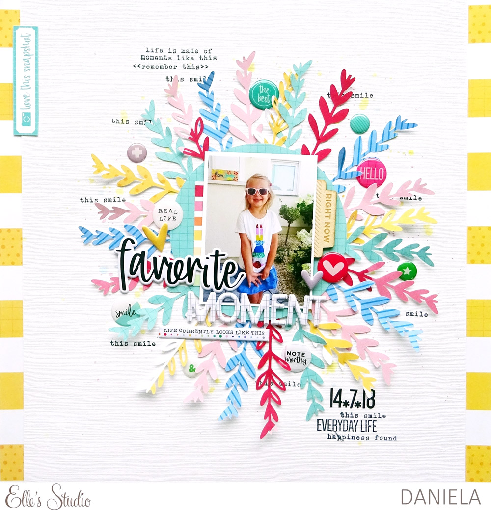
I decided to cut lots of leafy branches from different 6″ x 6″ papers from the Noteworthy collection and arranged them under a paper circle to create a big display for my picture.
This is how my layout turned out:

Supplies | November 2018 Digital Cut File, Jane Alphabet Stickers – Black, Puffy Heart Stickers – Spring Mix, Noteworthy Puffy Stickers, Noteworthy Epoxy Stickers, Noteworthy Wood Veneers, Noteworthy 6 x 6 Paper Stack, Noteworthy 12 x 12 Paper Collection, All The Details Stamp
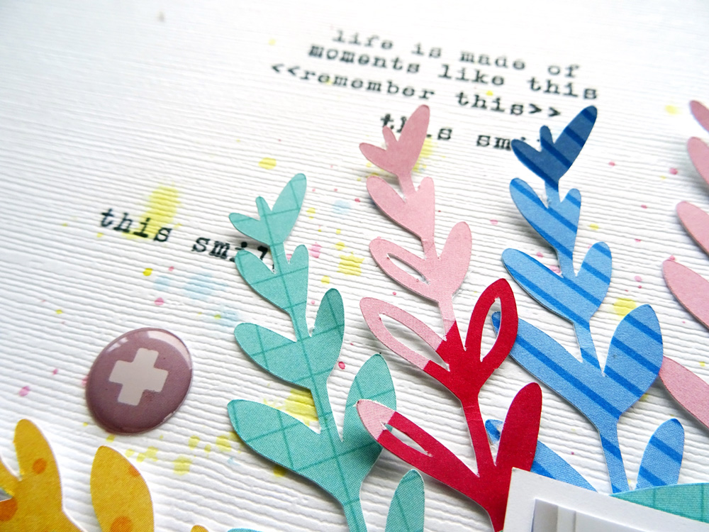
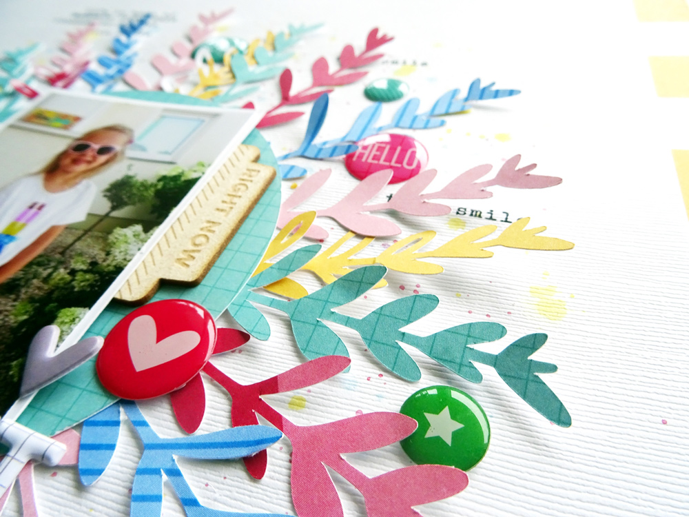
I made use of the cut file in two different ways. Sometimes I only cut the outer lines of the shape and sometimes I cut it with the blanks. This way, the arrangement of the branches becomes more interesting because there is more variety. Before placing everything on the cardstock, I applied some color splashes in yellow, pink and blue. I also added some of the Noteworthy Epoxy Stickers because I love the mix of different textures. The stamped phrases added in black ink from the All The Details Stamp add more details to the page and build a nice contrast to the bright colors.

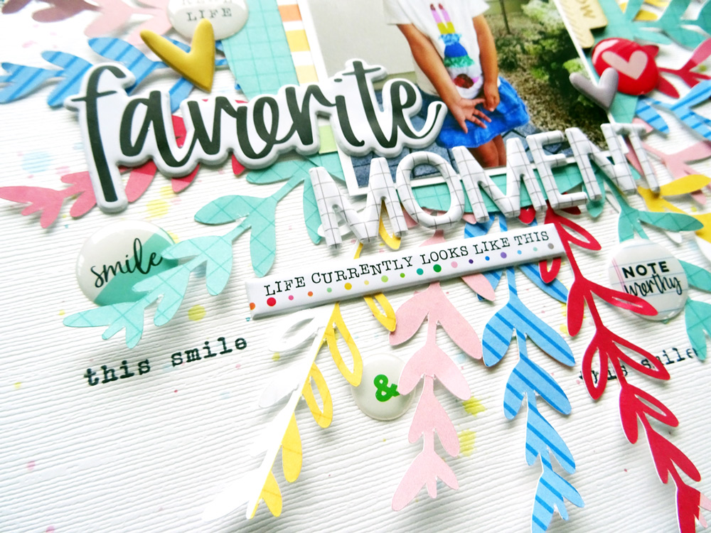
All the elements of the page are overlapping somehow. I love building clusters— that’s my favorite style of scrapping. The picture is joined to all the elements with the Noteworthy Puffy Stickers, which create the title of my page. The picture of my daughter is one of my favorites taken last summer. She is wearing her favorite shirt and glasses and is so happy about her outfit that she got out of the closet herself. If you take a closer look at the picture, you can see that all the colors I used for the branches occur in my girly’s shirt as well.

The branches are only adhered to the cardstock on one end, the one that is under the paper circle. This way, a kind of 3D effect is created because the other end doesn’t lie flat on the paper, but stands up a bit. The Noteworthy Wood Veneer tab even adds more dimension to the page as well as the Noteworthy Epoxy Stickers.

All in all, I really like how this layout turned out because it conveys the cheerful mood my daughter was in when the picture was taken. Hopefully, you feel inspired to use the November 2018 Digital Cut File yourself! I’d be happy to see what you create, so don’t forget to tag #EllesStudio on social media when sharing your work.
Thanks so much for stopping by and have a great day!

Digital Cut File Perfection with Daniela
