Our design team members create some fantastic projects, but sometimes even they look for inspiration from other sources! Today, Daniela is with us to share how she was inspired by another project that she found here on our blog. Let’s take a look:
Hi there! It’s Daniela again and I’m so excited to share another layout today. It’s my turn to do a layout inspired by a project created by another design team member, and I picked “Jump” by Daniela Dobson:
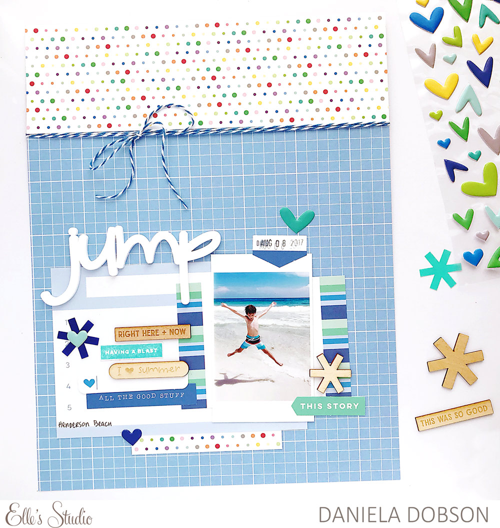
I love her layout, the combination of the patterned paper as a background divided with twine is such a great idea that I wanted to try this myself. I stuck to the overall design of Daniela’s layout, but since I usually do 12″ x 12″ pages, my version looks slightly different. Here is my layout:
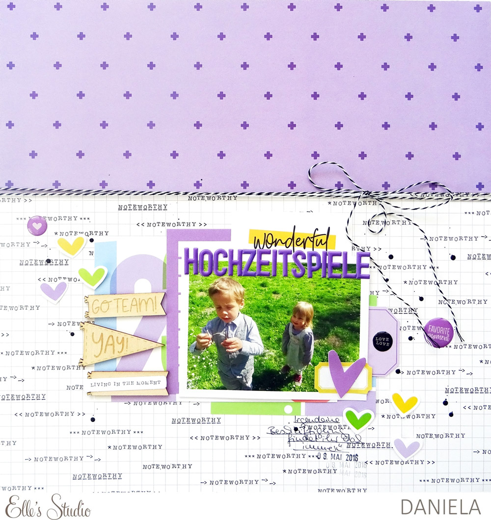
Supplies | August 2018 Kit, August Blank Label Stickers, Go Team Wood Veneer Flags, Purple Puffy Alphabet Stickers, Noteworthy Epoxy Stickers, Noteworthy 12″ x 12″ Paper Collection
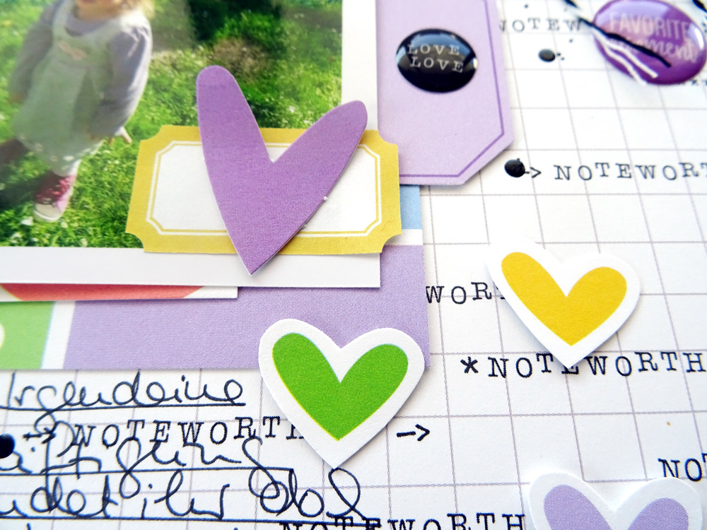
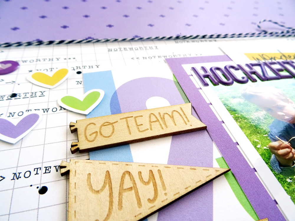
I added some embellishments around my picture. Hearts and Noteworthy Epoxy Stickers accompany this joyful memory of my kids playing on a meadow on our friends’ wedding. To add more hearts, I simply fussy-cut some from one of the tags in the August Kit. Of course, I also created some layers behind the picture by using various tags from the kit. Since purple should be the main color on this page, I used tags in different tones of purple here.
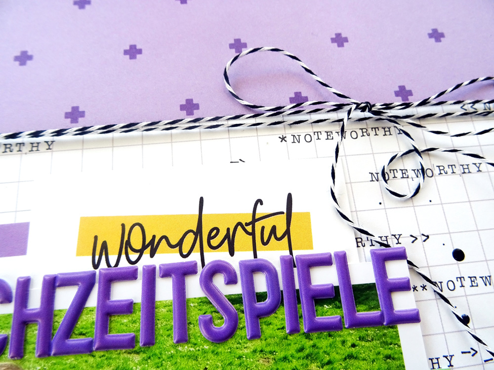
Right now, I’m really into the color combination of purple and yellow, so I used the purple plus sign pattern from the Noteworthy 12″ x 12″ Paper Collection and added yellow accents that really pop, like the “wonderful” tag from the August Kit. The Purple Puffy Alphabet Stickers have the same color as the plus signs in the patterned paper, so I used these to create my title, “Hochzeitsspiele,” which means “wedding games” in English. I also added some black and white twine because the background grid paper from the Noteworthy 12″ x 12″ Paper Collection is in black and white.
Different textures are always a good way to create unique projects, so I added some of the Go Team Wood Veneer Flags and placed them next to the picture. Some black ink splashes add even more detail to the page.
I hope you like my page! Maybe you got inspired as well and want to scrap-lift one of the layouts you can find on the blog. I’d be happy to see what you create!
Thanks for stopping by and have a great day!

“Inspired By” with Daniela
