We’ve shared quite a lot of Noteworthy inspiration here on the blog already, and most of it has been on scrapbook layouts. How about we explore how beautifully Noteworthy can be used on pocket page spreads? Pocket page creative extraordinaire Nathalie Leonelli is with us today to give us some tips and tricks on how to make your pockets work with what you’re documenting, and we know you will love the marriage of her amazing style and the Noteworthy collection! Let’s take a look:
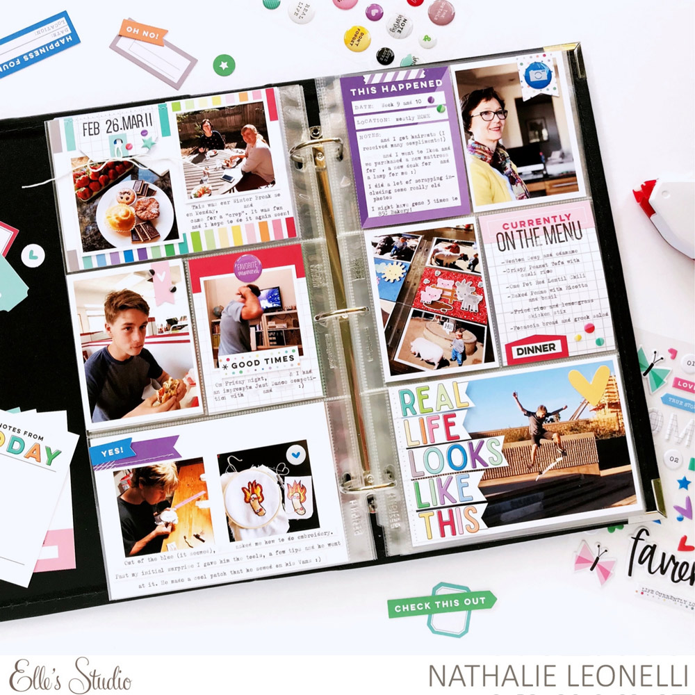
I couldn’t wait to dig into the new Noteworthy collection! I love its colors and the many coordinating elements! Since I was making a pocket page in my everyday album, I concentrated on the Noteworthy Journaling tags but I also played with so many bits and bobs! I love the bits and bobs!
Supplies | Everyday Goodness Stickers, Mini Dated Stamp, Foodie Stamp, Noteworthy Double-Sided Journaling Tags, Noteworthy Word Labels, Noteworthy Cutouts, Noteworthy Bits and Pieces, Noteworthy Puffy Stickers, Noteworthy Epoxy Stickers
Did you know that the Noteworthy Journaling Tags are double-sided? They have different patterns and colors on each side, giving you so many great options to build your page!
I first picked my two favorites in the pack, they were both 4″ x 6″ and they set the tone for my project. I used the striped one on the top left with my dates and the other one on the bottom right… I’ll talk more about that one below.
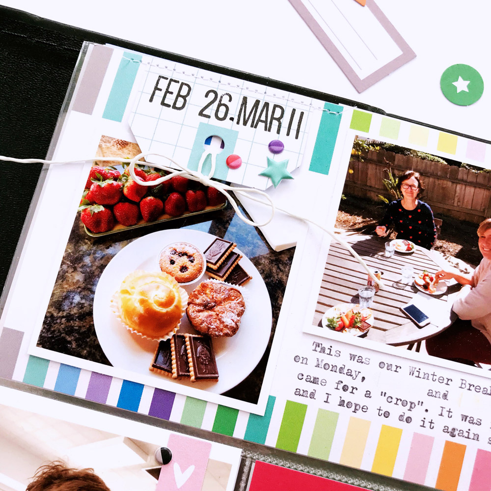
Because I had many photos I didn’t want to dedicate a whole tag to the dates this time, so I stamped them on a tag from the Noteworthy Bits and Pieces using the Mini Dated Stamp and just added the top part. I then embellished with some Noteworthy Puffy Stickers. I love the two-tone dots!
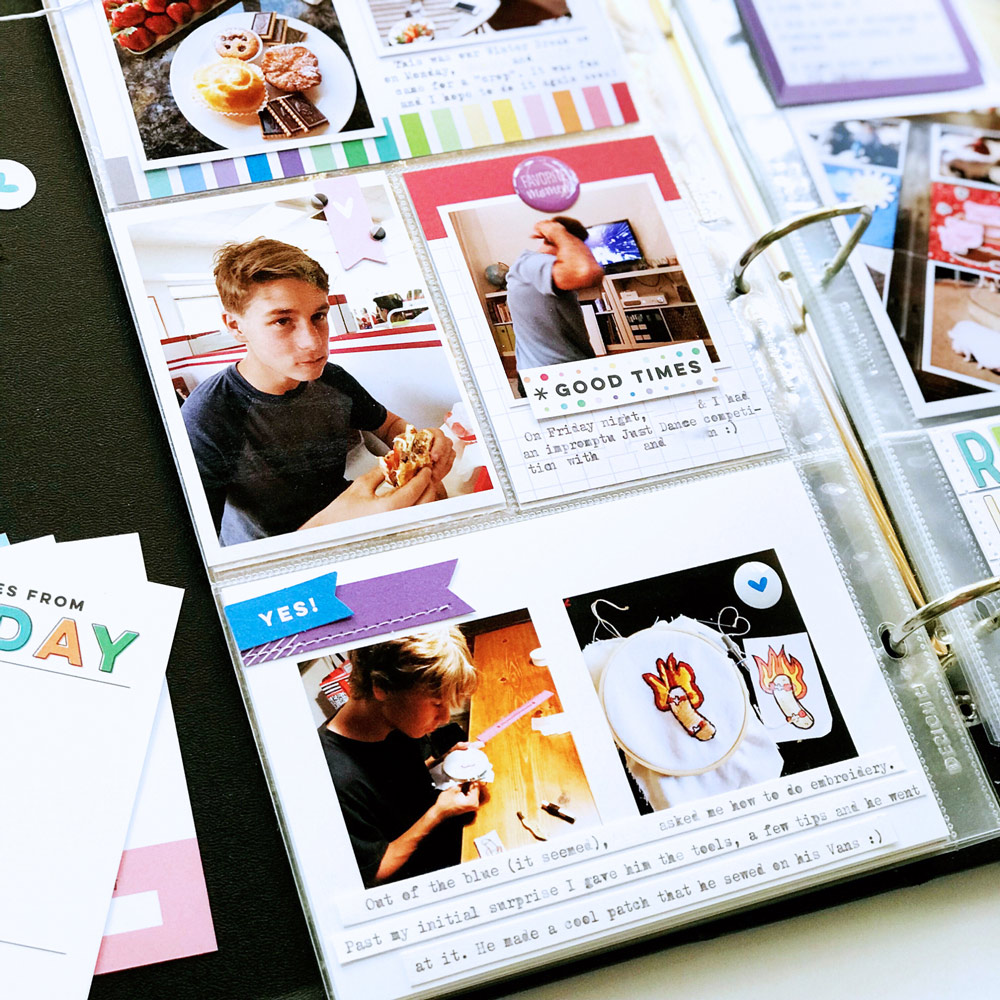
Since I like to mix my embellishments, I also used several of the Noteworthy Epoxy Stickers on tags, on flags and directly on the photo. They not only add a different texture to the spread, but they are also a great way to bring another touch of color. I am always so conscious of color balance on my pages!
I love the look of this spread but the “pièce de résistance” for me is that bottom right pocket! I really wanted to combine that particular “real life” 4″ x 6″ tag with the quote and that 4″ x 6″ photo. I didn’t want to cut the photo, so I had to cut the tag. I stopped short of fussy cutting each letter and chose to create flags with each word, lining them up with the left edge of the photo.
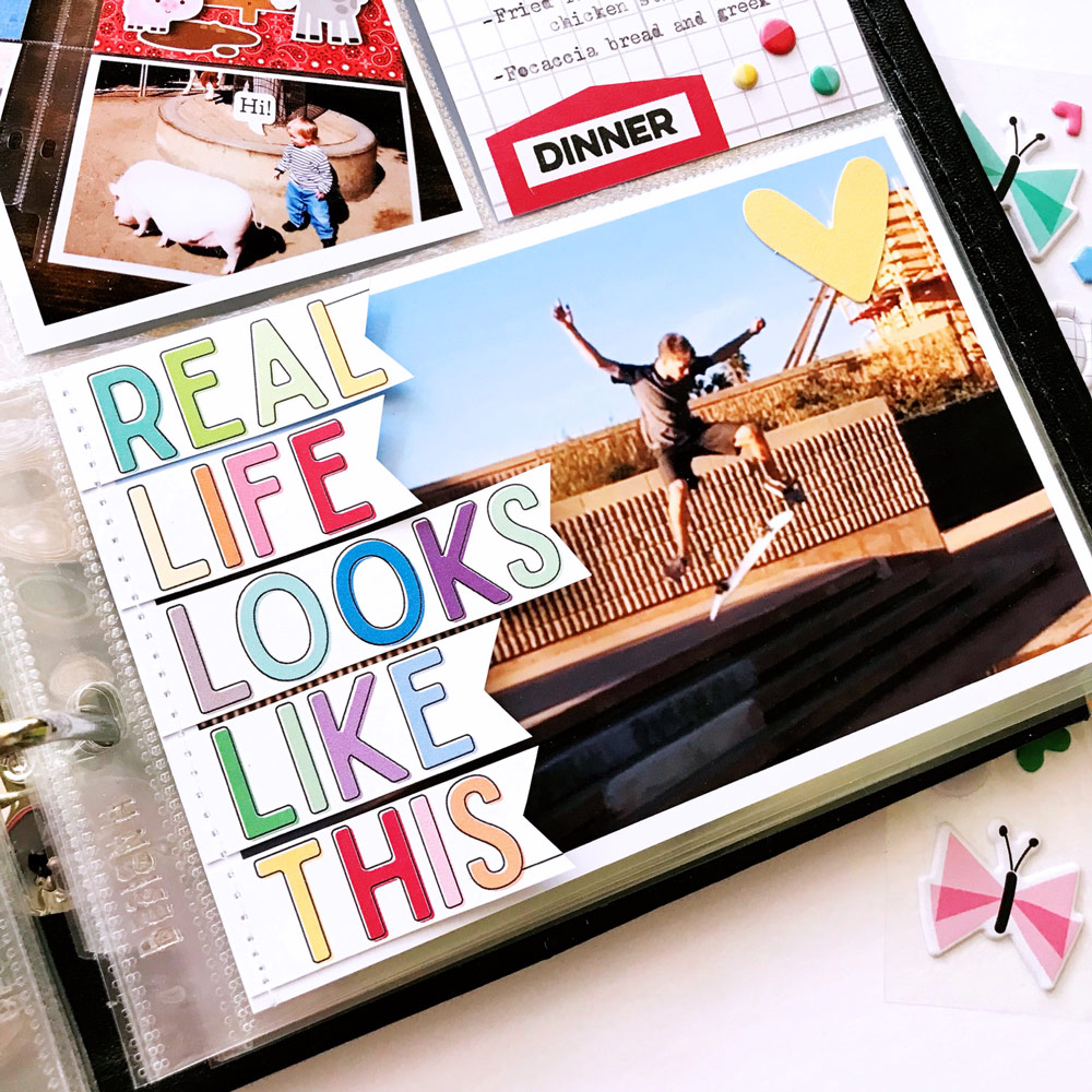
I love the way they lift at the end matching the lift of my boy’s jump in the photo.
To summarize, a few tips:
- You don’t have room for a title card? Just add your dates on the top part of a tag or label, still leaving you room for photos
- You don’t want to cut the photo? Cut the part of the tag you want to use and be creative with it!
- You don’t like a card right side up, use it upside down and put a label on top (I am cheating here as I never talked about it but can you guess which tag it is?)
I hope this pocket page inspires you to grab a set of Noteworthy Double-Sided Journaling Tags (they’re only $3.75!) and a few matching embellishments! They are very versatile and will brighten your project with a rainbow of colors.
See you next time and until then, happy scrapping!