We’re loving all of the inspiration shared by our design team and special guests using the Let’s Go Traveler’s Notebook Kit! Today, we have the talented Mandy Melville with us to share a few pages from her traveler’s notebook. She’s documenting a fun family cruise using our new kit, and we know you will love her clean and colorful designs, that are focused on balance and repetition. Let’s check out her notebook:
Hi everyone, I’m so excited to be here today sharing some traveler’s notebook inspiration with you using the new Let’s Go Traveler’s Notebook Kit!
Up until about two years ago when I was first introduced to traveler’s notebooks, I had always documented our memories in a 12″ x 12″ format. Now that I’ve discovered notebooks, I love using both formats! What I particularly love about traveler’s notebooks is that it’s quick and easy to create a layout. So, when I’ve only got a small amount of creative time, this is definitely my go-to format. I also love that I can take my notebooks with me when I’m away from home because they’re small, and I only need to pack limited supplies. I like to use my traveler’s notebooks to document everything from little everyday things, through to big things like vacations!
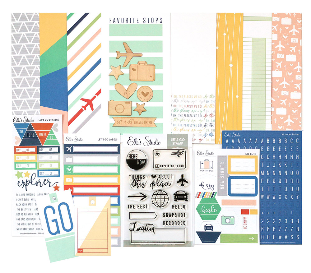
The Let’s Go Traveler’s Notebook Kit is great for documenting your vacation photos in your traveler’s notebook! I love the bright and fresh colours in the kit, and the fun travel themed embellishments! It was perfect for documenting some photos of a cruise that we went on in 2016!
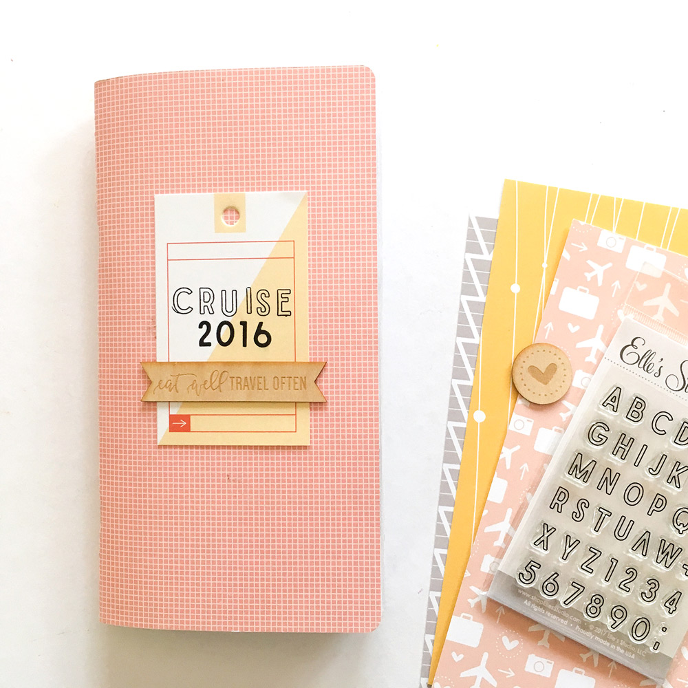
I like to add a little bit of embellishing to the cover of my inserts, but not so much that it gets difficult to handle as you’re working in it. So for the front of this insert, I stamped my title, using the Stanley Jr. Alphabet Stamp, in both the solid and outline, onto one of the die cut tags from the kit, and then adhered it to the cover. I also added one of the beautiful wood veneer pieces from the kit across the bottom of the tag. And that was it! Cute and simple!
For my first spread using the Let’s Go kit, I wanted to feature some of those gorgeous bright colours! I used two of my favourite papers from the kit–the lovely bright yellow one, and the one with the phrase ‘oh, the places we go!’ repeated across the bottom. When I’m creating a TN layout, I often like to cover one side of the spread with a more colourful or busier patterned paper, and I leave the other side just white (or I cover it with a more subtle or neutral pattern.)
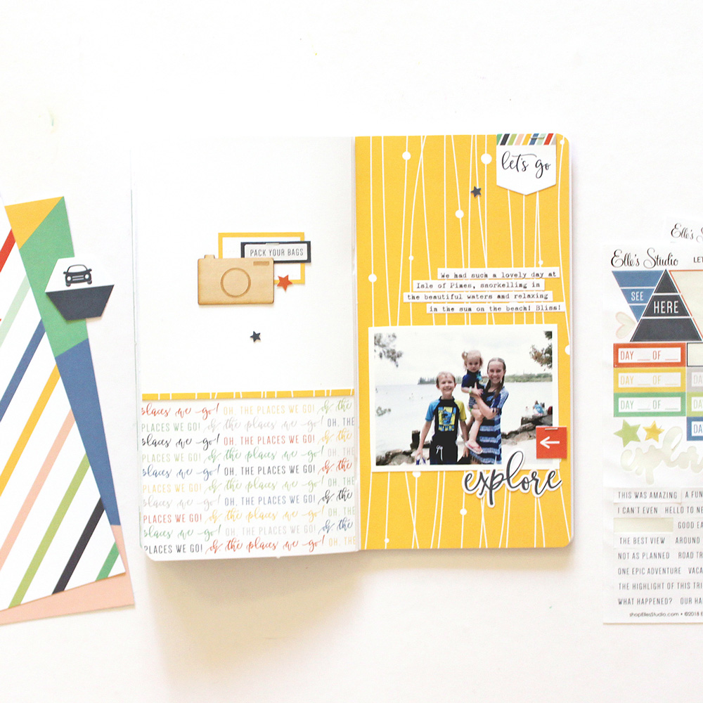
Doing this provides some colour and interest to the spread, without it being too overwhelming. So for this layout, I decided on covering the right hand side of the spread with the brighter yellow paper, and the left hand side with the more subtle pattern. The gorgeous bright colours in this kit were perfect for documenting a photo of my three kids, taken when we visited one of the South Pacific islands on our cruise.
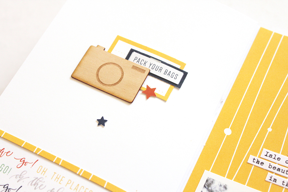
I added my photo to the right hand side of the spread, and then you’ll notice that I’ve created three points of interest, or embellishment clusters to the layout. The first is on the left hand page, where I’ve layered together a couple of labels and a wood veneer camera. I made sure that I included a little bit of each of the three main colours that I’m using on the spread in the cluster. If you try and have a good balance of the colours on both pages, it will help the layout to look cohesive. Next, I stapled the die cut piece that says ‘let’s go’ to the top right hand corner of the spread. The final point of interest is the title underneath the photo.
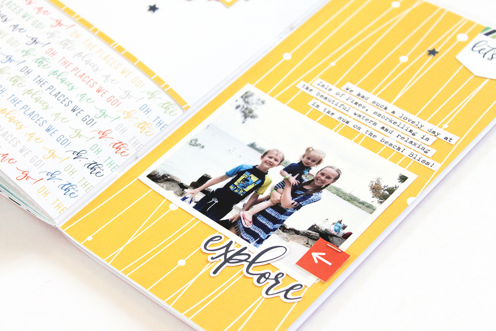
I used the “explorer” sticker from the kit for my title, but I cut the ‘r’ off the end of the word, so that it would say “explore” instead of “explorer,” as I felt this fit the photo better. Don’t be afraid to alter embellishments to make them work for you! Having those three points of interest creates a visual triangle on the layout, helping to draw the viewer’s eye around the page. I finished the spread off with some typed journaling strips and a few little punched stars.
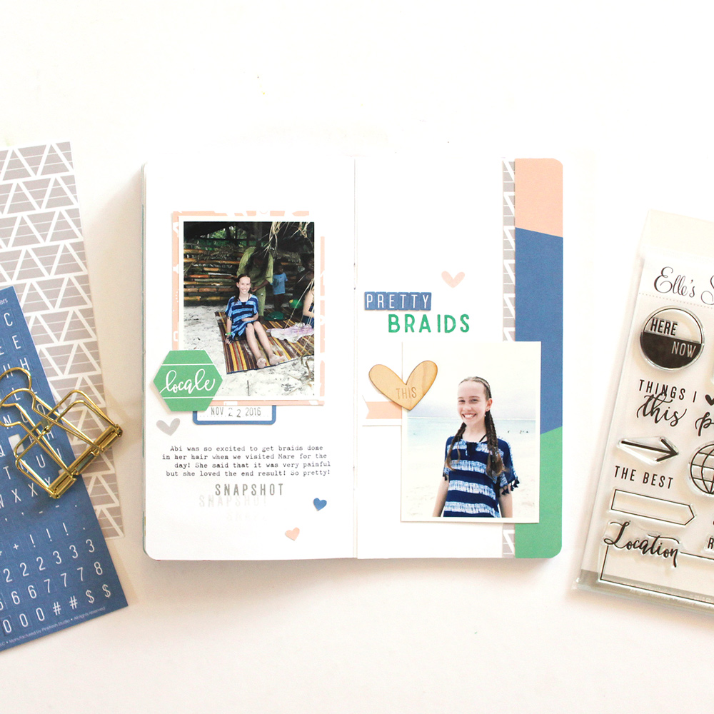
For my next spread, I knew that I wanted to use that beautiful blue in the kit, as it matched the colours in my photos perfectly, and I decided to also pull in the green, the light pink, and just a touch of grey. I really love how the pink and the grey help to soften this colour palette. I documented two photos on this spread, taken when my eldest daughter got her hair done in braids on the island of Mare.
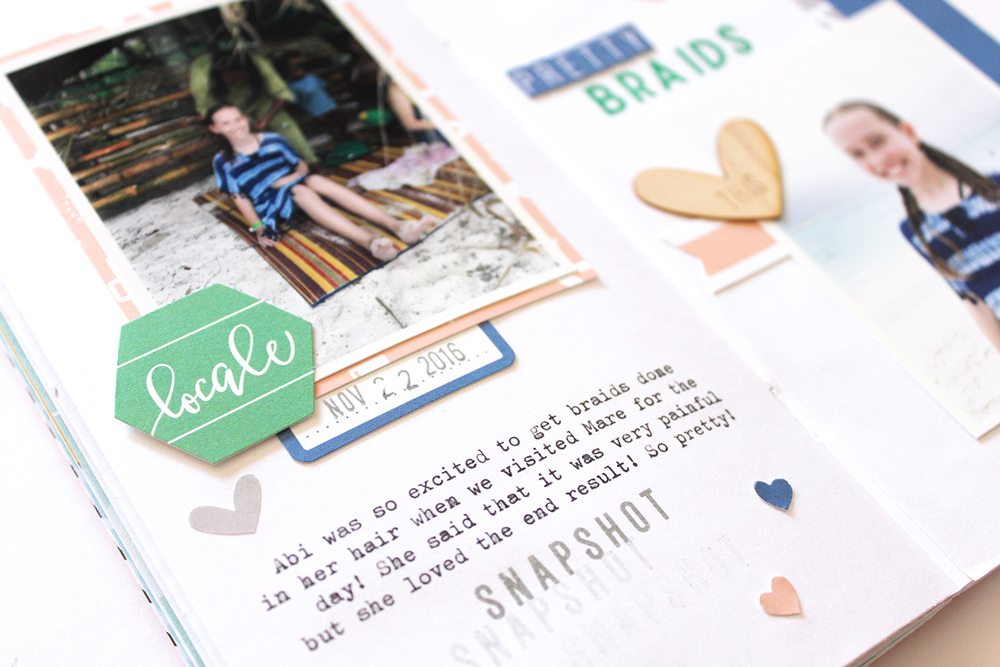
I added the first photo, taken when she was getting the braids done, on the left hand side of the spread. I matted it with the light pink patterned paper, and then I created a little cluster on the bottom left hand corner of the photo. Once again, I made sure that I included a little bit of each of the colours from my palette on this page. One thing to keep in mind when creating embellishment clusters in your traveler’s notebooks is to use fairly flat embellishments such as stickers and die cuts, as these don’t add too much bulk to the insert. I also added some typed journaling and a little bit of stamping underneath the photo. (If you’re wondering how I typed straight onto the page, I typed it onto a piece of white printer paper, and then adhered that to the page in the insert).
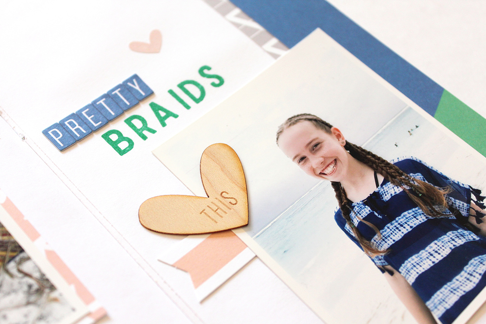
Down the right hand side of the spread, I added a strip of the paper that has the colourful sunburst stripes on it. This paper also has yellow on it, but as I didn’t want to introduce a new colour to the page, I trimmed it down so that only the pink, blue and green were visible. I also tucked a thin strip of the grey patterned paper under the edge of that strip, which brings a little bit of the grey to this side of the spread. I adhered my second photo towards the bottom of the page, overlapping the strips of patterned paper. I tucked a die cut banner under the left hand side of the photo, and I layered a wood veneer heart there as well. For my title, I used a combination of the little, navy alphabet stickers from the kit, and the Stanley Jr. Solid Alphabet Stamp. I like to include some smaller details on my pages to finish them off, so I added a few little heart stickers, as well as a couple of hearts that I punched out of the patterned papers.
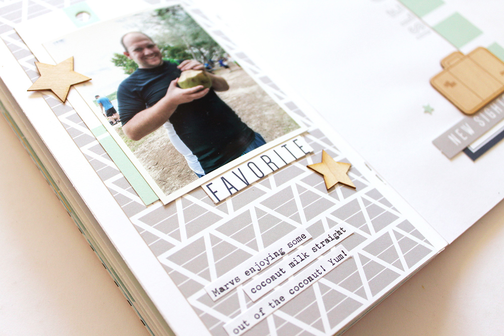
For my final traveler’s notebook spread using the Let’s Go kit, I documented a photo of my husband taken on the Isle of Pines, which was the last island that we visited on our cruise. I decided on this layout, to focus on the greys and the light greens in the kit, with a couple of pops of navy blue for contrast.
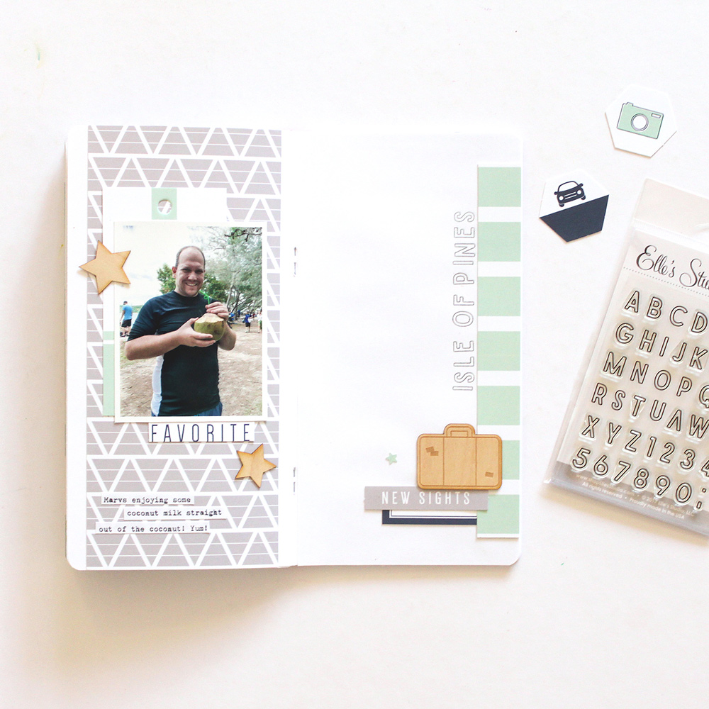
I started this layout off by covering the left hand side of the spread with the grey patterned paper from the kit. I trimmed it down a little as I didn’t want it to cover the entire width of the page. By leaving a little gap either side, it just adds a little bit more interest to the layout. I added my photo to this page, and I layered one of the tags from the kit underneath it. The word ‘favorite’ that I tucked under the bottom edge of the photo was actually trimmed off the patterned paper that had the title ‘favorite stops’ at the top. As I mentioned before, don’t feel like you have to use papers and embellishments as they are intended–get creative and make them work for you! I also added a couple of wood veneer stars to this page. The wood veneer embellishments are probably one of my favourite things in the kit! They’re much thinner than most wood veneer pieces, which makes them perfect for using in your traveler’s notebook inserts!
I finished off the left hand page by adding a few strips of typed journaling at the bottom of the page.
Over on the right hand side of the spread I added a strip of patterned paper down the side. This was actually part of the paper that has ‘favorite stops’ at the top, and it has green boxes for you to journal in, but I wanted to use it more as a striped patterned paper.
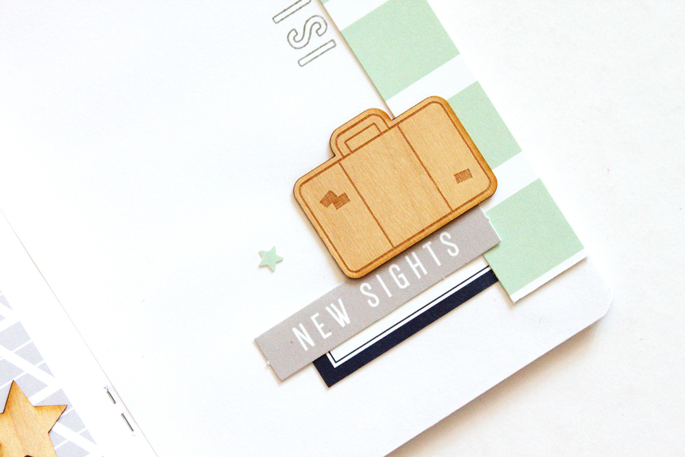
I created a little cluster down in the bottom right hand corner of the page, which gives the layout a diagonal flow as your eye travels from the photo on the left down to the cluster on the right. In that cluster, I included a third wood veneer piece, as well as a couple of die cuts from the kit. I finished the layout off by stamping my title vertically along the right hand side of the page using the Stanley Jr. Outline Alphabet Stamp. I used grey ink to tie-in with the other grey elements on the spread.
I had so much fun playing with the Let’s Go kit in my traveler’s notebook, and I hope that I’ve been able to show you some different ways that you can use the kit. Thank you so much to Elle’s Studio for inviting me to contribute this month and for giving me the opportunity to create with this awesome kit!
Supplies | Let’s Go Traveler’s Notebook Kit, Stanley Jr. Alphabet Stamp—Solid, Stanley Jr. Alphabet Stamp—Outline

Hi, my name is Mandy, and I live just north of Sydney in Australia. I’ve been married to Andrew for 16 years this year, and together we have three kids: Abigail, who’s 13 years old, Isaac who is 10, and Eleanor who is 3. We also have two kittens named Sasha and Archie. As well as looking after my family, I work one day a week at my local scrapbooking store, which is so much fun! I’ve been scrapbooking for about 13½ years, since my oldest was a baby! I love being able to preserve my family’s precious memories, and I equally love the creative outlet that it provides! I mostly like to document my photos on 12×12 layouts and in traveler’s notebooks. Over the past few years I’ve been super lucky to be on some amazing design teams, and I’m so thankful for these opportunities, because I love sharing my projects with fellow crafters who are also passionate about memory keeping! You can find more of my work at my Instagram account, blog, YouTube feed and in my classes!
Be sure to find more traveler’s notebook and layout inspiration from Mandy via the links above! We’d love to see what YOU are creating in your TN with the Let’s Go Traveler’s Notebook Kit! Share your project on Instagram using the hashtag #EllesStudio!
Capturing a Family Cruise with the Let’s Go Traveler’s Notebook and Special Guest Mandy Melville!