We are happy to welcome Melanie Blackburn back for her second guest post with us, using the March 2017 Kit and add-ons. On her fabulous spread, she’s proven that this kit can be perfect for your pocket pages, even if spring hasn’t sprung where you live!
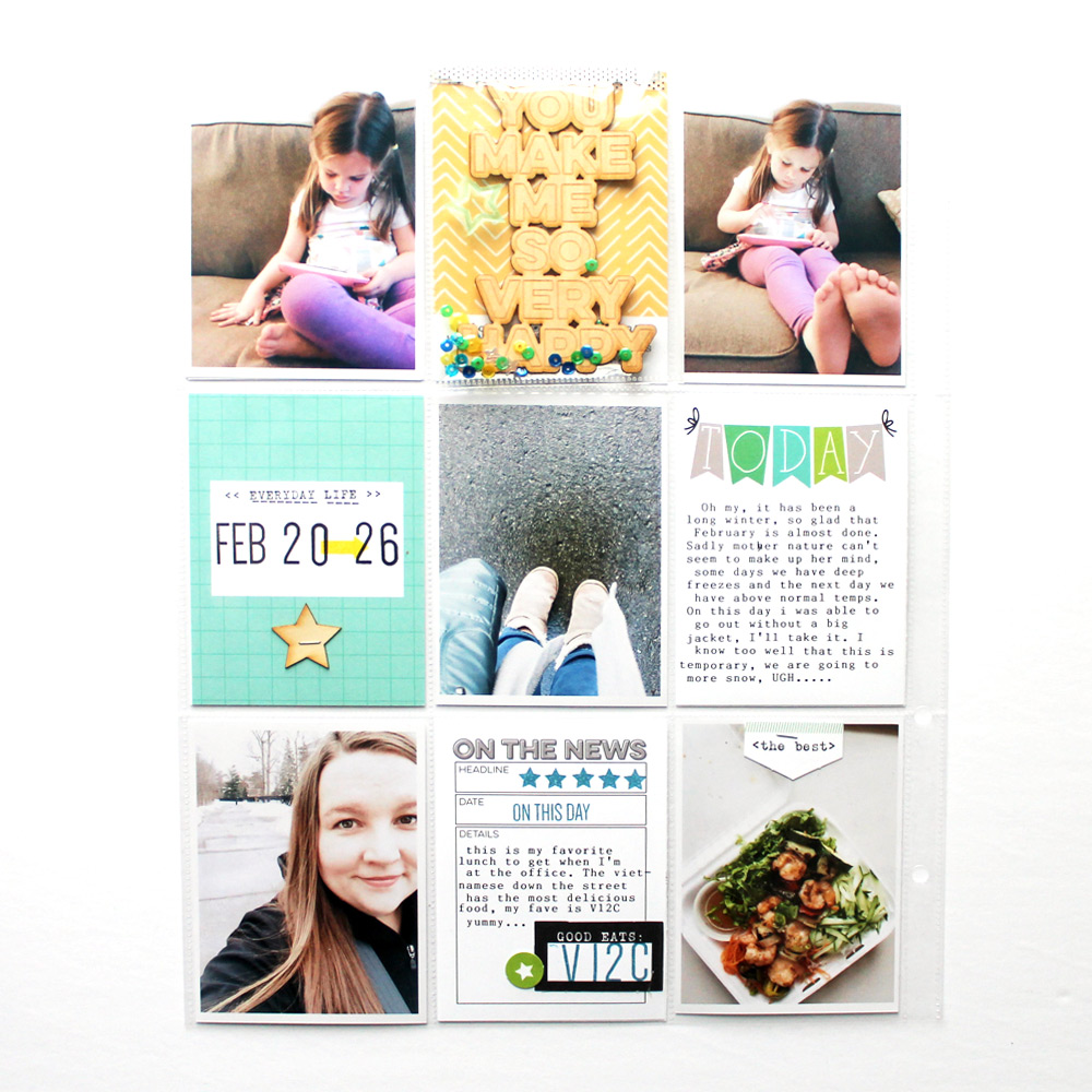
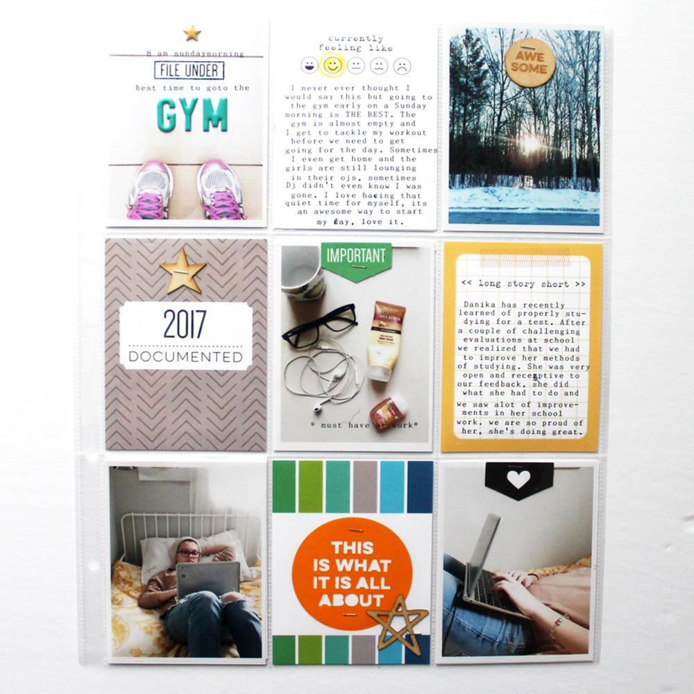
Hello crafty friends! I’m excited to be back today to share another pocket page spread, this time from our family album. I’ve been mostly using 9″ x 12″ page protectors for this album, but I will sometimes switch it up to 6″ x 12″, but only when I don’t have a lot of pictures to use- especially at this time of the year when we are typically inside due to the cold weather. My spread today features a mix of pictures and stories from late February. I always make an effort to include at least three stories in my family spreads. I really want my family to look back fondly on these little stories that they might have forgotten. I love the flexibility and versatility of the March 2017 Kit, not only is it excellent for spring theme spreads, but it will also work with everyday spreads- even dark cold wintery spreads such as mine!

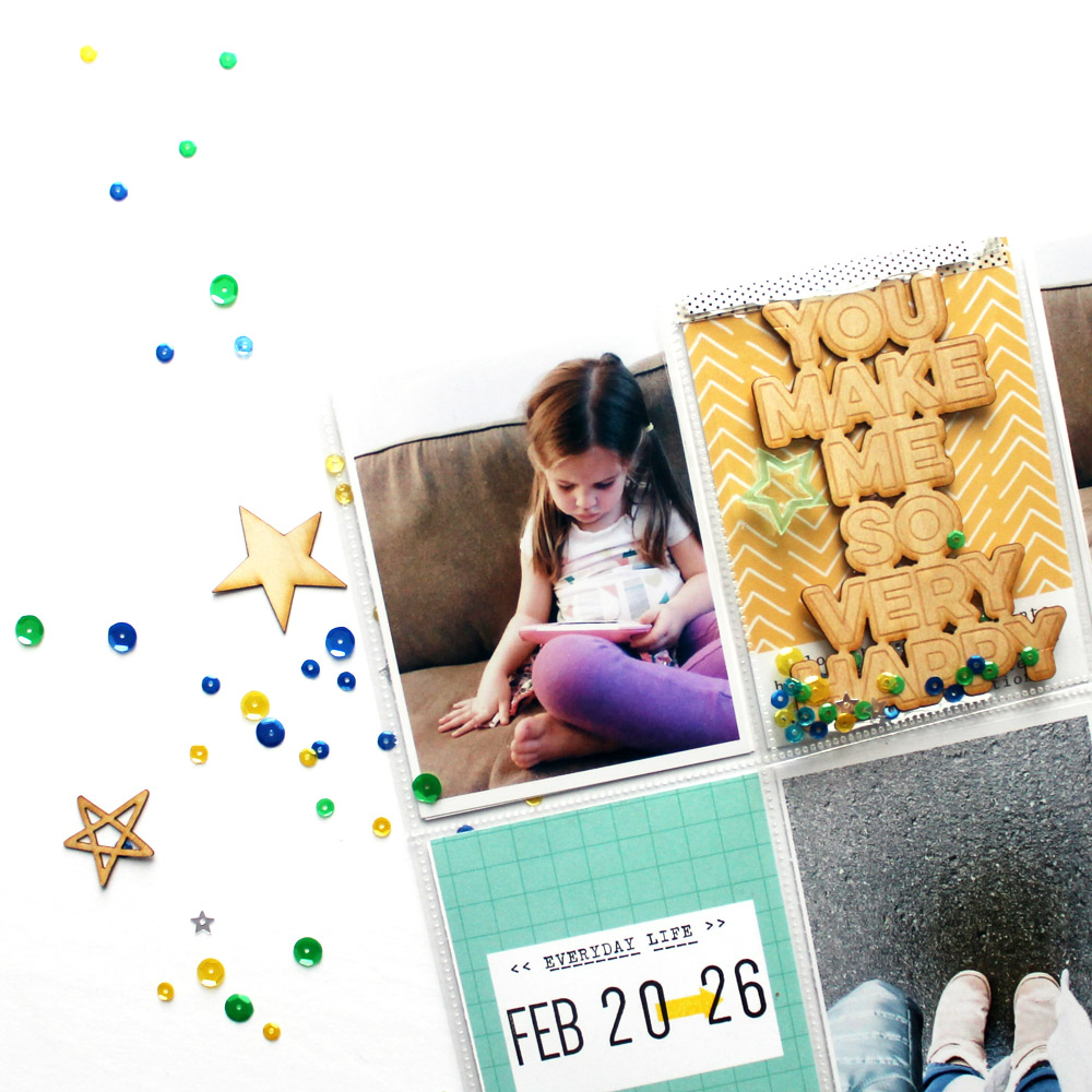
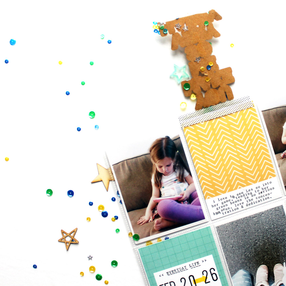
The So Happy Wood Veneer is so much fun, and I knew I had to use it as a focal point. I opted to design a flip pocket with a spare transparency sleeve which I trimmed down to 3″ x 4″, perfect to overlay a journaling tag. The plastic pocket is filled with the blue-green mix sequins and the wood veneer, on top of the pocket I adhered a spring mix acrylic star. The pocket was secured to the page protector using coordinating washi tape placed on top and underneath the flip pocket. Interactive elements such as this flip pocket are always fun, especially for kids! My daughters always love to flip the pocket to see what hides underneath.
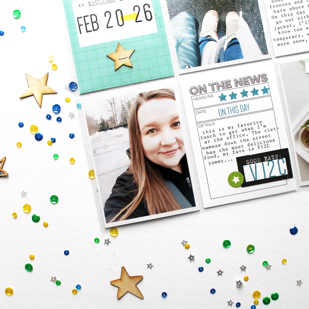
Even though I have a personal album, I try to include little bits of my life in our family album. The “on the news” card from the TV collection was ideal for documenting my favorite lunch at work. I embellished the card using a diecut from the March kit, paired with the Dated Stamp, which I modified using masking technique to indicate the meal number from the local Vietnamese restaurant. I love that I’m able to play around with a technique to get the full advantage of this lovely stamp set.
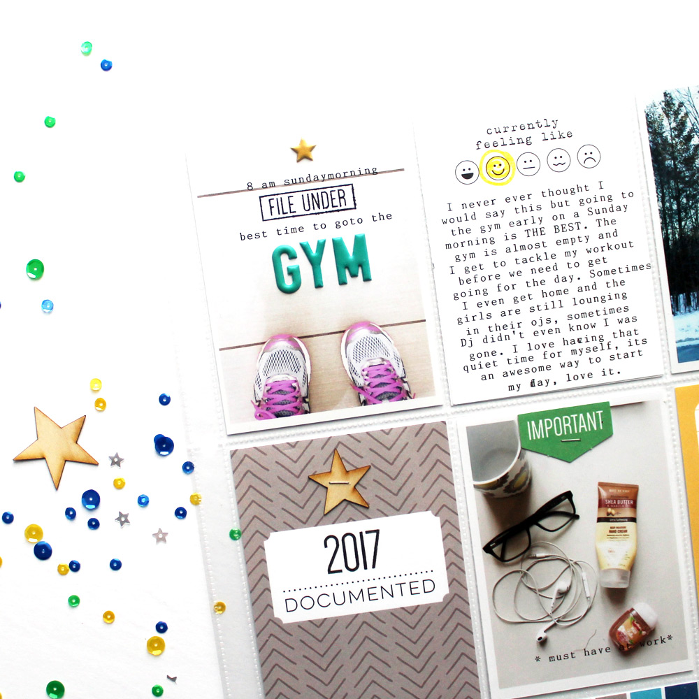
Another of my favorite techniques is combining different fonts on a picture to compose my journaling. I will often leave white space on my pictures so I can use this technique. On the picture below I combined my journaling (from my electronic typewriter) with a stamp from the File Under Stamp with the Teal Puffy Alphabet Stickers and I love the mix of fonts and textures.
This is a great way to maximize the use of white space.
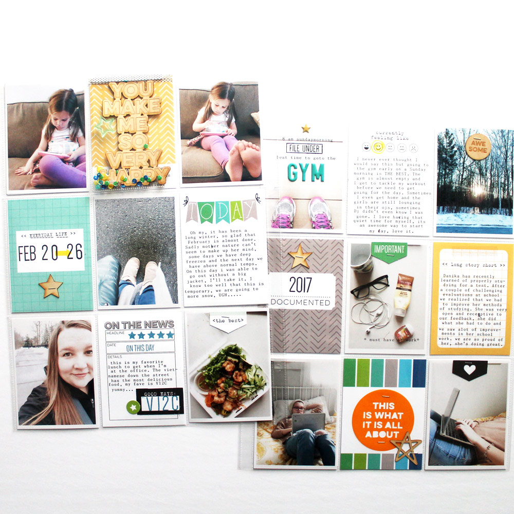
The end result is a fun colorful spread that highlights various elements from a typical week in my family’s life. The repetition of wood veneer and labels creates a cohesive design and strategically placing my cards in order not to repeat the color or patterns helps guide the eye through the spread. I hope you are inspired to use some of these design elements on your next project. Happy crafting friends!
Supplies | March 2017 Kit, TV Journaling Tags, Feel Better Journaling Tags, File Under Stamp, Dated Stamp, Acrylic Stars- Spring Mix, So Happy Wood Veneer, Puffy Star Stickers, Teal Puffy Alphabet Stickers, Vellum Sentiments, Wood Veneer Stars, Love Ya Wood Veneer Circles
We are already looking forward to seeing Mel’s next project using Elle’s Studio products! Stay tuned until next week when she shares her last project with us as the March guest designer. In the meantime, you can find more of her work on her blog and Instagram!

Comments