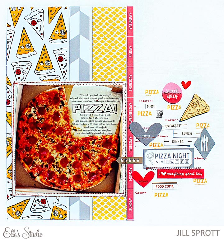
 Ask anyone who knows me: I love pizza. When I say “love,” I am referring to the always-hungry, always-craving kind of love, of the obsessive variety. Yes, I love pizza in a Criminal Minds kind way. I just can’t get enough. Neither can the pizza-lover who designed the new Elle’s Studio Let’s Eat collection, apparently. It’s absolutely packed with pizza-themed elements, as this layout proves.
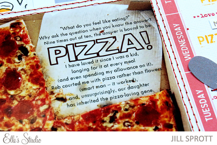
I began the layout by focusing on a photo that I took of a glorious, piping hot pizza pie. Initially, I wished that the photo had been taken before my daughter and I snagged the first of the slices, but in looking at that empty space where only the box liner remained, I realized that this would be a great place to add the journaling. I did so using the text tool in Photoshop, and then printed the photo.
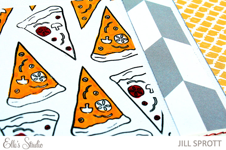
 The color scheme of the layout is based on the delectable colors in the photo — red tomato sauce and pepperoni, gray mushrooms, toasty light brown crust, and yellow layers of cheese. I dipped into the Let’s Eat Paper Collection Pack and cut strips from sheets of “Yum,” “Meal Planner,” and “Five Stars” papers, placing them vertically across the page, behind the photo. Knowing how much I love pizza, you won’t be shocked when I tell you that I still felt I needed more of it on the page, so I created my own pattern using the pizza stamp in the “On the Menu” stamp set.
 On the right side of the page, I added additional stamping using word stamps from the multiple (!) Let’s Eat stamp sets, and then worked in accents from the collection, one of which is a pizza wood veneer shape that is quite possibly the best accent that has ever existed in all of craftdom.
As a finishing touch, I stitched around the photo and over some of the accents. Upon completing the layout, I suggested pizza for dinner, and though my husband groaned, I can’t say that he was surprised.
Products used: Let’s Eat Bits and Pieces, Cutouts, Stickers, Good Eats Stamp, On the Menu Stamp, We Ate Here Stamp, Wood Veneers, Paper Collection Pack

Comments