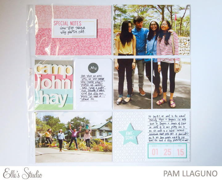
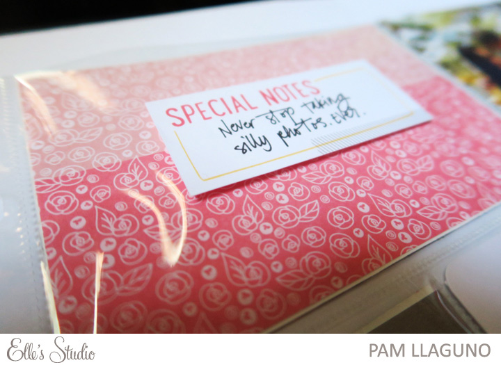
 Pam has some fun tips for Project Life that she wanted to share with us today – here’s what Pam as to say: To be honest, I only really spend about an hour max on each of my layouts. My days can get a little bit hectic with my day job + passion projects + general life. I really have no time to sit down and do a lot of techniques (stitching, painting, etc.).
I have two go-tos when it comes to adding that extra oomph to my layouts: stamping and adding dimension. Today, I’ll give you some tips on adding dimension to your post without using a lot of bulky embellishments.
1. Less is more. You don’t have to add dimension to every single card in your layout. Think about this, if everything’s 3D, then nothing is going to stand out because they’re all on the same level. Choose a couple of focal points that can really bring the layout together.
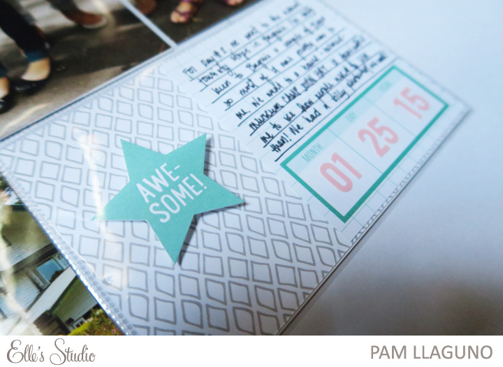
 2. Use foam squares / dots. These nifty little adhesives make it easy for you use your current stash (favorite: Elle’s Studio die cuts!) and convert it into nice raised embellishments. This technique creates dimension without making your layout too heavy.
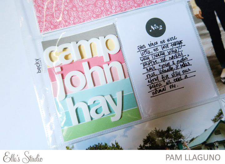
 3. Use foam thickers. Regular thickers add dimension but foam thickers are on a different level. Because they’re solid, they create a lot of dimension to your page. I like using big, bold thickers on a single card.
And that’s it! You’ve added dimension to your layout without it looking cluttered and heavy.
 Products used: Cienna Paper Collection; Letter & Number Stickers – Pink; Elle’s Studio Exclusive April kit and March kit.
Thanks for sharing with us today, Pam! We’d love to see and feature your Project Life spreads, too! Share them with us by uploading them in our Member Gallery – on Sundays we love to feature our members, and every featured member receives a $10 gift certificate to our shop!

Pingback: CraftCrave | DigiFree | CraftCrave