Hello, weekend!
While browsing through our design team gallery this week, I found a common theme between four layouts that just seemed to jump out at me. Funny how that happens! What theme, you ask? They all highlight the color yellow!
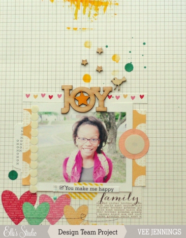
This layout created by Vee uses yellow to embellish one of our wood veneers as well as to draw your eye through the layout with painted accents along the top.
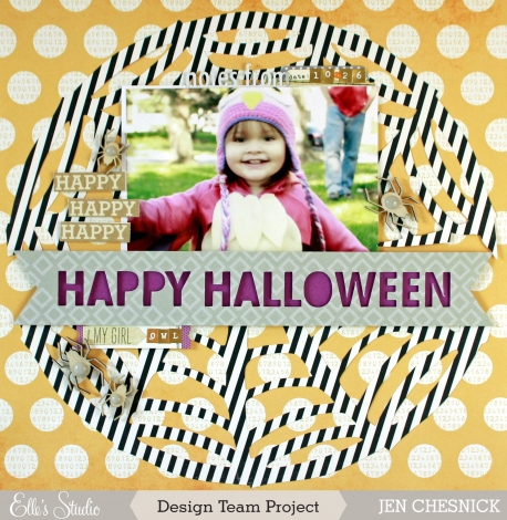
Jen used this yellow patterned paper from our Penelope collection to house this spiderweb die cut on her layout.
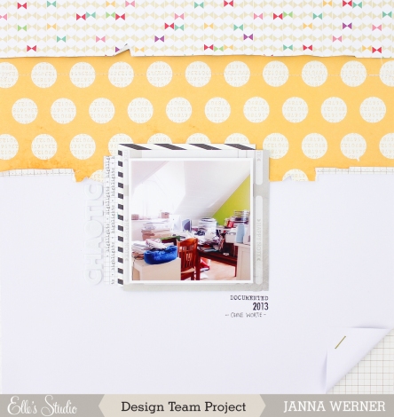
Janna used the same patterned paper but in a horizontal strip, to act as a grounding agent for her small scale photo. It gives your eyes a spot to land on this layout that embraces white space.
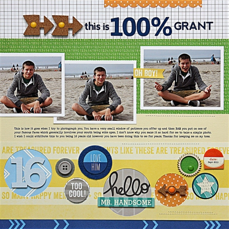
Our November guest designer, Summer Fullerton, also used a strip of yellow – this time from our Cameron collection – on this linear layout. Her sunny strip of patterned paper acts as the perfect container for additional tags and embellishments.
We hope these highlights from our talented design team inspires you to put your Elle’s Studio products to use!
Have a great weekend!


Comments