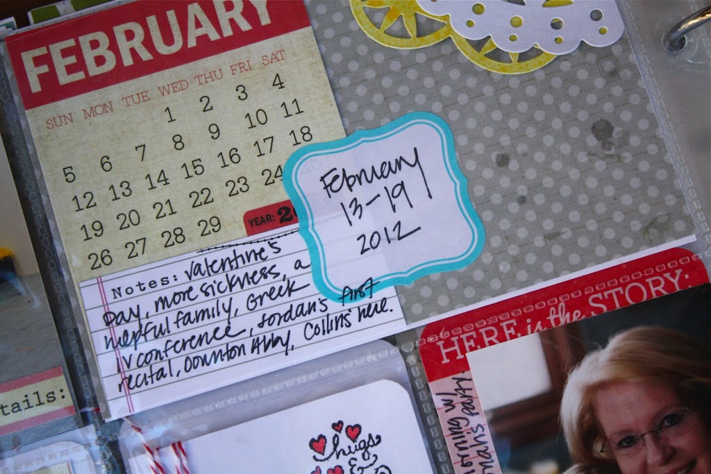
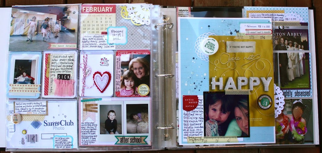
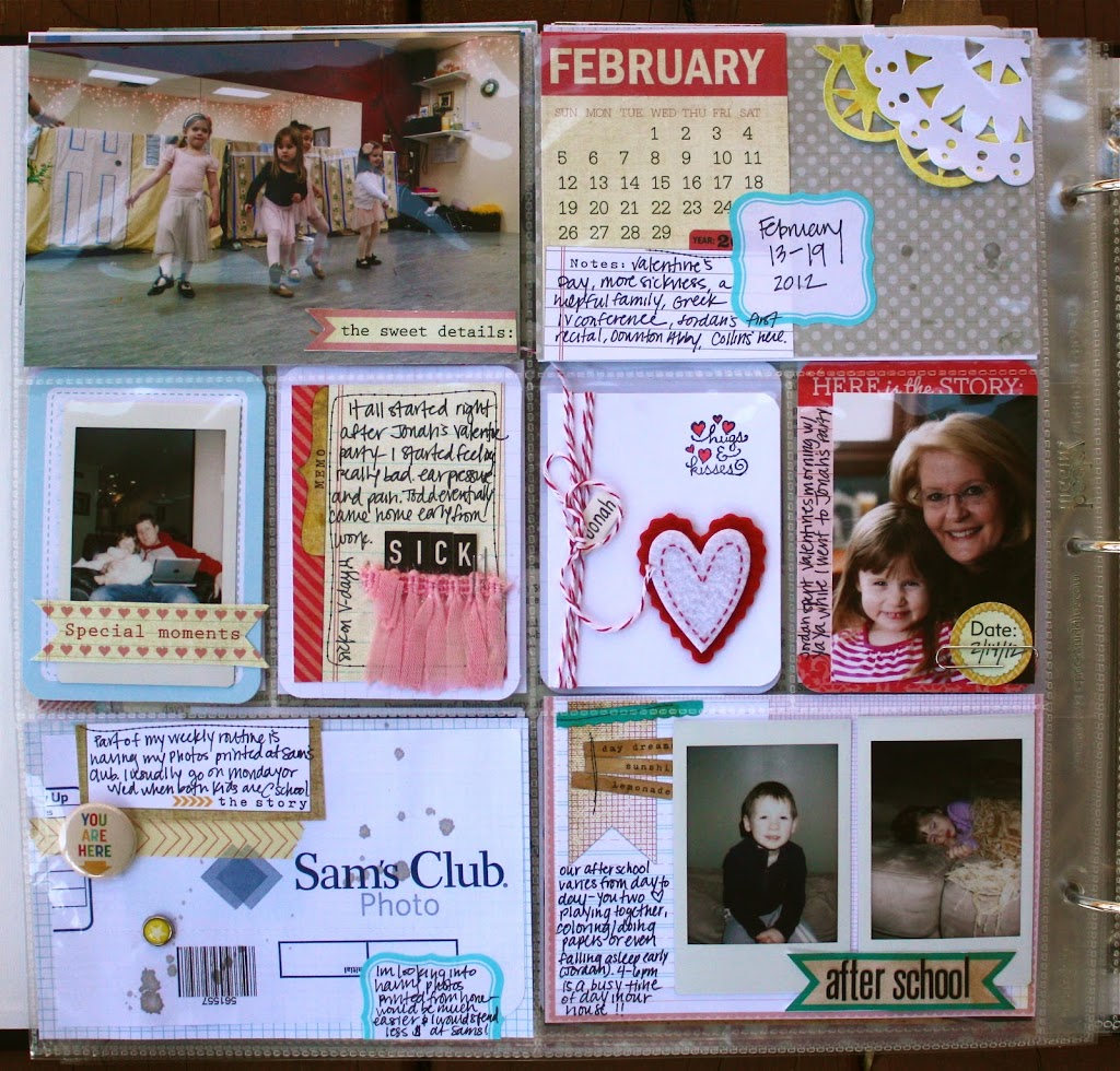
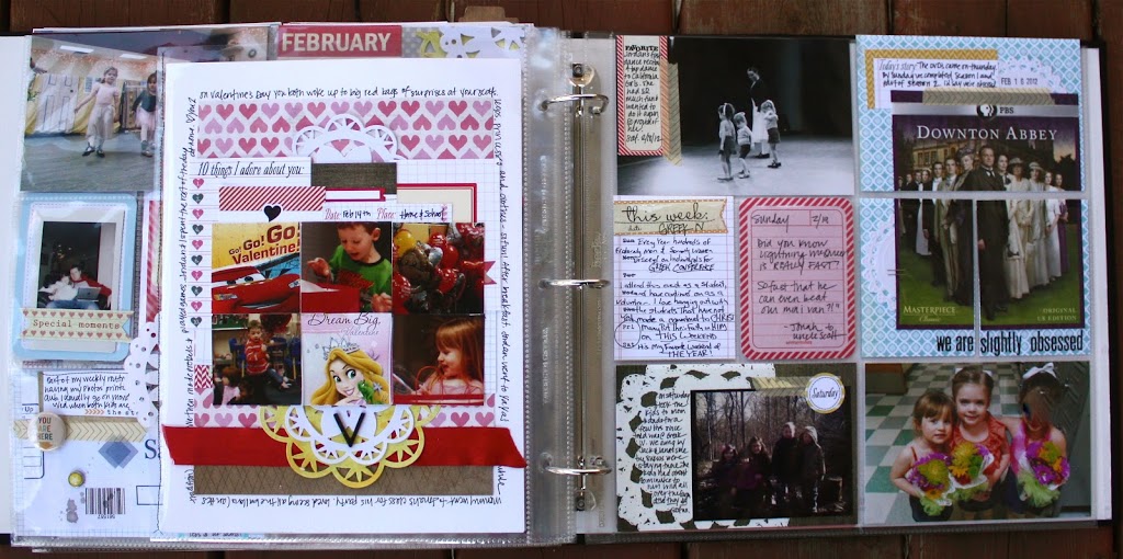
It’s Tuesday which means another week of Project Life here at Elle’s Studio! This week’s Project Life covers the week of February 13-19. My theme for this week as I was putting together my Project Life was: Break the Rules!!
Yes you read right, Break the Rules. I think it’s funny how as crafters we can establish a set of unspoken rules we feel we must follow. I feel like sometimes those “unspoken rules” could limit our creativity.
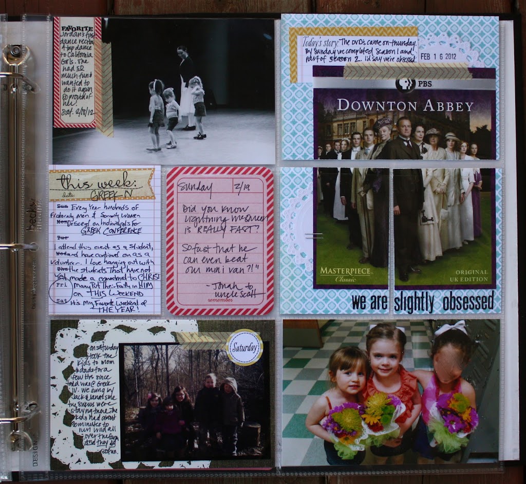
One of the first rules I “broke” in this week’s Project Life was displaying my photos chronologically. I have always felt that I should place the photos from approximately monday through wednesday on the left side, and on the right side should be about thursday through the weekend. All appearing in order of course. Well, I decided to mix it up a bit this week and included a photo from Thursday in the top left corner (shock!).
It occurred to me that the correct “chronological order” of my week is not what I want to remember about our lives years down the road. I want to remember the stories and special moments from that particular week. So if a photo looks better placed in a different spot, then I am going to go for it!!
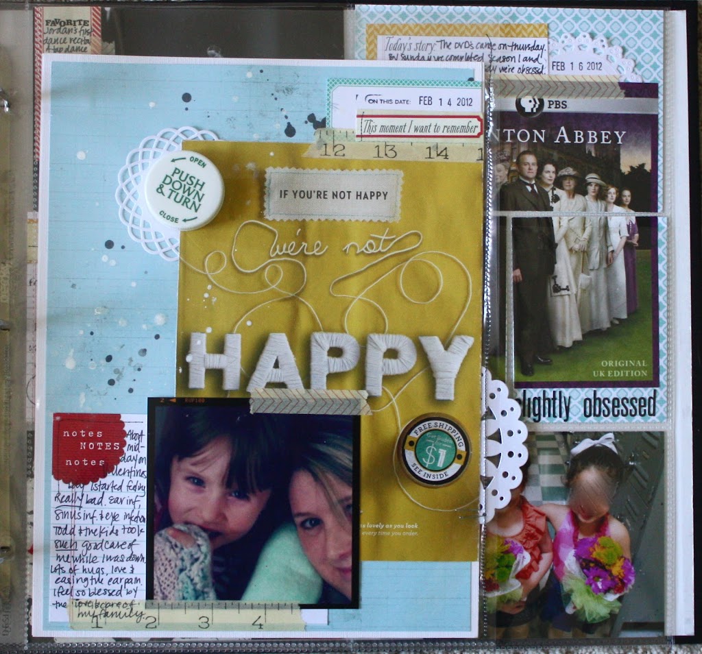
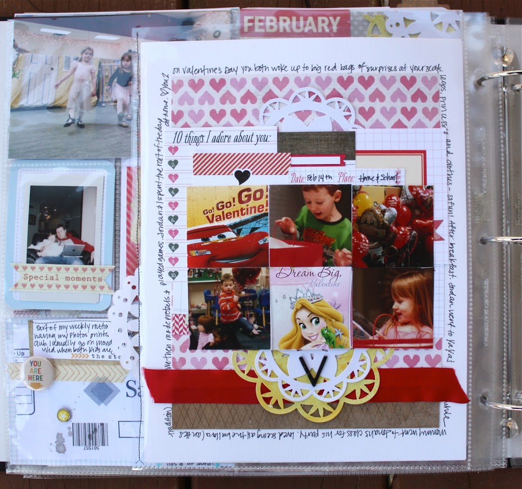
The second rule I broke, was I created a layout specifically for Project Life. I dabbled with this a bit in last weeks post, however this layout is much more geared toward Project Life. First of all, it’s double sided. Second, it incorporates Project Life “elements”, such as a catalogue cover, my prescription bottle cap, and my children’s Valentine’s from this year. These are not items I would put in a regular layout, And it took much less time to create! It’s fun and inspiring to see layouts and Project Life intersect.
The third rule I broke, was limiting my self to each compartment of the Project Life page protectors. I really enjoy Kelly Purkey’s style and how she approaches her Project Life album. She frequently uses enlarged photos and breaks them up into many different pockets in her album (you can see an example of this here). I was too chicken to try this with an enlarged photo, so instead I used a DVD cover to try it out. I think it’s a fun way to break things up a bit, and add a different element to your page. I also think it’s a great way to highlight a photo you love, OR a great way to still create a great Project Life page if you didn’t take many photos (just pick one!)
I hope a few of these ideas inspire you to “break the rules” a little bit and try something new this week as you create your Project Life spread!
We have a winner from last week’s Project Life post! Congrats to Kerry!!! Please send us the following info to info@shopellesstudio.com to claim your prize!
Name:
Address:
Prize: Project Life Feb 21
We have another giveaway today! Leave a comment here for a chance to win a $15 Prize Pack from Elle’s Studio!




Comments