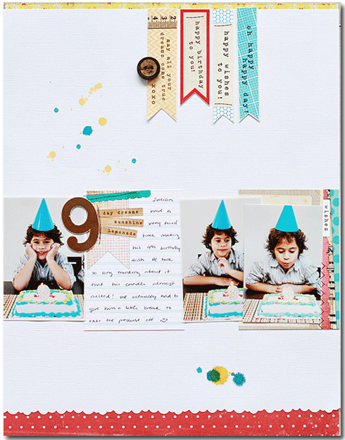
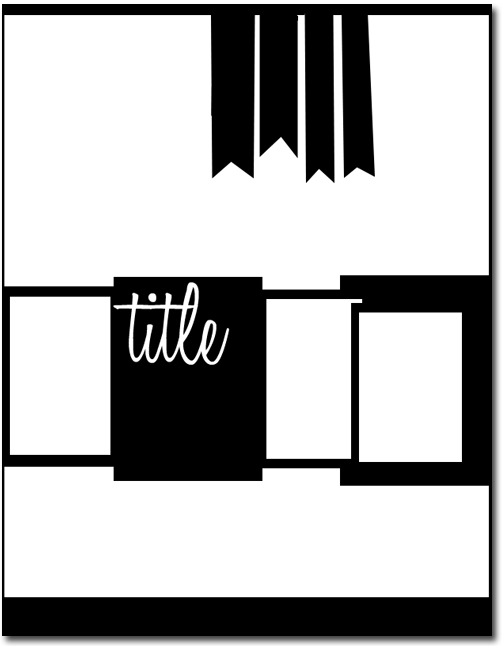
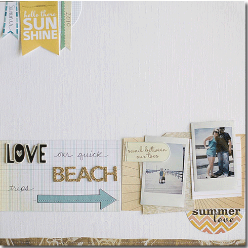
This week’s sketch is based on this layout from the July Inspiration Gallery from ES design team member Waleska. That single horizontal band containing her photos, journaling and embellishments? Love the composition!
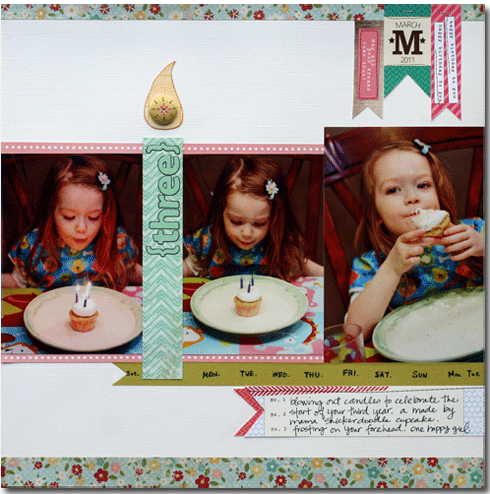
By now, you know that I normally scrapbook with typical size photos, usually 4×6 and 5×7. For this layout, I used three 4×6 photos and simply cropped two of them smaller to eliminate extra background and keep the focus on my daughter blowing out her birthday candles. Instead of a journaling block between two of my photos, I created a strip for my title which I then turned into a candle to coordinate with the subject of my layout. Inspired by Waleska’s banners along the top of her layout, I included three of my own and then also trimmed the edge of my tape and journaling block to match.
Our July Guest Designer, Jen Gallacher, took at turn with this week’s sketch. I love that she used the sketch to create a layout that maintains her usual design style.
I really like this monochromatic take on the sketch from design team member Allison Waken and how she spread her title work over a large area within her design.
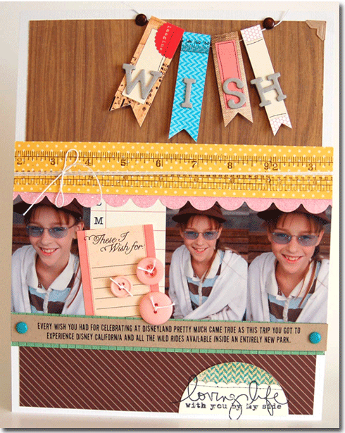
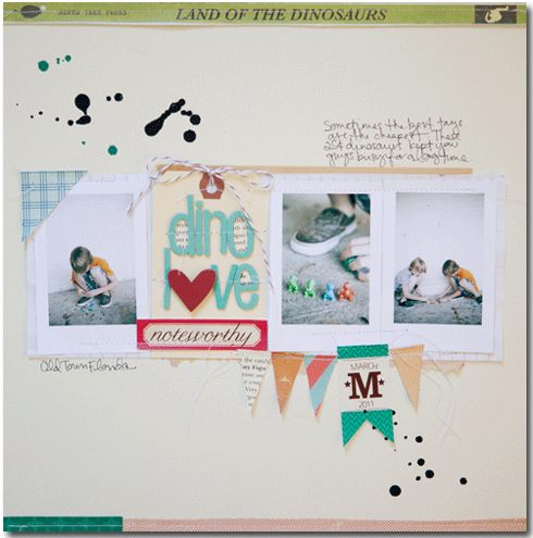
Although similar to Waleska’s original layout in that it features ink splatters on a white backdrop, this layout from design team member Marcy Penner. I love how Marcy moved the location of her pennants and strung them together with thread.
Marcy comments, “Right away I was inspired by the banner in the sketch. My intention was to place it exactly as it was in the sketch… but as is often the case… this changed as my layout when along.”
Looking for an incentive to use our sketch this week? We can help with that! Post a link to your layout created using this Sketch Thursday sketch for your chance to win a $5 ES gift certificate. Link must be posted by 11:59p on Wednesday, August 24, 2011.



Comments