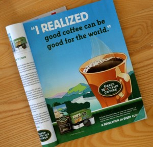
I love finding inspiration in advertising, and once of my favorite places is magazine ads. This ad from Green Mountain Coffee was featured in the Dec/Jan 2011 issue of ReadyMade magazine and immediately caught my eye with it’s bold use of color and titlework.
While looking for suitable photos for this layout, I came across some shots of my son on his birthday wearing an orange shirt. Since the coffee cup in the ad was various shades of orange, I knew the photos could work. But I wasn’t sure what size or how many of them to print just yet.
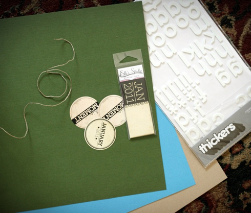
Using the ad as a rough guide to my page layout, I arrange some of my supplies in a similar design:
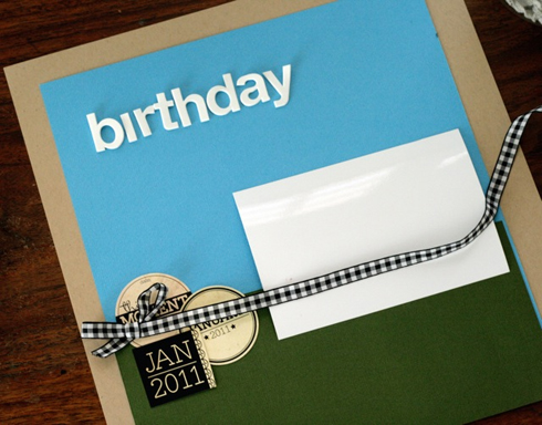
I used a blank piece of 4×6 photo paper to indicate approximately where my photos might go. This helped me determine what size to print them (I opted for two photos approx. 3.5 x 5″).
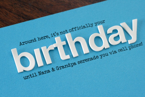
To create a title similar to the ad, I used a combination of foam letter stickers and typesetting, printed on cardstock. I was able to determine the placement of the type by laying out the letter stickers (but not sticking them down), and measuring roughly the area they took up before removing them. Then I set my text up in a word processing program and printed on the blue cardstock.
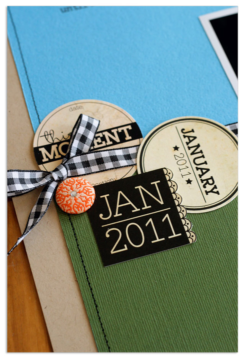
Notice how the main focal points in the ad (title, coffee mug, product placement) represent the focal points on my page (title, photos, embellishment tags.) I also used the location of the ad type (lower right corner) for my journaling placement.
So the next time you’re stumped for page ideas, flip through a magazine and pay attention to the ads. There is lots of inspiration to be found there!



Comments