Happy Friday, ES fans!
I love going through the design team gallery to find a common theme or common products used and how each team member has put their own spin on it. Today we’re highlighting single photo layouts. Check out the amazing projects from our talented team.
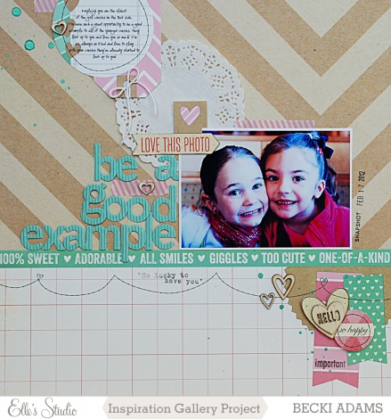
I love how Becki used the chevron paper from our Penelope collection to draw your eye to her adorable photo on this layout.
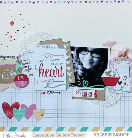
Valerie intermixed a row of tags and embellishments with her photo to create movement through the center of her layout.
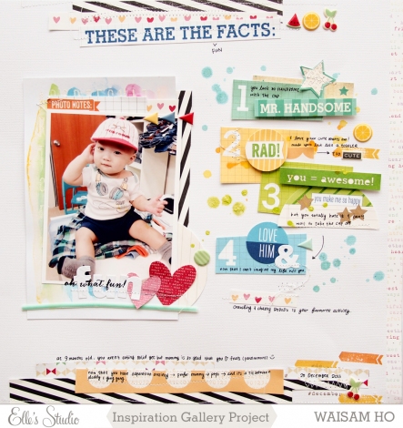
To ground her photo on a solid white background of this layout, Waisam created borders of paper and embellishments along the top and bottom margins.
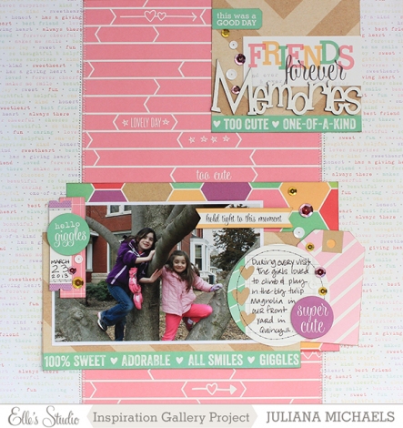
Juliana layered tags around the border of her single photo to keep the focus of her layout on these two adorable girls.
Don’t forget to leave our designers some love in the gallery if you enjoyed their projects.


Comments