Hello! It’s Jennie McGarvey here today to talk about pocket pages! I personally love these little bite-sized bits of beauty but don’t often create them. Every time I do, though, I wonder why these aren’t regular occurrences since they are so much fun, especially when you’re using the September kit and add-ons to create them!
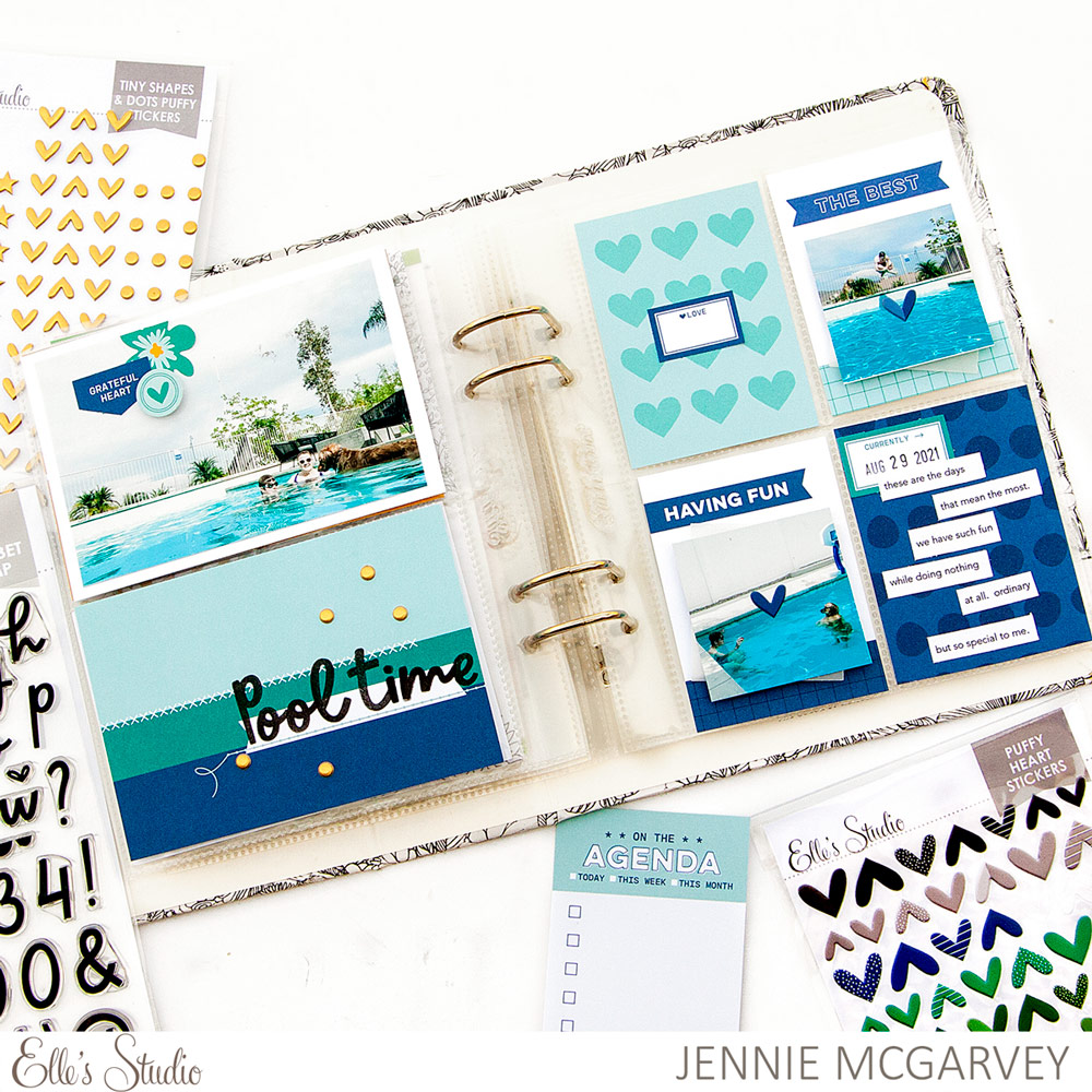
Supplies | September 2021 Kit, Autumn Die Cuts, Autumn Puffy Hearts, Gold Tiny Shapes and Dots Puffy Stickers, Thankful Paper Stack, Lizzy Alphabet Stamp
I’m working on my 6 x 8 inch album and knew I wanted to make something visually pleasing, but simple. The easiest way I know how to do this is to create a monochromatic layout. Elle’s Studio products make this idea so very easy!
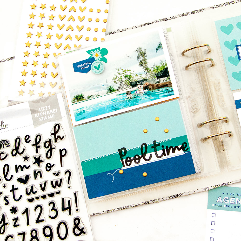
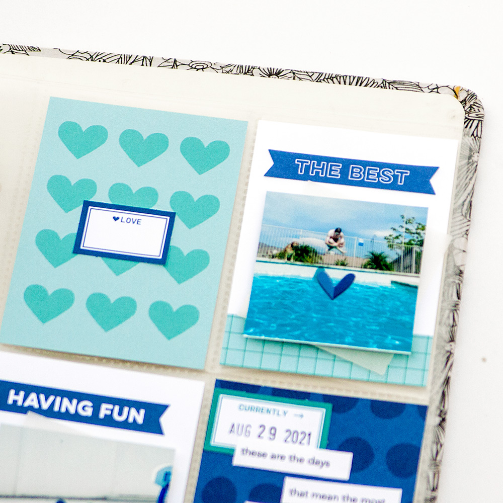
Now, the pocket tag acts as sort of a title for this layout and I don’t always do that. However, it worked well AND fit the color palette. What more could you ask for? I stamped the title with the Lizzy Alphabet Stamp and scattered three of the Gold Tiny Shapes and Dots Puffy Stickers on the tag and that is all it took. Simple—yes! But it works and fits perfectly with my layout.
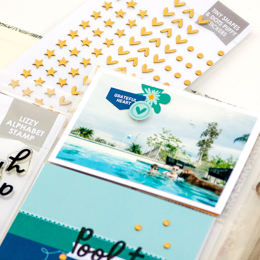
The left side of this layout includes two 4 x 6 inch pockets and I chose one tag from the September Kit and one photo. However, it’s the photo I decided to dress up! Is that really true? Nah, I added a bit of fun to the pocket card, too! I trimmed the photo down just a bit to add a white mat to make the photo pop. One decorative cluster really helped decorate, but keep the focus on the main photo for this layout.
The right side of the layout consists of four 3 x 4 inch pockets and this is my favorite layout. These 3 x 4 inch pockets really make me feel like I have the most freedom, but this really is unique for the creator!
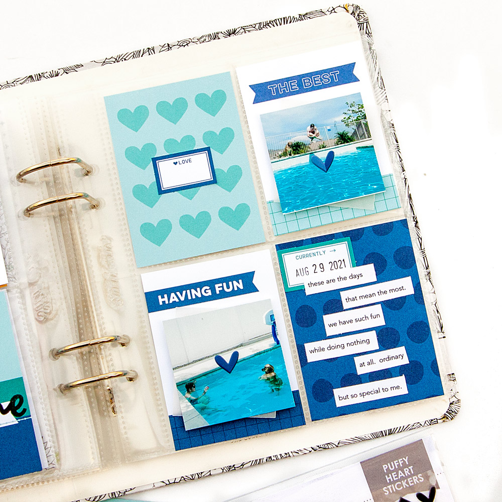
The bottom tags are quite straightforward. Journaling? Check! The photo was trimmed down to a square, mounted with foam adhesive, and accented with a bit of vellum peaking out. I do love the dimension the hint of vellum offers. My favorite part? The blue Autumn Puffy Heart in the center! I think it’s a truly fun and unique addition.
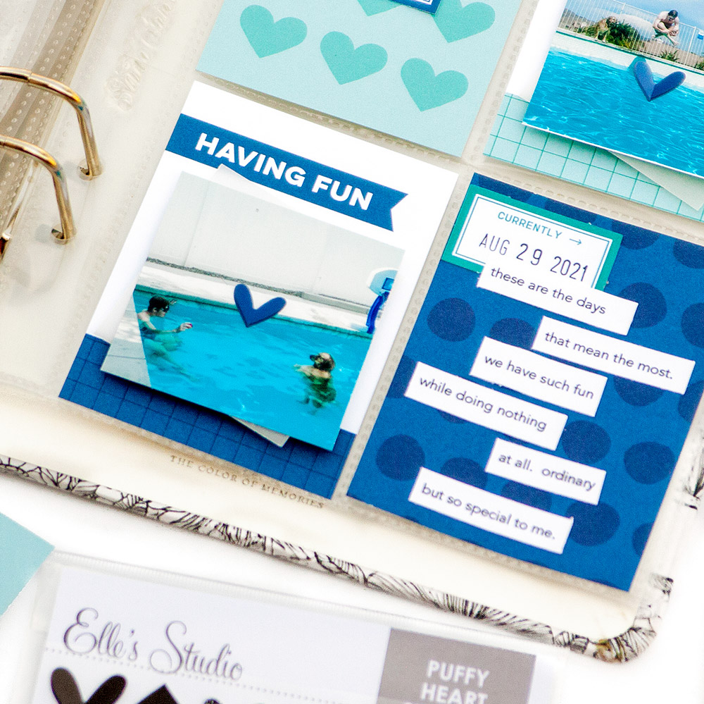
The top tags are not any more significant than the bottom, however, there is a detail you may have not have noticed at first glance. While the photo tag is very similar to the bottom, done purposefully to promote cohesion, even with the puffy heart detail, the top banner is altered. I added one of the banners from the Autumn Die Cuts to personalize the card a bit further!
How are you at personalizing your pocket pages? What about the tags that are included in the monthly kits? We’d love to see your pocket pages, so please make sure to share them with us in the Elle’s Studio Facebook Group or on Instagram using the hashtag #EllesStudio!

