Hello, crafters! It’s Jackie here with my post using a sketch found in the From Sketch to Finish Vol. 6 Class as my inspiration. To say I had a hard time choosing which sketch to use first is definitely an understatement! Where do I begin when From Sketch to Finish Vol. 6 is full of great inspiration!?
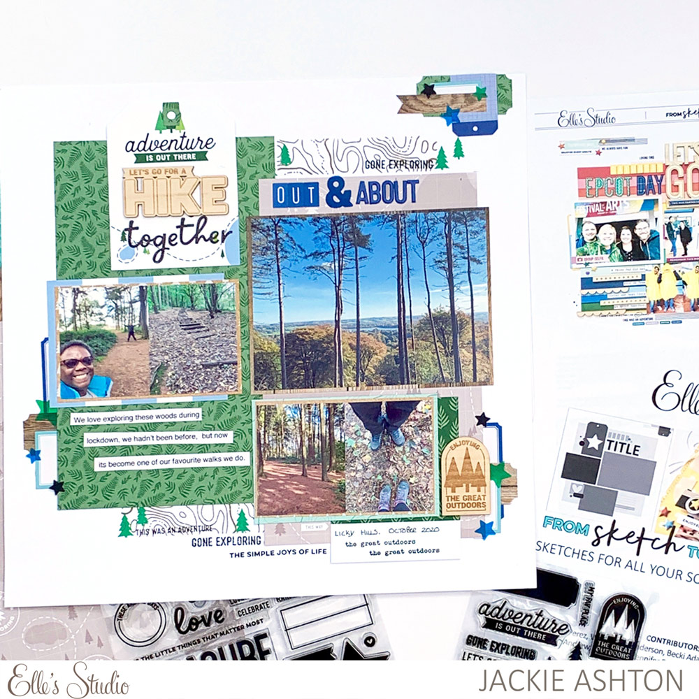
Supplies | July 2021 Kit, Cardstock Die Cut Tags, Navy Cardstock Label Stickers, Jane Tile Alphabet Cardstock Stickers – Navy, Navy Puffy Alphabet Stickers, Tiny Shapes and Dots Puffy Stickers – Neutrals, Navy Parker Acetate Alphabet Stickers, The Great Outdoors Wood Veneers, Adventure Paper Stack, The Great Outdoors Stamp, From Sketch to Finish Vol. 6 Stamp, Nesting Tags Metal Die
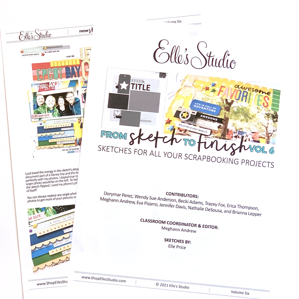
I ended up choosing the sketch used by Tracey Fox on page 5. I loved the placement of the photographs on the sketch and the layout.
The July 2021 Kit and add-ons theme is all about adventures, and I wanted to document these photographs of a new area we have found to have a walk during lockdown in the UK. As you can see from my layout above, I’ve tried to stay true to the sketch and I also used a few of Tracey’s tips from her layout to incorporate onto my page.
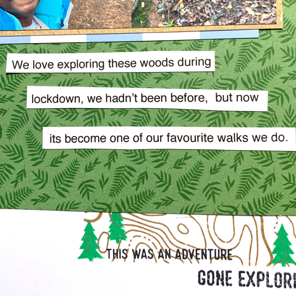
Going through the July 2021 Kit, I picked out three journalling tags that co-ordinated with my theme, and chose several patterned papers from the Adventure Paper Stack that worked perfectly for my woodland walk theme. Once I decided where I wanted my patterned papers to be placed on my cardstock, I lightly marked the area and then I added stamped images from The Great Outdoors Stamp before adhering patterned paper over the top.
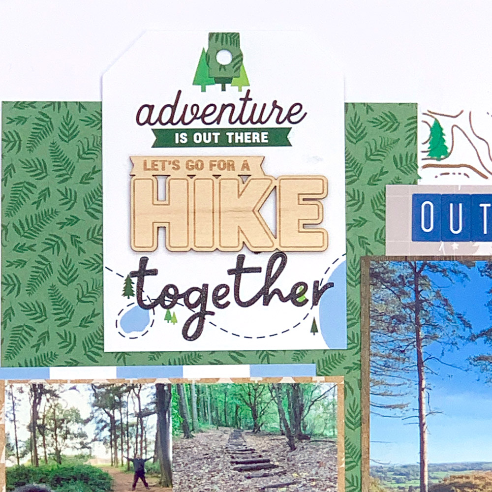
The sketch included a tag design at the top left, so using the Nesting Tags Metal Die, I die cut one of the journalling tabs, added The Great Outdoors Wood Veneer piece and stamped a phase from the From Sketch to Finish Vol. 6 Stamp.
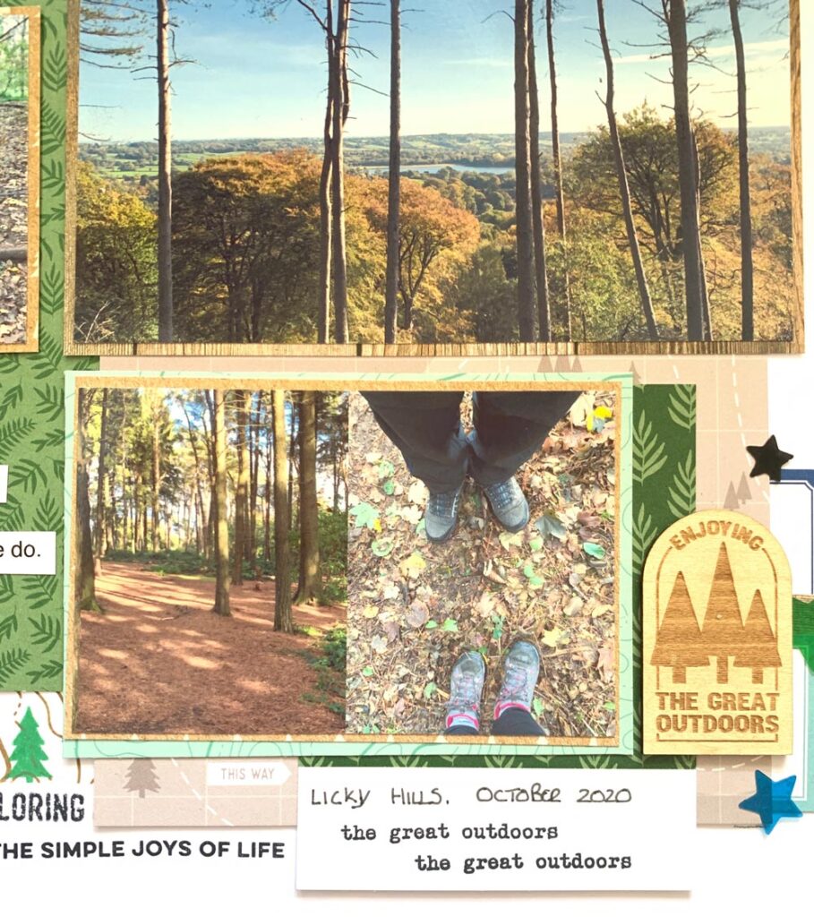
When reading Tracey’s description of how she created her layout, I loved that she was able to incorporate smaller sized photographs, without the layout looking too cluttered. After choosing which photographs I wanted, I used an app to resize four of them. I backed these with patterned papers from the Adventure Paper Stack and used two of the journalling tabs as layers behind.
Once all my photographs were all adhered to my background, it was time to add embellishments around the page. I added another The Great Outdoors Wood Veneer to the bottom of my page.
When I look at a layout that has used a sketch as their starting point, I can find a few visual inspirations to add to my page. Tracey had added printed journalling strips at the bottom of her layout, which I copied and added in the same position. She had also used different alphabet fonts for her title, and my title consists of three different sets: Jane Tile Alphabet Cardstock Stickers in navy, Navy Puffy Alphabet Stickers and Navy Parker Acetate Alphabet Stickers. I love this pop of blue accent that these alphabets add to my layout.
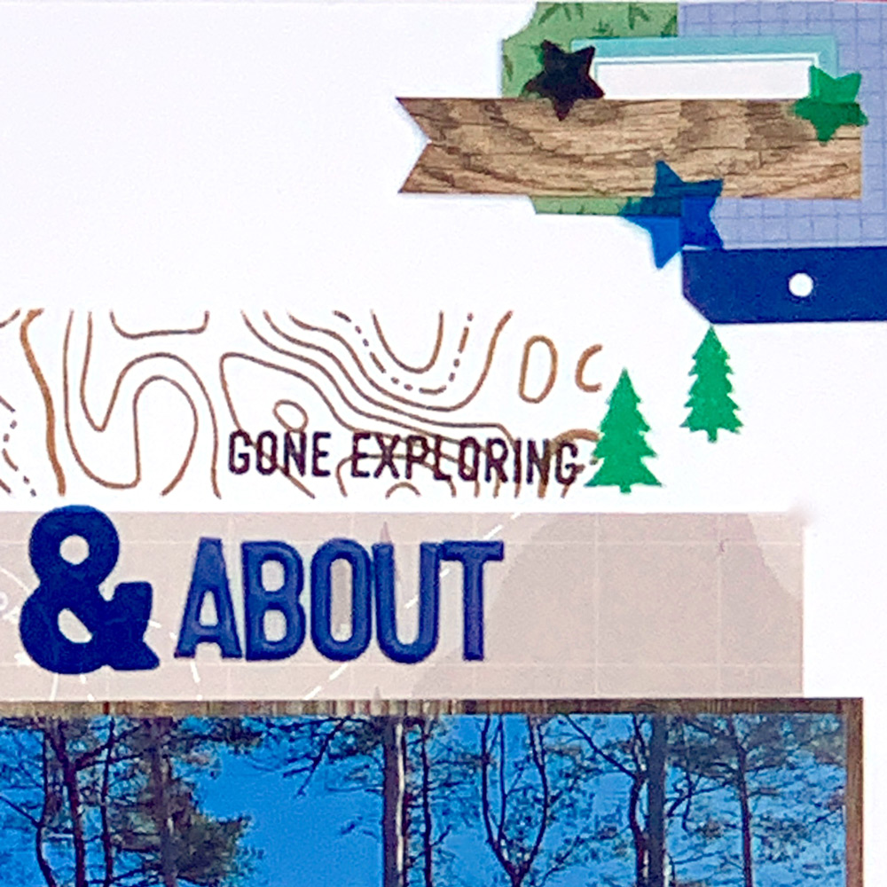
To finish off my page, I added some stamped details around the page, something that Tracey’s had done on her layout.
From Sketch to Finish Vol. 6 has really inspired me to try and complete some more layouts using these sketches. Don’t just look at the sketch as a single image, read the hint and tips given by each of the designers, use some visual inspiration from the examples to add to your layouts. I’m sure you will be inspired with each and every sketch in this class!

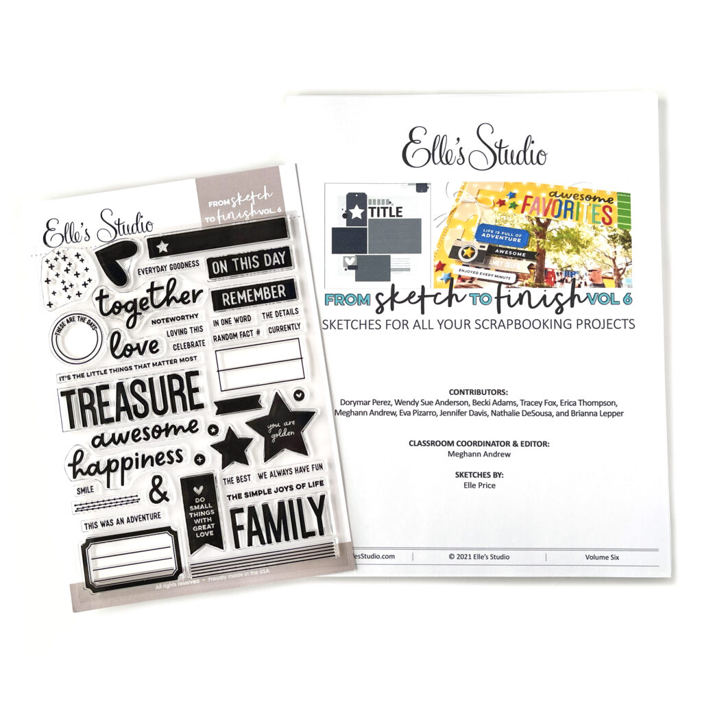
Want to create using this sketch just like Jackie did? You can find this class now available in our shop with the exclusive 6 x 8 inch stamp, or as a digital download only!
We can’t wait to see what YOU create! Share how any of our new sketches in the class inspire you to create by posting your project in our Elle’s Studio Facebook Group or by posting on Instagram using the hashtag #EllesStudio!
