Hello Elle’s Studio friends! It’s Aimee here to walk you through creating a simple, yet meaningful layout using your February kit and add-ons. Let’s take a look at what I did.
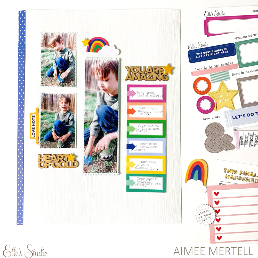
Supplies | February Labels, Bright Die Cut Tabs, Happy Little Moments Chipboard Stickers, XOXO 6 x 8.5 Inch Paper Stack, Heart of Gold Wood Veneers, Good Times Tab Stamp
I knew I wanted to create a sort of, “reasons why” style layout using these photos I snapped of my son mid-story— he tells the best stories! I grabbed the February Labels as I thought they would be a great jumping off point and a fun place to list my reasons. I went ahead and filled in the boxes with a bunch of reasons why my boy is amazing and instead of trimming them down into individual labels I opted to leave them together, which actually inspired my layout design and photo sizing.
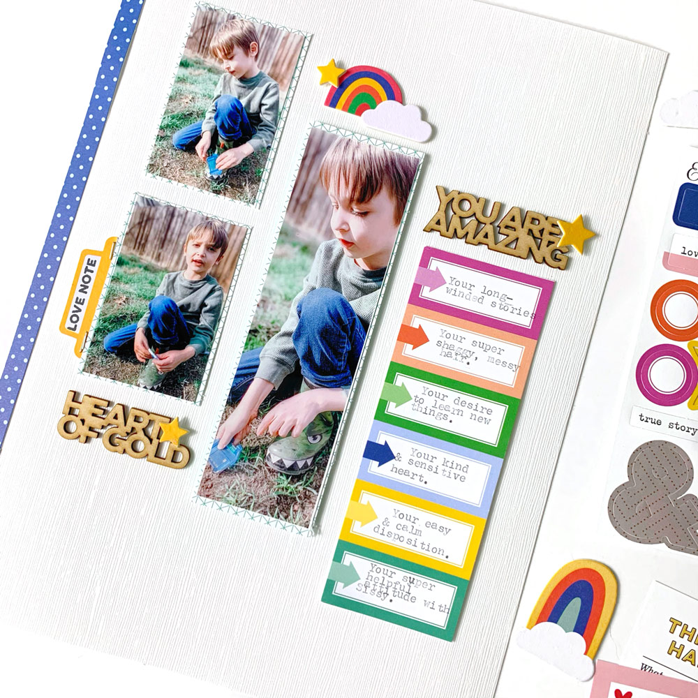
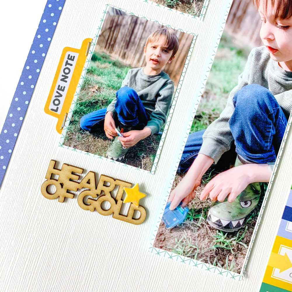
I printed out my photos the same dimensions as the label strip and laid them in a stair pattern. I then selected some of my favorite Heart of Gold Wood Veneer pieces to help direct my story and the overall theme of my layout.
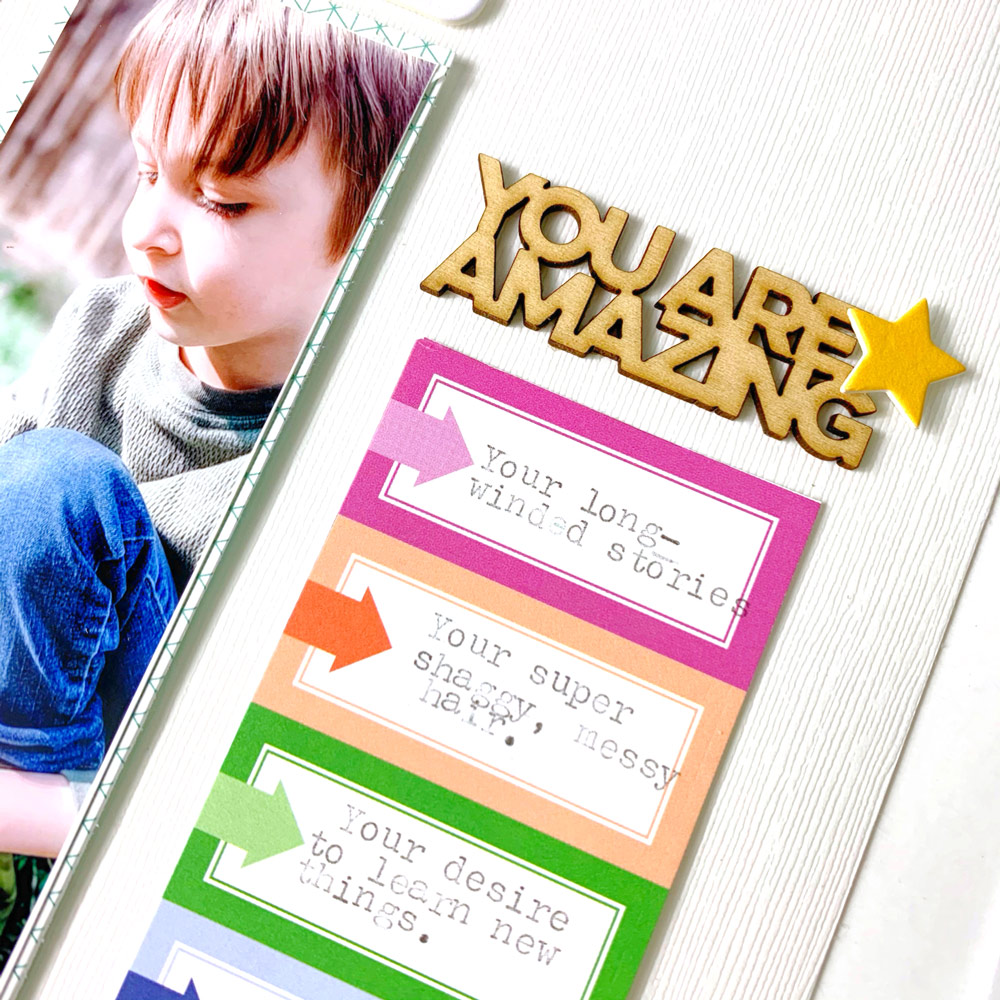
I chose the phrases, “heart of gold” and “you are amazing” and also added in a “love note” stamped sentiment on a tab from the Bright Die Cut Tabs. Being intentional about the phrases or embellishments you use on your spread can do wonders for making your entire layout feel meaningful without needing any extra fluff. Don’t get me wrong, sometimes it’s fun to fluff, but that doesn’t mean it’s always necessary!
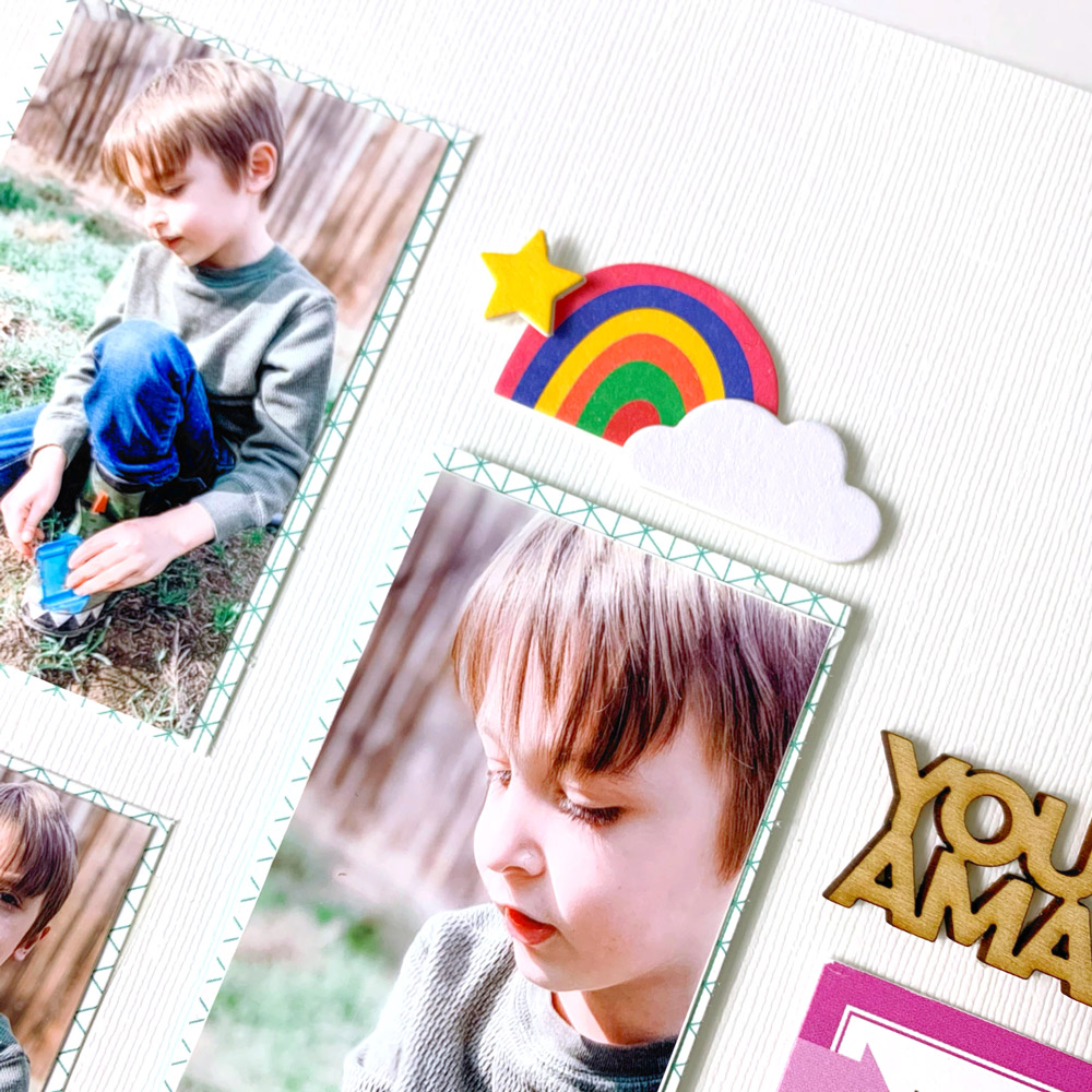
Next up, I added a bit of whimsy with some gold stars and a rainbow cluster from the Happy Little Moments Chipboard Stickers—sweet and simple.
Even projects with minimal embellishments can be just as striking or impactful as one with ALL THE THINGS—especially if you’re choice with your products. This is one of those situations where less was definitely more, and I hope it inspires you to try a simpler and more intentional approach to your next page. Until next time, happy creating!

