Hello Elle’s Studio friends! It’s Candace here to share with you a simple, clean layout all about angles and dimension. Layouts can be simple but still have a strong design and create lots of interest and dimension. Using the June Kit and extras, along with the Magical Memories collection, I created a layout that combines all of these principles.
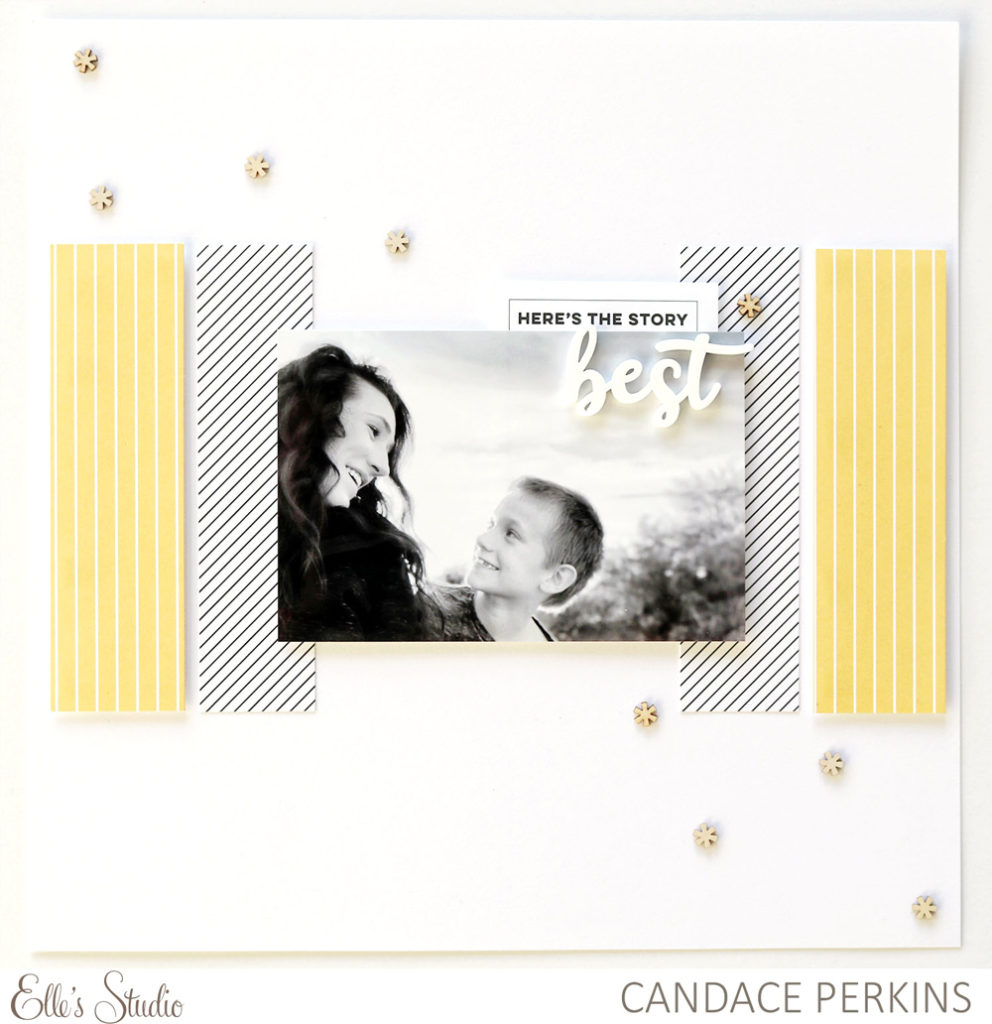
Supplies | June 2019 Kit, Magical Memories Wood Veneer Confetti, Best Friends Acrylic, Magical Memories 6 x 6 Paper Stack
I started the layout with a clean, white cardstock base. By keeping the background simple it keeps the focus on the different angles created by the photos and paper on the layout.
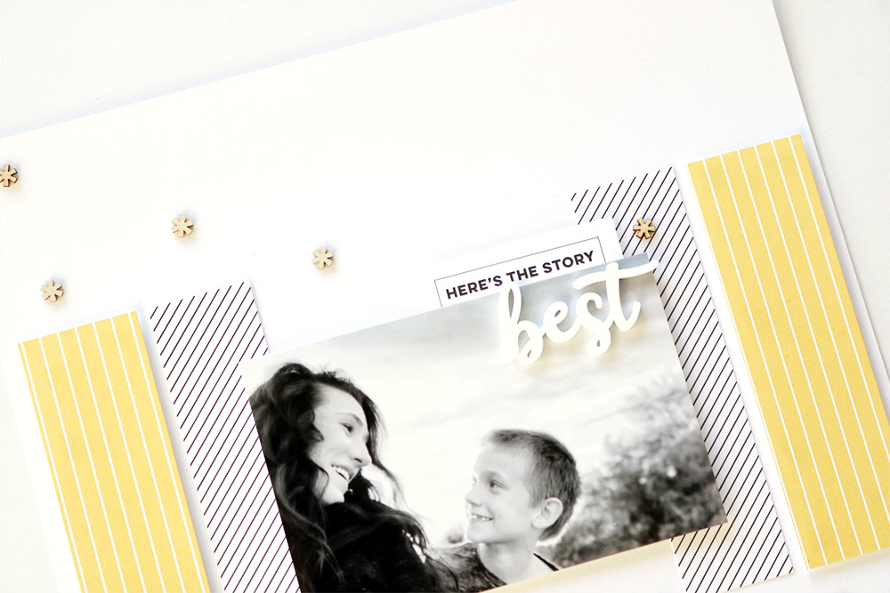
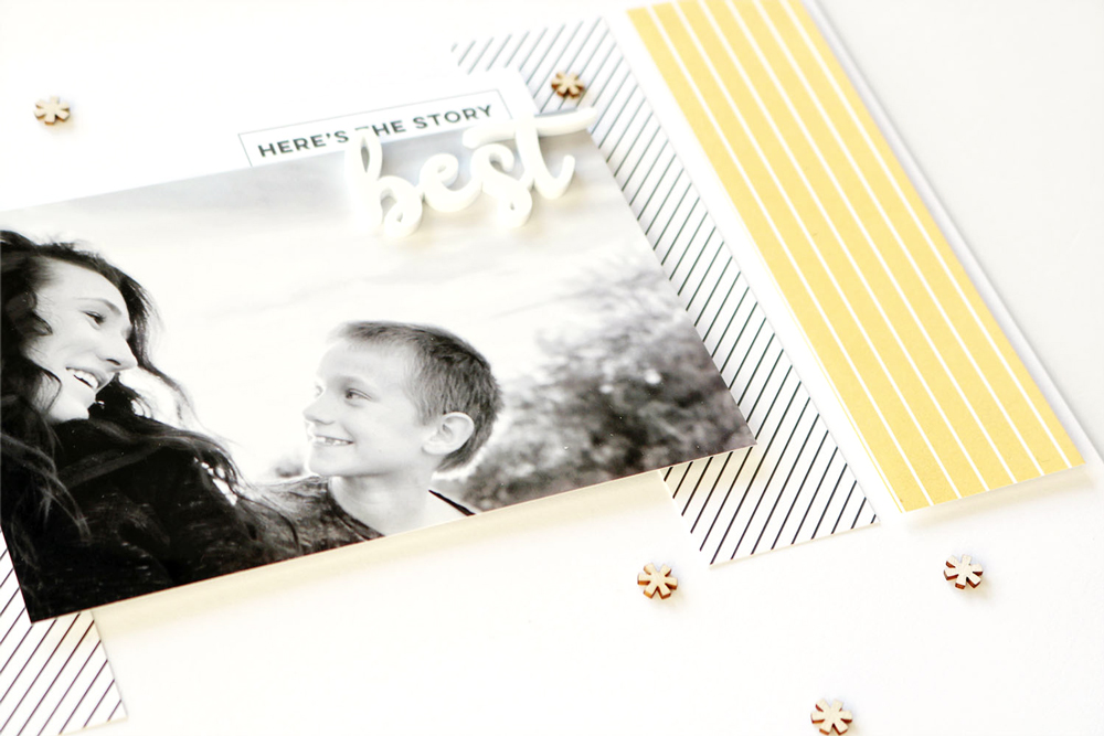
For my first angle, I worked in the horizontal plane. Working in the middle of the layout, I created a horizontal line with strips of paper from the Magical Memories 6 x 6 Paper Stack and my photo. To create interest within the horizontal plane, I alternated the dimension of the different papers using foam adhesive.
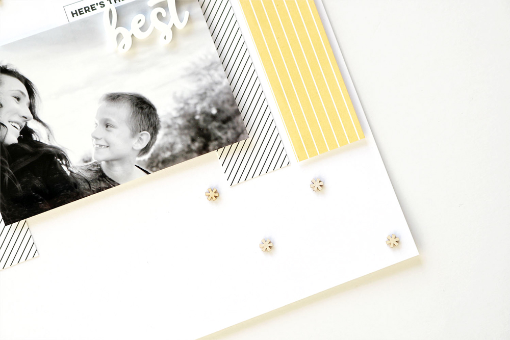
I popped up the yellow papers on the border of the layout. Then as I moved into the center of the layout I alternated the dimensions; one paper flat then my photo popped up.
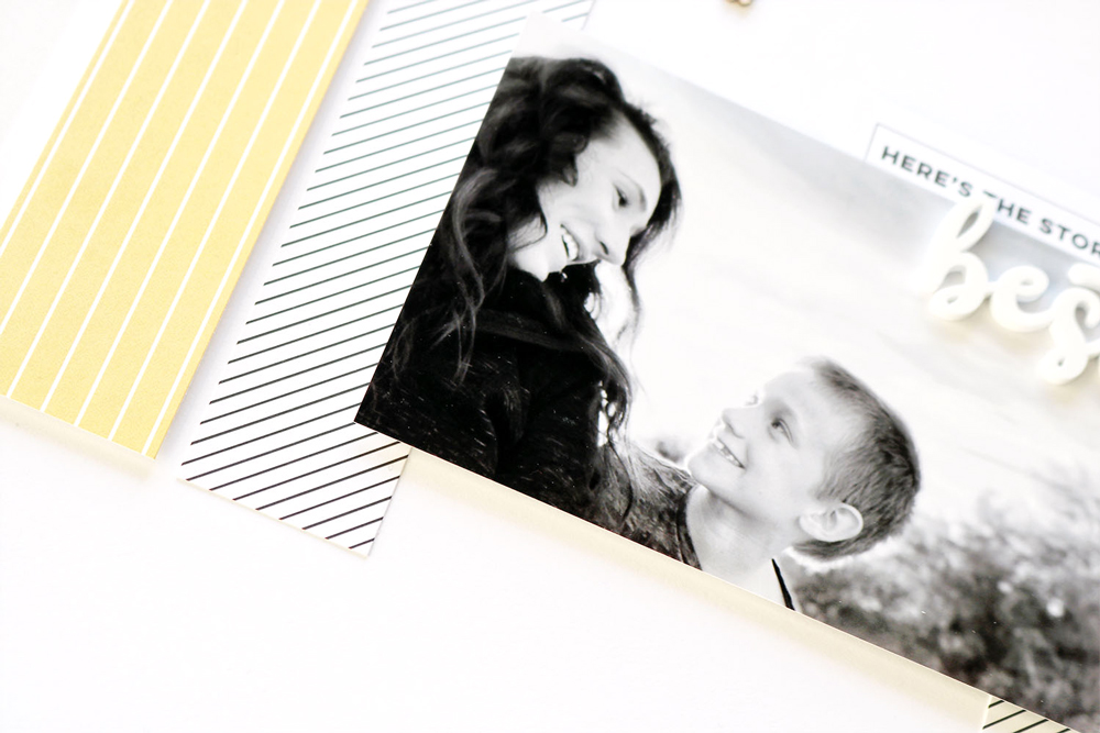
For my second angle, I worked in the diagonal plane of the layout. Using the wood veneer asterisks found in the Magical Memories Wood Veneer Confetti, I created a diagonal line across the center of the layout. I love the balance this brings to my page. By working in two lines, I am able to balance the weight of the elements across the page, and I love the final result! Such a special moment captured and documented on a simple layout with balance and interest.
How will you use angles and dimension on your next layout? Get creative and have fun!


Comments