Now that summer is here, the pool and the back yard are calling to us, leaving little time to scrapbook. But, with the new sketch we’re sharing today, we know that you will want to drop your summer bucket list to create, the way that Tracey Fox did! Let’s take a look:
Don’t you just love creating a page from a sketch? I sure do—especially when the sketch is based off of an amazing layout created by fellow Elle’s Studio design team member Melissa Mann for the May inspiration gallery. Here’s a look at the sketch:

The signature feature of this sketch is the awesome sunburst surrounding the focal point of the layout. Melissa used branding strips from past 12″ x 12″ paper collections to create this effect on the original, and when Laura Wonsik scraplifted Melissa’s layout for last month’s “Inspired By” series, she mixed branding strips with stamps from the Hello stamp set. I wanted to go in a different direction for my layout:
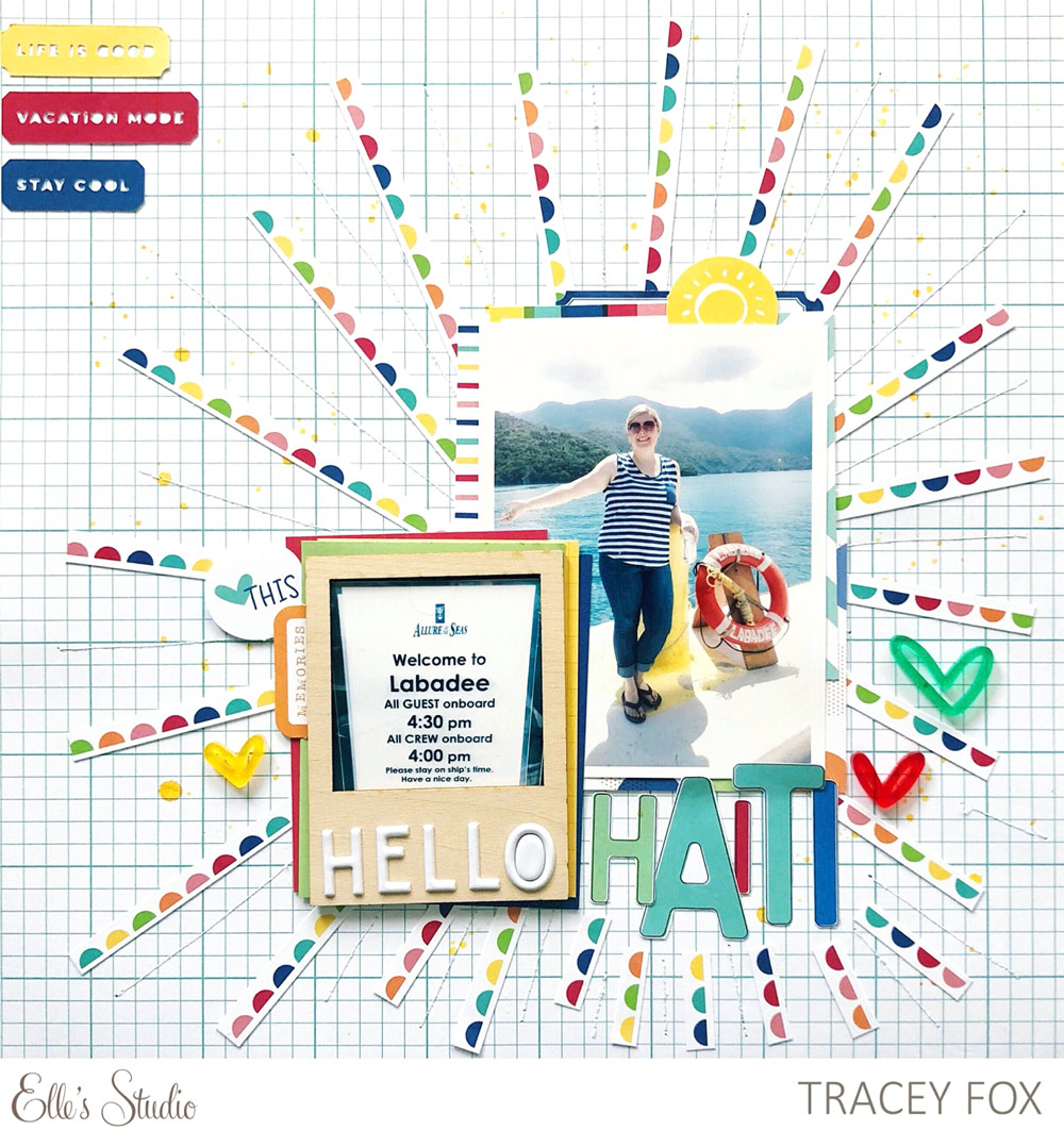
Supplies | June 2018 Kit, June 2018 Digital Cut File, June Blank Label Stickers, Summer Wood Veneer Frames, Bright Hand Drawn Acrylic Hearts, Hello Happy Puffy Words, Shine 6″ x 6″ Paper Stack, Noteworthy 12″ x 12″ Paper Collection
For my take on the sunburst, I selected a sheet of paper from the Shine 6″ x 6″ Paper Stack with lines of colorful scallops. I trimmed it into strips which I adhered to the grid background paper from the Noteworthy 12″ x 12″ Paper Collection. I also added some white stitching in between each of the “rays” of the sunburst for a little extra interest.
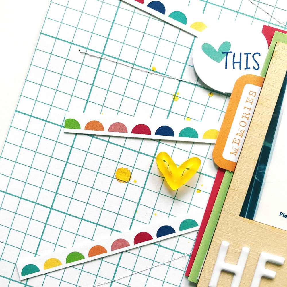
I used my smaller photo in one of the Summer Wood Veneer Frames, and I built my title using the Hello Happy Puffy Words and letters I fussy cut from the words printed on Noteworthy Paper 3. I then layered up the photo and frame with bits of paper and tags from the June Kit and the Shine 6″ x 6″ Paper Stack, and I adhered them to the center of the sunburst.
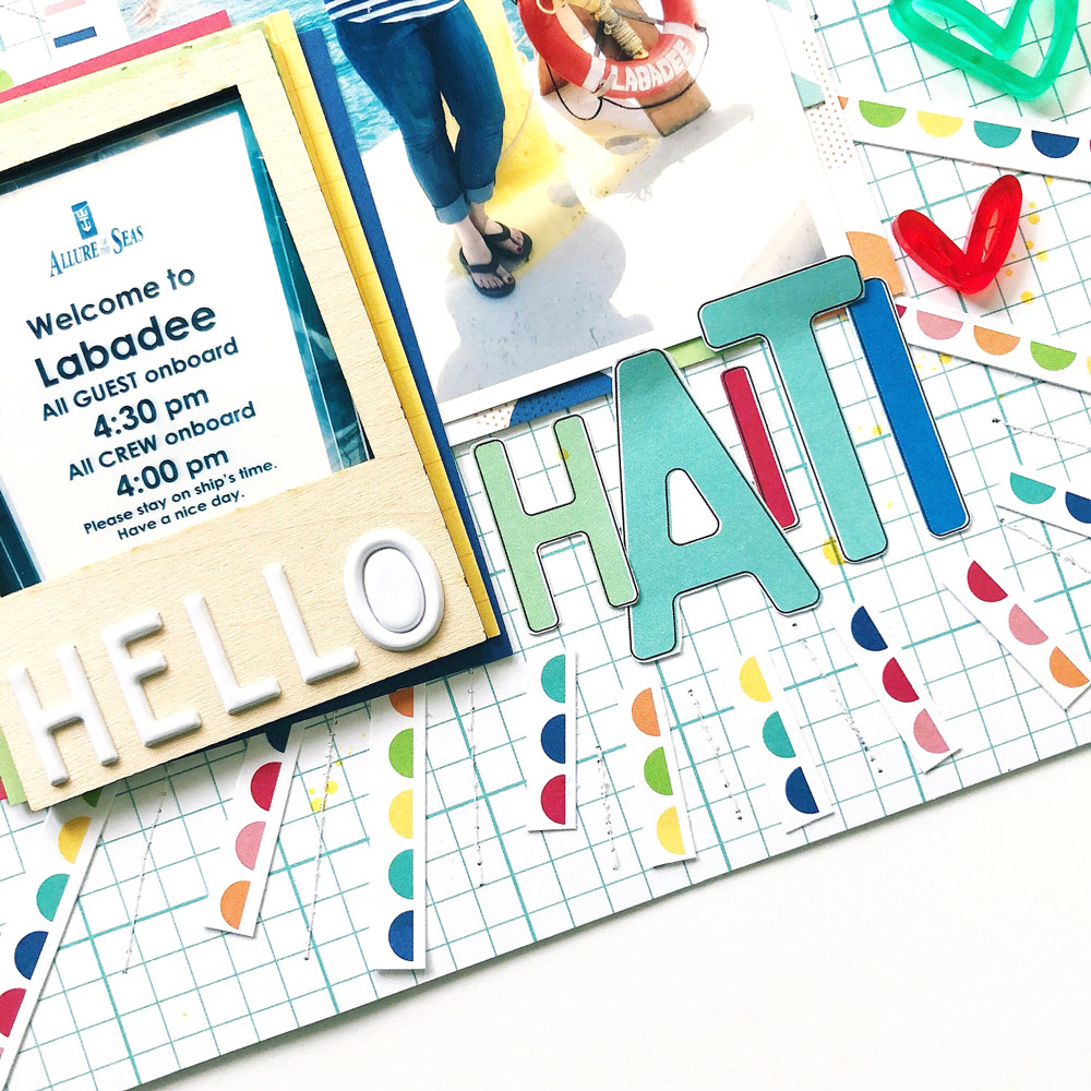
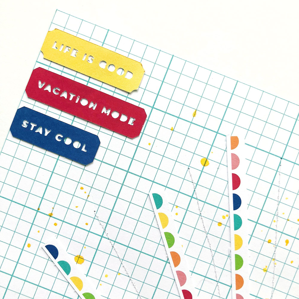
Some die cuts from the June Kit, three of the Bright Hand Drawn Acrylic Hearts, and a few yellow ink splatters helped me embellish the layout. For a finishing touch to bring a bit more color to an edge of the page, I added some of the summer sentiment ticket shapes from the June 2018 Digital Cut File to the top left corner.
How would you create a layout or other project from this sketch? We’d love to see! If you share a take on this sketch on social media, don’t forget to tag #ellesstudio. Thanks for stopping by today!

Sketch Day with Tracey Fox
