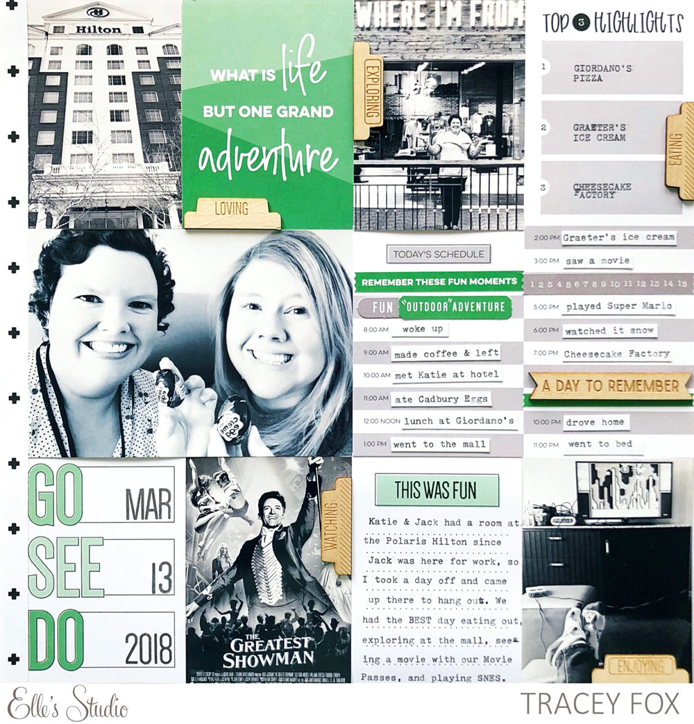
Our monthly kits are full of beautiful colors, but that doesn’t mean that you have to use all of them on your projects! The new layout that Tracey Fox is here to share with us shows that going monochromatic can be just as beautiful as using multiple colors! Let’s see what she created:
My 12″x12″ albums are full of traditional scrapbook layouts instead of pocket pages, but that doesn’t mean that I can’t arrange photos, 3″x4″, and 4″x6″ tags on a page in a way that’s inspired by pocket scrapbooking. And the tags in the April Kit are so awesome, I wanted to feature as many of them as I could by adhering them side by side with my photos to cover the entire layout.

Supplies | April 2018 Kit, Currently Wood Veneer Tabs, Everyday Goodness Stickers, Dated Stamp, Noteworthy Wood Veneers, All the Details Stamp, Noteworthy 12″ x 12″ Paper Collection
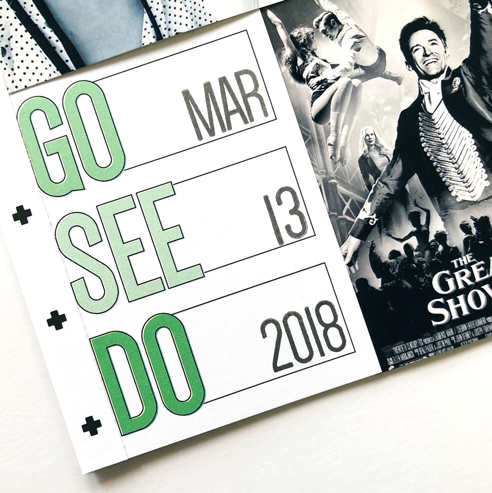
Just like every month’s Elle’s Studio kit, the April Kit is simply bursting with brilliant colors that coordinate perfectly with past products and current collections. Inspired by the beautiful “go, see, do” and “what is life but one grand adventure” 3″x4″ tags in the kit, I chose to focus on just the beautiful greens and grays on this layout about a wonderful day off with my best friend. I edited my photos to black and white and printed them in 3″x4″ and 4″x6″ so they would match and line up perfectly with the tags.

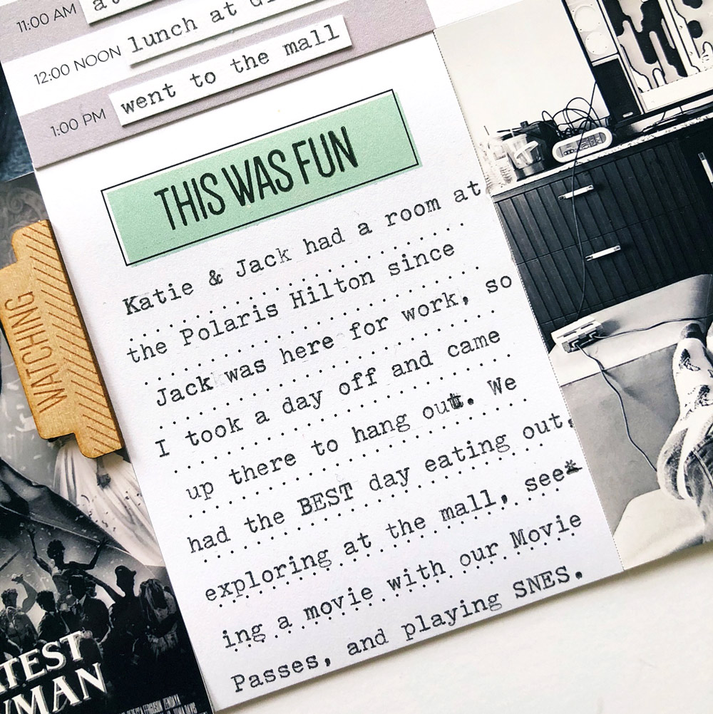
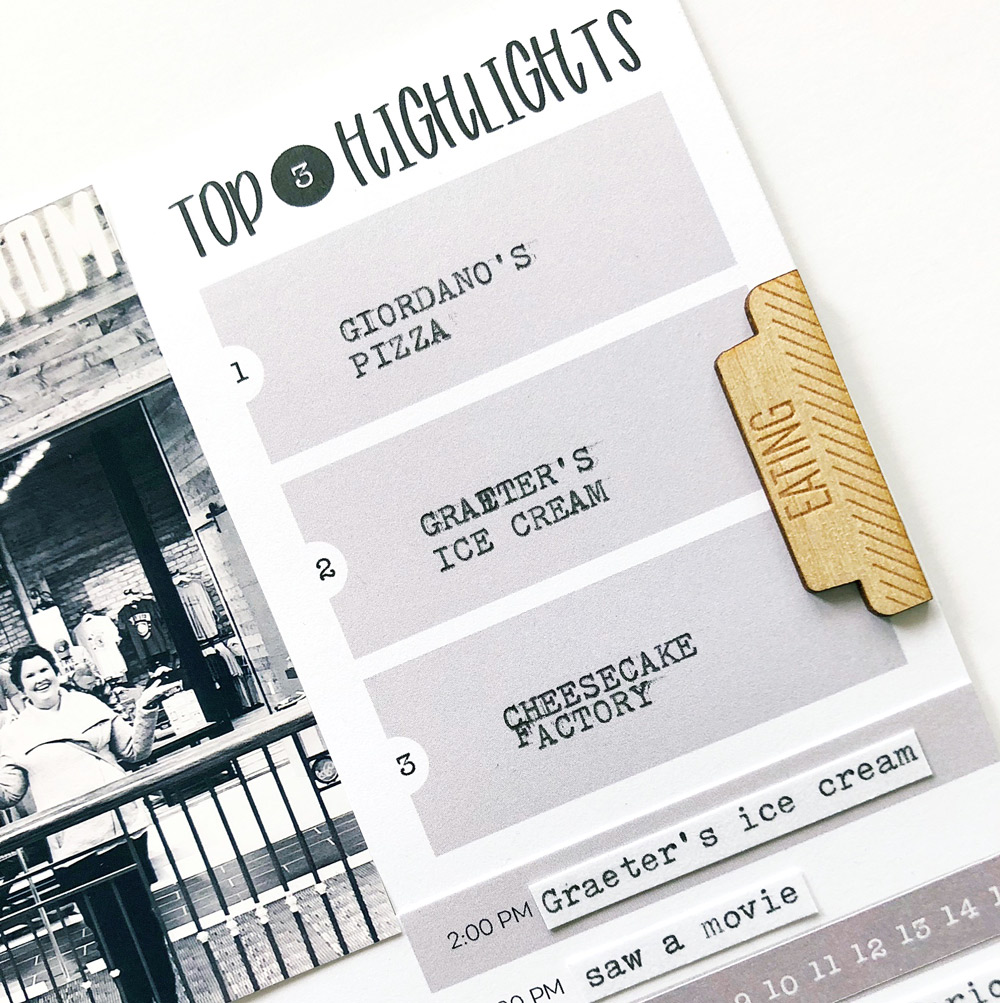
The tags I chose to use on the page contained the perfect prompts to tell the story of a really fun day I took off work to spend with my best friend Katie: where we ate out, went to a movie, played video games, and enjoyed each other’s company. I especially love how the “today’s schedule” tag allowed me to fill in a hour by hour account of our awesome day together.

After I adhered all of the photos and tags edge to edge on the page, I embellished the layout with the Currently Wood Veneer Tabs, diecuts from the April Kit, and some of the Everyday Goodness Stickers.

My home photo printer prints photos slightly smaller than 4″x6″, so I was left with a bit of excess space on my 12″x12″ canvas. It would have been fine to just cut the page down, but instead, I decided to use a black and white plus sign-patterned border strip from one of the papers in the Noteworthy 12″ x 12″ Paper Collection to decorate the left hand side of the layout and break up the grid design ever so slightly.
Have you ever tried isolating just one color from the monthly kit in order to tell a story on a monochromatic layout? It’s a fun challenge to meet, and the result is super cool! Thanks for joining me today. I can’t wait to see what you create with the April Kit and extras!

Documenting A Day of Going, Seeing and Doing with Tracey Fox
