I’m a pretty simple girl.
I married my high school sweetheart and we have three kids (Molly – 12, Jack – 10 and Max – 8). For the last 11 years we’ve been living on the family farm and renovating a 120 year old farmhouse in Canada. Yes. Still renovating! 😉 I’m a major homebody so country life is a great fit for me!
Back in the day I earned my Bachelor of Education degree, but an artistic life has always been calling my name (I come from a long line of artists) I’m always busy doing something creative… photography, scrapbooking, decorating… you name it! I love that scrapbooking combines so many of my hobbies into one! It’s the perfect fit.
You can find me at my blog, Hello Forever (www.marcypenner.com), and hanging out on Twitter. I also design for October Afternoon and Project Life. I’m so very happy and honored to be here at Elle’s Studio.
blog – www.marcypenner.com
twitter – https://twitter.com/#!/marcypenner
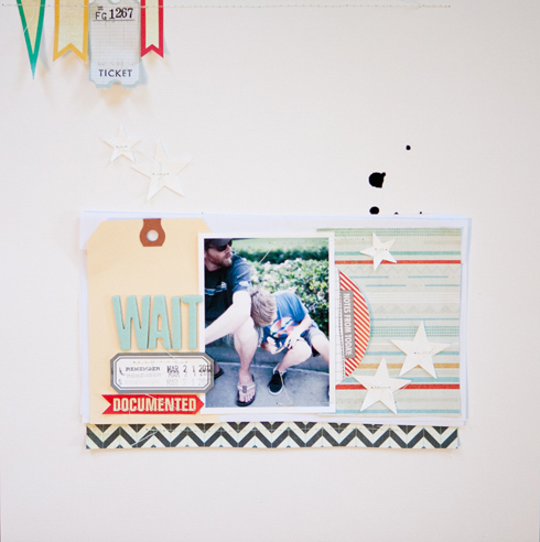
I’m honored to be back here at Elle’s Studio for Make It Sunday. Today I wanted to show you all how this layout came to be:
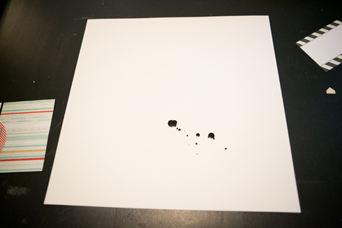
1. I usually start my layouts with a piece of white cardstock and by adding some ink/paint splatters. And this layout was no exception.
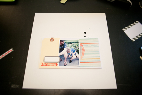
2. From there I decided on my design… basically three rectangles across the center of the page. One for the title, one for a photo and another for paper and embellishing.
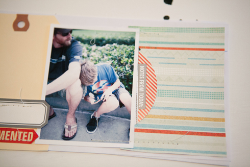
3. I slowly start to layer on elements. I know my title’s going to go on the left… and I know I want to use the large round journaling spot so that it can pull out from behind my photo (this is important to remember when adhering everything down). These get piled up on a random sheet of copy paper.
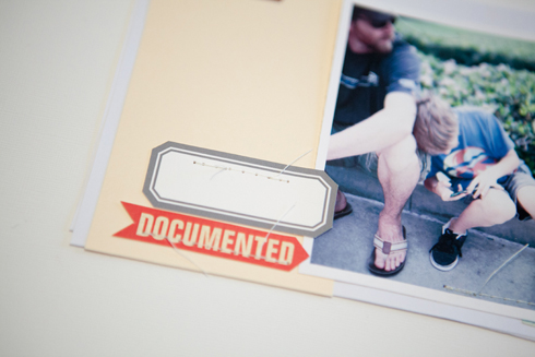
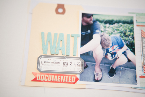
Here’s a better look at the left side with stitching… I love that little
documented arrow…
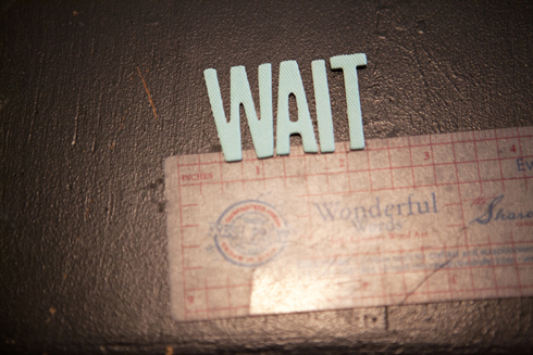
4. For my title I chose some Thickers and placed them on a clear ruler. Titles are usually the only things I like straight… go figure.
I placed these above the label on the left.
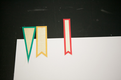
5. I cut of some of the
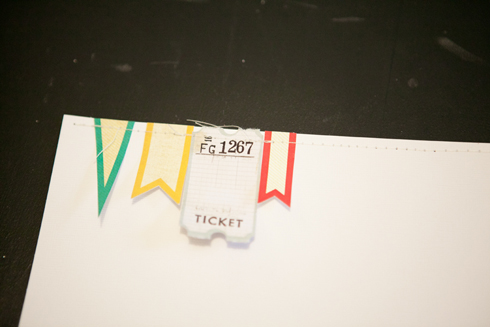
new pennants and added them to the top.
6. The tops were trimmed off and a ticket was added when I decided that I didn’t like the space in between them.
7. I like adding tone-on-tone details to my pages. They add a little bit extra and still keep my page simple.
Here I punched out some white stars and sewed them down.
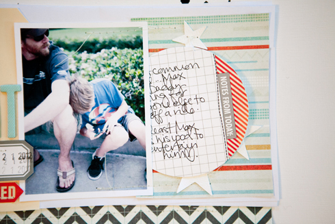
Here’s a closer peek:
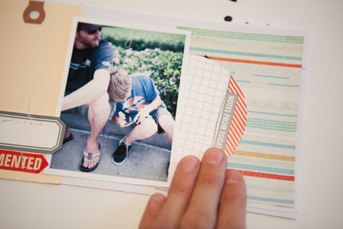
Here’s the journaling card filled out…
… and tucked back in.
Our Make It Sunday blog series has been taken over by past members of our design team! We are so excited to see their work featured again, here at our site! Look for a different past design team member each week.



Comments