Today we have another project from our guest designer for August, Andrea Gray! This time, Andrea is working her magic on a fun scrapbook layout inspired by one tag in the August exclusive kit. Let’s have a look!
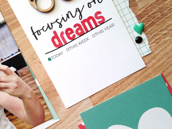
Hi everyone! It’s Andrea here and I’m back to share a 12” x 12” layout with you today! When I flipped through the August exclusive kit’s 3” x 4” tags, I found the “focusing on” tag and immediately thought of the perfect photo to document: a photo of me daydreaming about cute frames!
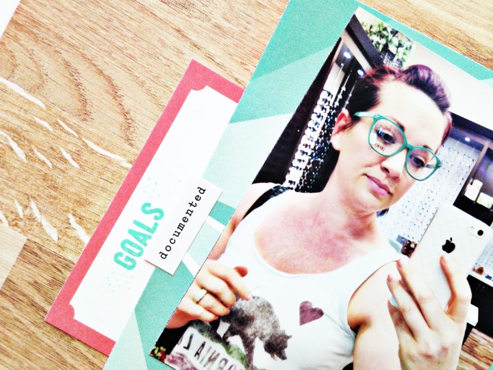
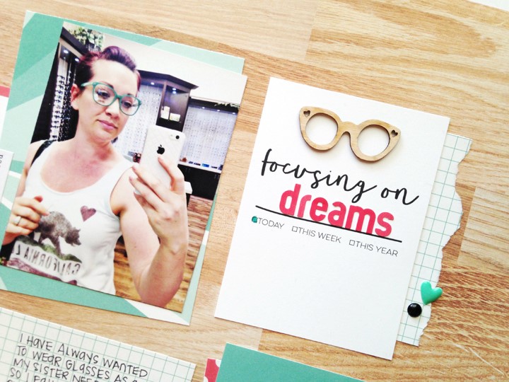
When I saw the little wood veneer glasses in the Sunny Days wood veneers, it completely sealed the deal! The story is that I have always wanted glasses but have 20/20 vision. I know, I know – poor me! LOL. But now that there are so many cute frames available, it makes my envy even stronger!
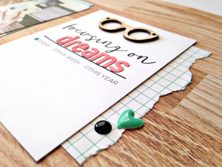
My process for starting a layout is typically the same. It starts with the photo and then I select supplies to complement it. I like looking beyond the obvious colors in the photo. For example, the glasses I have on are teal, which is perfect because it coordinates with the patterned paper in the Sunny Days collection. But check out the background of the photo: I spy woodgrain. I decided to use the full 12” x 12” Adventures woodgrain paper from Sunny Days paper collection as the background and use the Sunny Days Stars teal sunburst paper to mat the photo so the woods didn’t blend together. I wanted them to connect visually, but not touch.
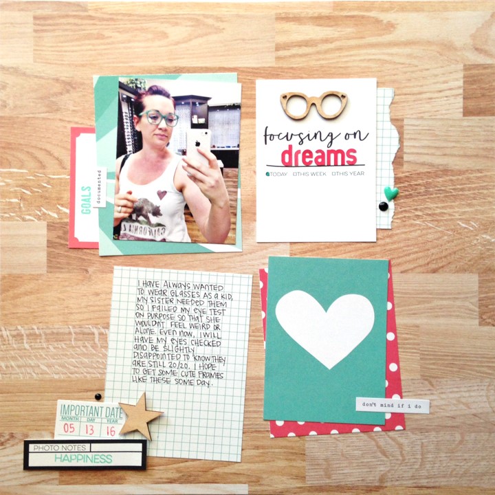 Supplies used: August exclusive kit, Sunny Days 12” x 12” paper collection, Sunny Days 6” x 6” paper stack, letter and number stickers- pink, Little Moments Word Labels, Notes from Today stamp, and Work Hard stamp.
From there, I continued with the grid-style format using contrasting colors for matting the focal pieces. For lighter tags, like the grid, I kept the matting light so it stood out against the woodgrain, and for darker elements, like my photo and the heart tag, I used lighter colors to back them.
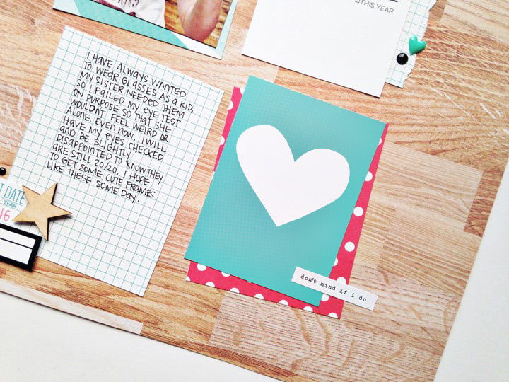
Keeping the embellishments to a minimum was important since the woodgrain pattern can feel quite heavy. To achieve this, I added a small cluster of tags to the bottom left of the grid journaling tag and used a wood veneer star from the Sunny Days wood veneers to balance it all out.
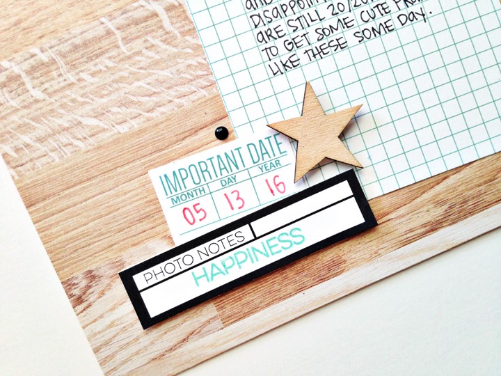
My favorite part of finishing a layout is adding tiny little shots of color here and there so I added some coordinating enamel dots, a tiny sentiment strip and colored in a box from the checklist!

And that’s all I have for ya today! See you again next week for my final guest post – and pssst – we’ll be talking about planners! Happy scrapping!
 Hi & hello from Northern California! You might know me around the crafty world as retrohipmama and I am super stoked to be a guest designer this month! Outside of scrapbooking I love to do different crafty things, jump on the trampoline with my two boys, scroll Instagram (I’m always there so follow me @retrohipmama), eat dark chocolate, have conversations with my husband in movie quotes or song lyrics and watch football. I am currently on the Illustrated Faith and Gossamer Blue design teams and love inspiring others to make stuff! My style has definitely evolved over the almost 20 years I have been memory keeping, but my layouts always come out clean and colorful and full of stories. This summer I am teaching myself piano and going on a lot of different crafty adventures!
Be sure to follow Andrea at her blog, on Facebook, and YouTube, and stay tuned for one more project from her right here on the ES blog!

Pingback: Focus // Elle’s Studio August Guest Design – retrohipmama