Hey, ES fans!
Today I wanted to share with you a few projects from the current Design Team Gallery highlighting neutral background layouts. These layouts keep the focus on the amazing photos that they display and include many of our Elle’s Studio tags!
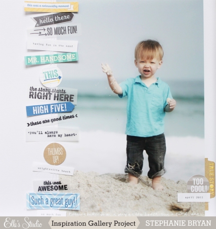
This layout, from Stephanie Bryan, uses a solid white background to showcase the adorable photo of this handsome little guy. Stephanie included her journaling as a footer along the bottom margin of her layout and embellished along the left border of the photo with several tags, vellum and stamps. A perfect end result!
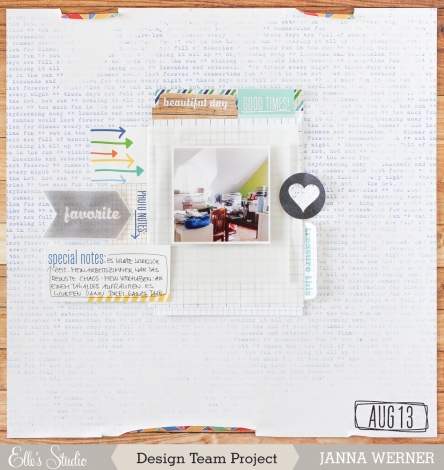
Design team member Janna Werner creates the illusion of a neutral background using one of our pattern papers with a subtle print, even though it’s bordered by a wood grained paper. The effect is still the same. Your eyes are immediately drawn to the single photo near the layout’s center.
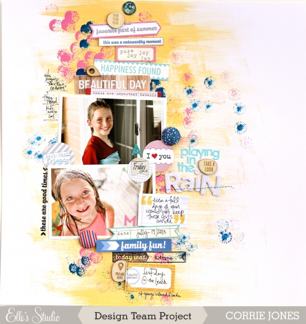
The last layout I’m highlighting today is by design team member, Corrie Jones. Corrie creates a great home for several tags and embellishments by simply painting an area of her layout. Gorgeous!
We hope these gallery highlights from our talented design team inspires you to create your own neutral background layouts and projects. What creative ways will you find to display your Elle’s Studio tags?


Comments